Starbucks founder Howard Schultz once was asked what made his brand one of the most recognized in the world. Without hesitation, he answered, “Authentic brands don’t emerge from marketing cubicles or advertising agencies. They emanate from everything the company does.” With those few words, Schultz encapsulated the essence of branding.
Branding, as a concept, is much more than eye-catching packaging, clever advertising, or even a great product. The most powerful and enduring brands are built from the heart. They are real and sustainable. Their foundations are stronger because they are built on the human spirit, not simply an ad campaign. Companies that are authentic last.
“Authenticity” is easier said than done, or even defined. Components include the brand’s heart and soul, personality, and backstory. Those, coupled with a well-defined target demographic, will help a brand position itself in the market. Consumer research comes into play at all points in the process of identity creation. Consumers seek functional, emotional, experiential, and self-expressive benefits from the products they buy. One often-subconscious question lies at the root of their purchasing decisions: “What’s in it for me?” Answering that question honestly—through consumers’ eyes, not the brand’s—can help determine the “face” that will resonate most with the public.
In today’s maturing cannabis market, where acquisitions, mergers, and partnerships are on the uptick, creating a memorable brand is essential for survival. Jared Mirsky, founder and chief executive officer of branding and marketing consultancy Wick & Mortar, advises clients to invest in their brand, hype up what makes it unique, and put the brand’s story at the center of every promotional effort. “It’s so easy for a brand to feel derivative in the cannabis industry,” he said. “Cannabis is an industry that contains a ton of passion, which is transformational in creating a memorable brand. Most of the clients we work with are in this business because they genuinely care about the craft, the benefits, and the customers.”
Here we present some companies—large and small, new and mature—that have invested significant time, thought, and money in creating and nurturing their brands.

European mystique
For Prana Principle, branding was not about creation but translation. The company leveraged the reputation and history of its twenty-five-year-old corporate parent, APAX Nutrition Europe Ltd. The corporation played up its European heritage—which many Americans find exotic—when it launched the American division, APAX USA Inc., under which Prana operates. “Our experience in Holland, and now in Colorado, provides the perfect synergy for innovation,” said founder and chief executive officer Sebastien Hebbelinck.
Prana Principle portrays itself as “the experienced CBD company” that regards consumers with respect. “We don’t want to just sell a trendy product at a time when CBD is all the buzz,” Hebbelinck said. “Using any of our products is a very personal choice for our consumers. We respect that. We want Prana to be a trusted name that customers believe in.”
As part of an effort to dispel conflicts between perception and reality, the company has partnered with groups including Hemp History Week, U.S. Hemp Roundtable, and Hemp Industries Association. “Through these relationships, we are working to change [the image of] the entire CBD industry,” Hebbelinck said
Targeting a precise demographic
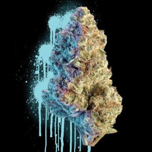
Blake Powers and Danielle Sebastian, Korova’s marketing team, have been in the weed game for more than two decades, frequently adapting the company’s messaging to meet evolving demographics and market forces. Powers ascribes much of Korova’s success to company-wide belief in the product. “If we don’t smoke it, you don’t smoke it,” he said. “That’s what drives the brand.”
With roots in the underground, the company successfully merges the hip with the mysterious. Product packaging, with its third-eye cow and graffiti elements, is just esoteric enough to provoke curiosity without rounding the bend into confusion. “We love collaborating with visual artists to create limited-edition apparel products and incorporate our love for graffiti into every jar of our flower,” said Powers. “The [visual] elements are what draw people in. What keeps them loyal is what’s inside [the package].”
Despite its growth, the brand maintains small-company appeal by creating personal relationships with budtenders and investing in slightly wacky in-store events. The “Korova takeovers,” as Sebastian and Powers call them, often include “screaming deals” accompanied by literal screaming contests judged by the company’s street team. On those days, “loyal fans line up before the [host dispensary’s] doors even open,” Powers said. Combined with branded swag for budtenders and consumers alike, the takeovers create a priceless, almost familial link between the company and its well-defined target audience: young consumers with above-average cannabis knowledge and experience and an affinity for street art and culture.
Inspiration and affirmation
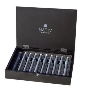
“Born in Venice Beach and raised in Palm Springs,” California brand Nativ’s message forms the core of its existence: You’re not a nativ of the place you come from. You’re a nativ of the place where you belong…the place where you can always be yourself. The words create an immediate reaction within consumers, inspiring, affirming, and creating a bond.
“Nativ seeks to nurture an easygoing, relaxed state of being,” said Inventory Manager Andrew Yeager. “We create experiences where wellness is joy.”
While the company puts an emphasis on social media promotion, it’s the endless time on the road hosting appreciation days at dispensaries that has allowed Nativ to create intimate relationships with consumers. Through meet-and-greets, the company founded a tribe of retail buyers and customers. “Nativ utilizes innovative packaging, uniform branding, and a commitment to clean cannabis to stand out in a competitive marketplace,” Yeager said. “When you see Nativ on the shelf, you know you’re not buying just cannabis but a full wellness experience.”
Community outreach
It should go without saying cannabis edibles companies adhere to strict food- safety standards and efficacy testing. Those, and business integrity, are at the top of KIVA Confections’ list of must-dos. But for co-founder Kristi Knoblich Palmer, community and inclusivity are at the center of everything the company does.
“In a medical or recreational market, KIVA’s mission remains the same: We want everyone to feel empowered to enjoy our product to enhance life’s greatest moments, no matter how large or small they may be,” she said.
Thus, the company reaches into the communities it serves. In 2018, KIVA mounted an onsite presence at Outsidelands and hosted a suite of elevated parties for the holidays; in 2019, the company organized a Valentine’s Day bash for influencers. “We are constantly searching for new ways to resonate with our current consumers and untapped market segments,” she said.
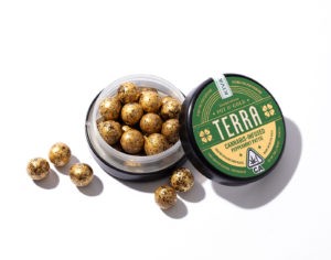
The company’s product packaging is outreach of another sort. Each line has its own carefully considered look designed to appeal to a subset of a broad target market: KIVA Bars invoke an eco-conscious vibe; Camino Gummies appeal to the outdoorsy-California set; and Petra Mints and Terra Bites trade on traditional aesthetics and portability. Palmer said she considers packaging a storytelling medium. “We constantly draw inspiration for current and future brand offerings from unexpected sources like art, history, travel, and pop culture,” she said.
Understanding and addressing the market
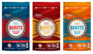
When mg Magazine featured Tripp Keber on its September 2015 cover, the energetic chief executive officer of Denver-based Dixie Elixirs & Edibles oversaw a company with a solid footprint in a handful of states that had positioned itself as one of a very few national brands in the industry. Fast forward to today and the rechristened Dixie Brands, now helmed by co-founder and Chief Executive Officer Chuck Smith, remains a leading provider of edibles in the U.S., has added more branded product lines, and soon will expand its Dixie-branded offerings to six Latin American markets courtesy of a joint venture with Khiron Life Sciences.
Andrew Floor, vice president of marketing, traced the company’s longevity to understanding consumer habits, wants, and needs and then addressing those things with both products and marketing. “The infused cannabis category is driven by exploration and discovery, and our Dixie brand satisfies the needs of that consumer via big, bold flavors and colors across a product portfolio ranging from beverages to gummies, chocolates, mints, and concentrates. Our Synergy brand, on the other hand, is performance-based, crafted for a health-and-wellness consumer looking for a more holistic cannabis experience. Synergy branding is more restrained to reflect that audience and satisfies their needs through a ratio CBD:THC product portfolio that delivers true balance from micro-dosing.”
In the future, he added, “We will become even more consumer-centric, using our understanding of our audience’s needs and wants to drive every decision we make, from branding to packaging and product development to communication.”
The one word that defines the image Dixie wants consumers to have first and foremost in their minds? “Authentic,” said Floor.
As far as challenges the company faces as it moves ahead developing national and global brand awareness in such a fast-moving industry, Floor pointed to a “multitude of challenges” faced by “multi-state/multi-country [consumer packaged goods] companies: maintaining consistency of product experience across borders, overcoming consumer misperceptions and stigma, and hugely limited [point-of-purchase] marketing opportunities in highly regulated and restricted retail landscapes, just to name a few. But at the top of that long list of challenges undoubtedly lies the regulations limiting our ability to communicate with our consumers. Those regulations are both regional and fluid, which means our marketing team has to work overtime to keep abreast of what we can and can’t do or say.
“Worse,” he continued, “the canna-curious consumer is hungry for information, wanting to build relationships with brands they can trust. Despite the fact Dixie Brands wants to be a responsible partner and guide for them on their journey into the category, restrictions on how, where, and when we can communicate with them make satisfying that primary consumer need incredibly difficult.”
Defining a category
When Mirth Provisions’ founder Adam Stites wanted to create something new in the medical space, he turned to his friend Peter Metz, co-owner and creative director at the Sockeye agency. “I’d seen their ability to get to the essence of what or who a brand is and reflect that in a way that is honest, super-original, and ownable,” said Stites. “Sockeye has helped us think about our brands from the ground up.”
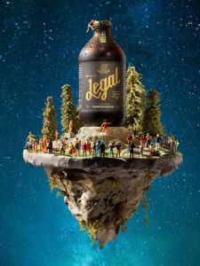
Metz saw an opportunity for Mirth to pioneer a new kind of product designed for those who enjoy edibles but eschew products “replete with high-fructose corn syrup.” The result: Legal, a sparkling infused beverage with an aesthetic reminiscent of hometown brews, backyard cookouts, and soda fountains. The team chose the name Legal to celebrate the repeal of prohibition.
Stites said the brand targets an upscale, health-conscious demographic, which responds well to the product’s look, taste, effect, and subtle message about good, clean fun. “The Legal consumer might try other options, but they come back to us,” he said.

The maverick effect
When it comes to understanding branding, gambler, internet celebrity, and Ignite founder Dan Bilzerian has an advantage: His over-the-top lifestyle led him to a position among the top forty Instagram influencers globally. “Dan saw the sea change in cannabis and CBD coming, and how his core audience of 18- to 34-year-olds were over-indexing for interest and use,” said Ignite International Inc. President Jim McCormick. Naturally, the pair set out to create a sexy lifestyle brand.
Ignite is a maverick. While the company respects the industry’s traditions, Bilzerian and McCormick have no intention of becoming part of the pack. According to McCormick, the brand always is looking for the next peak to climb, because…well, “there’s no prize for second place.”
“Every brand touchpoint has Ignite’s unique viewpoint built in, and every execution has to feel authentic to Dan’s lifestyle and worldview,” he said. “If other cannabis companies buy billboards, we buy building walls. If other brands throw parties, Ignite leverages Dan’s incredible 32,000-square-foot house and packs it full of celebrities and athletes.”
The brand’s packaging reflects Ignite’s uncommonly in-your-face approach to marketing a premium product: The aesthetic is modern, urbane, and sleek…with a sharp edge. In keeping with its objective of cornering the 18- to 34-year-old-male demographic, the company’s social media presence leverages not only Bilzerian’s 26.9 million Instagram followers but also takes a bite out of Snap and Twitch. “We market more like Red Bull than we do a typical cannabis company,” McCormick said. “We have some of the most popular influencers who post for free because they believe in the products and their benefits, they respect Dan, and they know being associated with Ignite will increase their engagement.”
As much as Ignite trades on the testosterone-fueled reputation of its founder, the company also attracts what McCormick described as “unique females” who are confident enough to lean into the Ignite brand. If the company’s performance to date is any indication, “unique females” probably will see that as a challenge.
Helping consumers define themselves
When IONIC launched in 2012, cannabis was still mostly hiding behind the wall of medicinal treatment. The company intended to reframe the discussion by creating a brand specifically aimed at respectable professionals with families and jobs who also use cannabis. “We were one of the first companies in cannabis to market a brand as a legitimate and socially acceptable product for recreational use by responsible adults,” said Chief Executive Officer John Gorst.
The challenge was creating a corporate persona that celebrated recreational use and demanded to be taken seriously—and convincing target consumers they could adopt the same attitude. “We wanted to bring cannabis out of the dark and reset the bar,” said Gorst. “The IONIC brand was created with a clarity of purpose.”
Back then the company’s most effective tool was understanding the consumer experience—which they did, because IONIC’s founders were exactly the type of consumers they wanted to attract. Education played an important role in the process, and still does. Gorst said the company will continue to invest significant resources in hosting educational in-store activations for consumers and special events for budtenders.
He also said IONIC understood early on the importance of developing a unique voice in an industry dominated by what the company’s founders perceived as sameness and outdated stereotypes. Gorst and his crew avoided the iconography and verbiage often associated with cannabis at the time. “We don’t feature pot-leaf imagery or use insider nomenclature like 420 or dank or canna-anything,” he said. “We try to avoid things that will instantly, even if subliminally, trigger those deeply rooted stigmas and previously held prejudices generally associated with cannabis.”
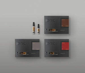
The team also insisted the company’s image evoke quality, class, and elegance. The brand sees itself as aspirational: bespoke packaging and timeless design elements reflect Gorst’s view that products make statements about those who use them. “Our products are designed to fit seamlessly into the discerning consumer’s life,” he said. “They don’t feel out of place. Our products aren’t something to hide; rather they are meant to be something one can be proud of and share.”
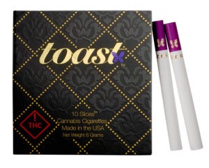
PACKAGE PRIDE
Toast set out to create a brand consumers would embrace in both social and wellness situations. During development, co-founder and Chief Executive Officer Punit Seth and his team focused on the concepts integrity, beauty, sociability, and accessibility. Packaging, they decided, would be crucial, since the look and feel of the product would do most of the marketing for them, at least initially.
Creative Director Gabrielle Rein found design inspiration in Prohibition and the Art Deco style of the 1920s. The elegant pre-rolls box is recyclable, high-quality paperboard with gold-foil details and a magnetic closure. The pre-rolls themselves, referred to as “slices” for market differentiation, bear a gold-foil logo.
The company has expanded its branding efforts with social justice initiatives. “We are well aware of the history of social injustice stemming from the prohibition of cannabis,” Seth said. “Our goal of elevating cannabis also means elevating our local communities.”
Strategically investing in fun
How did we become weekend warriors in our own lives? Many profess to hate Mondays, and there does not seem to be a lot of love for the rest of the workweek, either. But we’re completely different people on weekends.
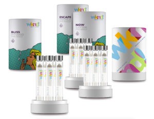
Weekend Unlimited built its recreational brand around the two days of the week we love most, offering consumers a “weekend feeling” every day. “Weekend’s packaging, marketing, and events, through Weekend LIVE, are designed purposefully to connect to those elements that make a weekend what it is, delivering life’s highs anytime, anywhere,” said interim President and Chief Executive Officer Chris Backus. “We aim to be synonymous with the idea that if you need even a few moments on a Wednesday to feel like it is Saturday, you can with one of our products.”
Though it may project a light-hearted image, the company doesn’t play around. A powerful aggregator, publicly traded Weekend acquires undervalued entities—including growers, live events, consumer packaged goods, retail stores, and research-and-development facilities—and then folds them into a multinational, vertically integrated operation where everything operates at scale. The company has the clout, and the market capital, to invest in brand-building. It heavily invests in media and public relations, along with consumer events, and has developed considerable name recognition in a relatively brief time.
Of course, the company’s playful spirit doesn’t hurt. Bright colors, product names like Love Potion, and pop-art-derived visuals make packages a standout on store shelves. “The use of pop art iconography on our packaging indicates a key direction the brand is going [in order] to differentiate itself in the market, one that has a playful, fun element that consumers can recognize and connect with,” Backus said.
Under everything lies the implied promise of relief from the weekly grind. “Consumers are people, and people regard their weekends as the best part of their week because there is a sense of freedom, relaxation, fun, and happiness,” Backus said.
 Lucid Mood
Changing the conversation
Lucid Mood’s name gets straight to the point: This is a brand designed for effect without the haziness.
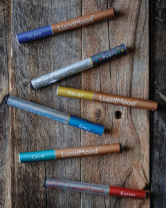
Though the company has nothing against wax and shatter, the founders thought surely the market had room for adults with errands to run. They set out to fill that space with products that “elevate your mood without clouding your mind.” First on the to-do list: Create a clean, sophisticated public image that embodies the antithesis of the “stoner” stereotype. Lucid Mood’s sleek vaporizers, organized by effect, are called “sippers.” The website and social media channels bear beautiful, painterly images of people enjoying themselves in everyday ways. The message is clear: Cannabis can play a role in your life without becoming your life.
“LucidMood is shaping the evolution of cannabis,” National Sales Manager Melissa Leffingwell said. “We are transforming the stigma of the old thoughts of marijuana into a sophisticated cannabis experience.”
“LucidMood would like users to feel inclusion—that there are products available that appeal to every level of Cannabis user,” Leffingwell said. “We have created six distinct and very precise moods that will allow both new and curious users as well as the most experienced consumer to home in on the right mood for the right moment.”
The medium is the message
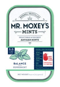
Mr. Moxey’s Mints was among the trailblazers in the micro-dosing movement. When the company debuted its tiny medibles in 2015, the idea was to provide a “portable, discreet, and well-dosed” product—a new concept at the time. “This product broke the mold on what people had come to expect from cannabis edibles,” said co-founder Tim Moxey.
Today, the mints are easily among the most identifiable products on dispensary shelves, thanks to clever branding moves. To provide a reference point, Moxey packaged the mints in colorful, Altoids-like tins—which checked the boxes for portable and discreet. The logo design and font choices give a vaguely pharmacy-like impression, and the product description, “herbal pastilles,” harkens to days gone by. Moxey said all those elements were carefully engineered to make consumers feel as though they’re dealing with an old friend…who just happens to embrace a new medical dynamic.
Mr. Moxey’s is one of the few cases where the branding effort focused almost exclusively on product packaging, but the tactic has worked. “Existing customers come into a store and point to the product they want, and new customers see a product that looks like it could be on the shelf of a natural grocer and want to learn more,” Moxey said.
Making it personal
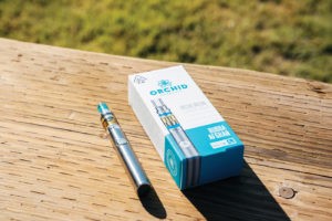
Orchid Essentials’ brand story is intensely personal. Chief Executive Officer Corey Mangold began using cannabis in 2015 to relieve anxiety, residual surgical pain, and other medical issues. After consistently experiencing less relief than he believed possible with vape cartridges and batteries, he decided to tackle the perceived problem himself. The former advertising agency executive knew the value of branding, and he built his on one word: pride.
“Pride is the key word,” Mangold said. “Pride in standing for beliefs that are widely accepted. Safety and efficacy, and a high-quality product, are just as important to the consumer as they are to us. We understand the consumer, the other products on the shelves, and how to create products that line up to the needs and wants of the consumer. We take pride in all those things, and in creating a brand that is intended for the cannabis user who is looking for benefits, a good experience, and a consistent experience they can count on each and every use.”
With more than twenty years of marketing and branding experience, Mangold used tricks of the trade that had worked for him in the mainstream. From the get-go, he wanted Orchid to stand out on shelves not by screaming, but by quietly insisting to be heard. Packaging is colorful but understated. “I wanted the package to be something a 38-year-old mother of three felt good about putting in her handbag and [at the same time] appeal to cannasuers, fashionistas, and young professionals.”
To help spread Orchid’s story, the company dispatches representatives into the field to host retail events for consumers, train dispensary staffs, and educate new users. According to Mangold, it’s important for any brand to educate consumers about its key selling points and how the products are different from anything else on the market.
In Orchid’s case, the outreach—especially recounting Mangold’s personal journey—has created a kinship, of sorts, with consumers who’ve had similar experiences. “We built the brand with mass-market appeal and a focus on health and wellness,” he said.

Encouraging an adventurous spirit
“WYLD is untamed and true to its very nature,” said Claire Wilson, marketing manager for the Portland, Oregon-based company. The founders grew up hiking, camping, and snowboarding all over the Pacific Northwest, which provided inspiration for an edibles brand that celebrates the wild, Edenic land.
“WYLD invites you to forge your own path and push yourself beyond the limits,” Wilson said. In doing so, the brand aligns itself with other companies that have similar values and a shared appreciation for the outdoors. The company has sponsored the nonprofit Adventures Without Limits and Banff Mountain Film Festival in Portland, as well as Friends of Trees, which helps develop green spaces in urban areas.The products and the dynamic are a natural fit.
Demonstrating a company-wide vision of adventure, environmental responsibility, and strength of character, Wilson and her WYLD team seem to be everywhere, educating, talking about the brand and the outdoors, and getting to know consumers. “We want to prove cannabis can go toe-to-toe with any industry and provide a model for other businesses inside and outside the cannabis industry,” she said. In fact, working to help eliminate the stigma surrounding cannabis has created exciting challenges for her team. The message they are passionately spreading is that WYLD offers consumers more than just a cannabis chocolate; the brand offers nature’s wildness itself in the flavor of a freshly picked raspberry or huckleberry. “Our ability to produce consistent, reliable products is rewarded by the loyalty and respect of cannabis consumers from all walks of life,” Wilson said. “WYLD is a brand that enhances and adds to your lifestyle. This allows consumers to explore and curate whatever experience they see fit.”
Tagging the right message
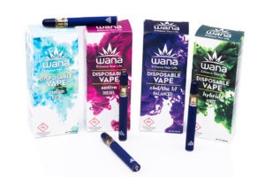
Nancy Whiteman set out to create a health-and-wellness brand with a twist. What developed was a living, breathing entity with a memorable tag line that delivers the brand’s core message: “Wana Brands: Enhance Your Life.”
“When we say, ‘Enhance Your Life,’ what we’re really saying is cannabis doesn’t have to be the center of your universe but it can be one way to augment your life,” said Whiteman, who serves as the company’s chief executive officer. “We chose ‘Enhance Your Life’ because it speaks to what we try to provide to both medical/wellness and recreational users.” The three-word slogan was effective during Colorado’s medical days, but it proved to be a genius move when the state legalized recreational use: Medicinal patients use Wana to enhance their lives through symptom management, and Wana helps adult-use consumers enhance the quality of activities they already enjoy.
From the beginning, Whiteman devoted resources to branding initiatives, many of which support dispensary partners. The company invests in extensive product testing to reassure both dispensaries and consumers its products are safe and will produce consistent effects. “We have found that once customers find a consistent product they like, they are very brand-loyal,” she said. More obvious are the point-of-sale displays, videos, and radio and digital ads that keep Wana’s name in front of consumers. Influencer programs create a sense of community. Eco-friendly packaging with shelf appeal and customized educational materials with consumption advice reinforce the brand’s holistic-health imperative—which applies equally to people and the planet. “Sustainability is one of Wana’s core [corporate social responsibility] priorities,” Whiteman said. “We led the industry by introducing a new package that cut our waste stream by 60 percent and is both recyclable and biodegradable.” The company also adopted a state park in celebration of Earth Day, and staff and their families converged on the area to clean it up. Wana’s commitment to environmental responsibility continues to generate goodwill.
The company’s profile also benefits from the Wana Athletes Program, through which the edibles maker partners with notables including endurance runner Flavie Dokken and yogi Martha Triantafillides. “Together, Wana Brands and its partner athletes work to educate the athletic community and beyond about how cannabis can enhance their experience and allow them to enjoy their passion to the fullest extent,” Whiteman said.
Everything comes back to the tagline: Enhance Your Life. It’s a seemingly little thing, but it packs a punch.
Sharing, caring, and toking
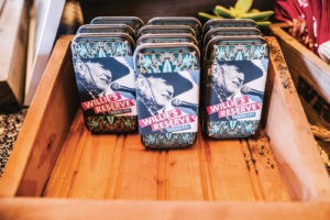
The Willie’s Reserve brand story is fueled by country music legend Willie Nelson’s decades of devotion to the cannabis community. In legal states, the brand appears in homes, rehearsal studios, backstage at concerts, and on Nelson’s tour bus—the same places where the legend of “Willie’s (not so) secret stash” grew during pre-legalization days.
The company Nelson founded keeps the legend alive. “Many of the musicians we’ve met really relate to the idea of Willie’s Reserve carrying on a tradition so woven into the fabric of American culture and music,” said Vice President of Brands Elizabeth Hogan. “It’s that same spirit our marketing teams bring everywhere they go, to create a welcoming environment, bring great people together, and make sure everyone has plenty of weed. After all, it’s always worked for Willie.”
Unlike some other celebrity-backed brands, Willie’s Reserve has not struggled to find a significant consumer base. A singular focus on authenticity reflects Nelson’s own persona, a “my stash is your stash” ethos the icon has presented since well before legalization. (A lengthy rap sheet attests to his penchant for sharing.) Now that cannabis is legal in many places, a broader swath of the American public can discover what all the fuss has been about. The brand also leverages Nelson’s outspoken support for family farms by partnering with small growers in local markets.
The company offers a range of products including flower, vapes, accessories, gear, and edibles, enabling Willie’s Reserve sales teams to work with each store to tailor the right product mix for their customers. “As budtenders know, it really comes down to offering the right option for what brought the customer into the store in the first place, and we aim to have plenty of options,” Hogan said.
In keeping with the brand’s identity, the Willie’s Reserve design team takes inspiration from Nelson’s albums and art. While there’s a lot of innovation in the cannabis world, the brand perceives a “lack of ritual.” That’s what Willie’s Reserve taps into, Hogan said: a sense of timelessness, of memories and associations that already have meaning to people.
“Willie’s Reserve pays tribute to this tradition of sharing, caring, and toking,” she said. “Now that the cannabis revolution is well underway, it should come as no surprise that Willie is one of its most enthusiastic and committed supporters. His vision guides Willie’s Reserve.”
The lap of luxury
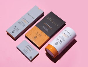
“Défoncé exists to elevate and delight, from the taste of our chocolate to the way we make it and the extra care we give to our partners,” said Southern California Regional Manager KeiLani Yanagihara. The upscale brand set about defining itself in a very deliberate way, taking cues from gourmet brands in the mainstream luxury market and attending to detail in both product and packaging. “We focus on stimulating the senses through our rich and varied taste and smell, the look and feel of our packaging and form-factor, and then the after-effect of consumption,” Yanagihara said.
The company revels in creating the kind of joy indulgence brings, celebrating chocolate as a decadent gift of the gods. Défoncé edibles are designed to be “revealed,” almost as though undressing a lover: gently open the package, visually caress the product, inhale the delicious aroma, and then linger over the taste. Each step of the experience is designed to surprise and pleasure.
The company also caters to high-end expectations, boldly promoting its ingredients as elegant and destined for those who want only the best. Défoncé sources its chocolate from gourmet suppliers TCHO and Guittard Chocolate Company, and the bars include upscale ingredients including vanilla beans, matcha, and hazelnuts. According to Yanagihara, the only essence customers won’t perceive is cannabis. “Défoncé is all about creating the finest chocolate in the world that happens to have cannabis as an ingredient,” she said.
Brand story as prologue
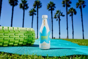
For mood33 co-foundrs Michael Christopher and Eric Schnell, infusing a beverage with a functional cannabis experience has embodied the journey of a lifetime. A lifelong asthmatic who overcame a debilitating childhood illness, Christopher’s adult dream was to develop a line of smoke-
free cannabis products he and other “regular people” like him could enjoy without risking their lives. In 2015, he met Schnell through a mutual colleague, and the dream became reality.
“I was crafting home recipes of cannabis-infused herbal tonics and kombuchas in my Brooklyn loft at the time,” Christopher said. “I was seeking advice on how to commercialize these early beverage concepts and thankfully met Eric and his team at BeyondBrands, an eco-conscious, New-York-based [consumer packaged goods] brand accelerator and development agency.”
That brand backstory grew into a simple, but powerful, mission: selling peace, happiness, and relaxation. The story and the mission resonate with a set of consumers who, in a digitally over-saturated, high-stress world accustomed to artificial satisfaction, turn to cannabis for peace, relaxation, and joy. “As more consumers see cannabis as the next-generation health- and-wellness ingredient it is, we seek for those consumers to identify mood33 as the brand that bottled the power of the plant and shared the happiness,” Christopher said.
After creating a fun, sociable corporate personality, the pair had to build an environment in which the personality could shine. Schnell’s background taught him one of the keys to winning consumers’ hearts and minds was engagement through in-person education and sampling. mood33 has hosted events in diverse environments including the hills of Malibu, yoga retreats and healing ceremonies, “mocktail” bars at book launches, “extra-happy” hours at consumption lounges, and cannabis tourism excursions in San Francisco and San Diego.
Hosting “mood bars” at underground dance parties in Oakland, California, took advantage of mood33’s signature marketing appeal: beverages infused with cannabis extracts, functional teas, herbs, fruit, and flowers, producing uncommon flavors and “moodstates.” “We opted to own the power of the word ‘mood’ and its connotation in our brand name,” Christopher said. The company’s products follow a naming convention dictated by that choice: Joy, Passion, Calm, Peace, and Energy. “Our goals were to offer consumers an easy way to select and engage with the products, and to determine the best usage occasion for each proprietary formula with a quick glance at the bottle and its label.”
And they’re always brewing something new. “We are now actually working on an [artificial-intelligence]-enabled facial recognition app that can prescribe the best mood33 product based on a consumer’s facial expression or current mood,” said Christopher.
Preserving family traditions
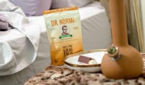
Jeff and Roberta Koz founded their company on principles they learned from their parents: a caring bedside manner, a contagious sense of humor, and treatment designed with patients, not for them. Dr. Norm’s is named for their father, an honest-to-goodness old-style physician who made house calls and treated patients as though they were family. Their mother was a pharmacist who also baked wicked-good cookies. Both passed away before the company came to be, but the offspring think the parents would be proud.
The siblings, both of whom enjoyed careers as branding and marketing professionals prior to founding the company, embarked on a mission to create a brand that telegraphs a nostalgic, apothecary impression. Ultimately, they intended to establish the kind of rapport patients enjoyed with their family doctors in the 1950s and ’60s, when compassion, comfort, and trust were the norm.
The effort may have been deliberate, but nothing about the brand’s expression is contrived. That’s important, Jeff Koz said, because a brand is nothing if consumers perceive a lack of authenticity.
“We didn’t create a character named ‘Dr. Norm,’” he said. “He was our dad. That’s his med school photo on the package. The cookie recipe really is Mom’s. Our brand communicates all of that.
“Ideally, every cannabis brand should communicate to consumers what to expect when they use the products,” he continued. “And when consumers experience what the brand communicates, that’s the home run.”
Koz said he and his sister—and a brother who’s a silent partner—take a great deal of pride in the way Dr. Norm’s authenticity resonates with a broad age demographic ranging from 21 to golden-agers in their eighties. The siblings, all in their fifties “and proud of it” according to Koz, have made a priority of maintaining the small-town-doctor, family-owned-company vibe even as the company grows.
Growth may take a sudden leap, in fact, thanks to the branding the Koz family accomplished. Four companies have approached the siblings about partnerships. “The brand and products are what attracted them,” said Jeff Koz. All four suitors offered investment with one caveat, he added: “Please don’t change what you’re doing.”
Clarifying the message
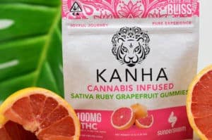
According to Cameron Clarke, a “sunderstorm” is a thunderstorm when the sun shines through the rain clouds. Clarke and Keith Cich coined the term, then realized it perfectly encapsulated the cannabis philosophy they’d developed over years of traveling in India and Asia, studying consciousness, plant medicine, and science.
They co-founded Sunderstorm, a brand built on deliberate consciousness and the harmonious blending of science and nature—with a liberal dash of Eastern mysticism. “We believe the plant can be integrated into one’s day-to-day life to relax, socialize, and heal,” said Clarke, who serves as the company’s chief executive officer. “This philosophy envelopes all our products.”
While Clarke and Cich knew who they and the brand were, the public wasn’t so sure. The corporate image, packaging, and message didn’t resonate; consumers seemed confused by the company’s several product lines that were related but had separate identities, stories, and demographics. So, Sunderstorm underwent an extensive, multifaceted rebranding early this year.
They discovered one hard fact: “Cannabis has something for everybody, but a brand can’t be all things to all people,” Clarke said.
The process was daunting but fruitful. Tinkering with the brand’s personality, expression, and voice forced Cich and Clarke to define their target markets in excruciating detail. They spent many late nights and early mornings working with the team at creative agency Madison 8, concocting ways to portray the brand’s promise through packaging, brochures, ads, billboards, videos, websites, and social media. Everything had to represent Sunderstorm’s motto: “Joyful Journey.”
The result? Four distinct voices with a unified message: “healthy, conscious, and clean.” Kanha infused gummies give off a distinctly Vedic vibe, “reminding adults to enjoy the fruits found on life’s journey.” Wind vapes manifest as both ethereal and dynamic, their packaging an homage to a force of nature. Nano sublinguals take an indisputably scientific approach, and Solara flower is eco-friendly.
“We focused our branding to deliver a message of joy and adventure,” Clarke said. “It’s all about positive vibes for us, and this flows through everything we do and offer.”


