Customers form their first impression of a dispensary before they even enter the store. Within moments of walking through the door, they have decided whether or not to shop. This means it is imperative to win their favor immediately. The best stores exude confidence and appeal in every display to gain customer loyalty and trust.
Today’s cannabis retailers are moving toward a more welcoming experience because this is what customers have come to expect at favorite non-cannabis mainstays like Starbucks, Apple, and IKEA. Customers want to see, touch, and experience products, and the more they engage with products, the more likely they are to purchase.

Lam said her team creates stunning visual merchandising solutions by following six key design principles.
Create a hierarchy within the store. Identify the most important message or product first. Then identify the second most important, and work down the list from there. This will prevent products from competing with one another when on display. Establish focal points.
Do more with less. Over-merchandising and clutter can overwhelm customers.
Choose function over style. Products should be visible and easily accessible, and displays should be easy on the eye.
Layer, layer, layer. Creating layers with signage, graphics, and products will allow brands to connect directly with customers.
Start at eye level and arm’s reach when placing products on display. Make it easy for consumers to learn, select, and purchase what attracts them.
Size matters. Consider the scale and proportion of products in relation to signs and fixtures. Balance and harmony in colors, sizes, and shapes creates a subtle, positive psychological effect.
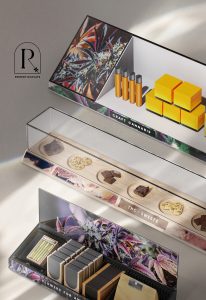
“We have designed many retail store environments for the cannabis industry that are beautiful, approachable, practical, and fun,” Lam said. “Now we are excited to be able to offer a line of visual display fixtures that can serve a broad market and help elevate cannabis-specific products in retail stores. The collection makes it easy for employees to effectively merchandise products. Our display fixtures are minimal and clean, yet fundamentally designed to engage customers in delightful ways.”

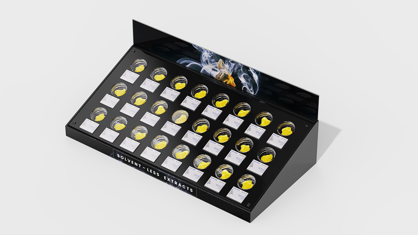
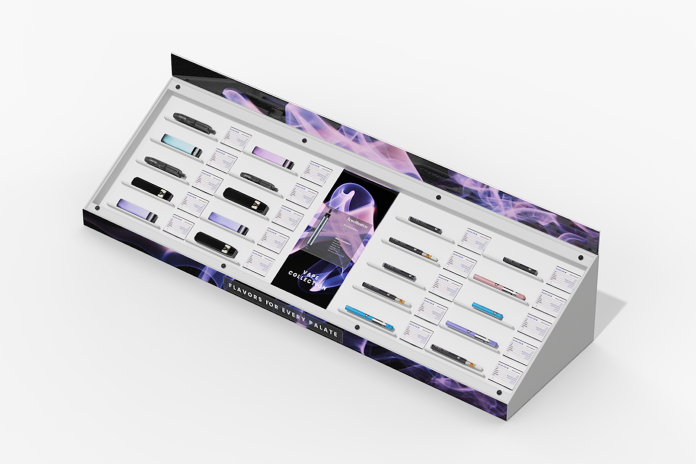
Remedy Displays has spent years studying and evaluating cannabis products and their packaging in order to make beautiful, approachable fixtures that incorporate marketing space and product-type flexibility. The fixtures consist of modular components, all with the capacity for added signage and product information, making affordable turnkey installs possible.

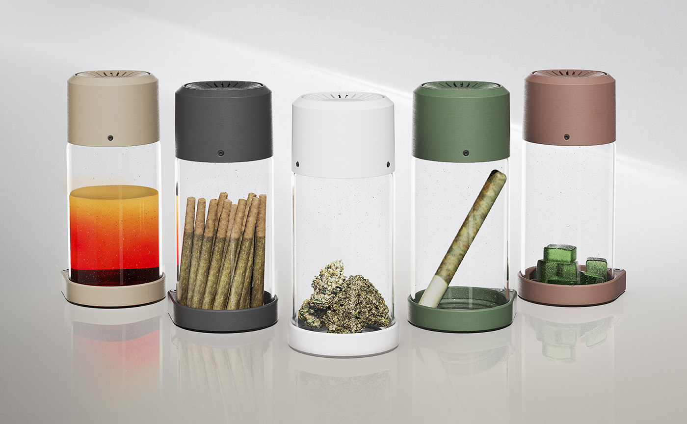
- Uninterrupted, 360-degree viewing, enabling customers to see the product from all sides.
- A lid that allows customers to smell the flower by depressing a button on the top. The lid automatically reseals itself.
- Multiple tethering points and a built-in locking lid to ensure both compliance and loss prevention.
- Sealed-lid construction that allows flower to stay fresher longer, reducing waste.
- An efficient design that consumes less real estate than traditional dishes. The jars measure two inches by four and a half inches, making the flower the star.
- Multiple accent colors to choose from and a variety of logo placement areas.
“Through our years of retail design experience specifically with cannabis stores, we’ve developed great opportunities for store owners and operators to style, merchandise, promote, and highlight their offerings with these innovative display offerings,” Lam said. “Everything we do when designing a store is focused around problem-solving for our clients. This led us to create Remedy Displays, because we noticed owners and operators struggling with how best to display their products.”
The team at Remedy Displays has the expertise and flexibility to offer visual solutions that ensure brand and product visibility and optimize use of retail spaces in the cannabis marketplace.


[…] team’s whole process was to jump straight in, the same way we’d lay out any other retail store. Product merchandising was the driver for design. Aside from aesthetics, we worked closely with the [dispensary’s] team […]