How many readers are over the age of 50? And how many are women? If you fall into these two categories, you’re in luck…this article is for you. And if you are not fortunate enough to be a middle-aged woman, don’t fret…you are about to learn something amazing.
Way, way back in ancient history, 1968 to be precise, a company called Hanes noticed a shift in the market for pantyhose. As you may recall, back then pantyhose was the rage. It was inexpensive to manufacture, and dozens of companies glutted the market with product (this sounds similar to the cannabis industry).
However, there was little brand loyalty, and a growing number of women were starting to purchase their pantyhose at grocery stores instead of department stores. It made sense: While a woman might shop for food multiple times a week, she would likely only head to a department store once every month or two. Rather than wait, women began purchasing pantyhose at the grocery store when it was most convenient.
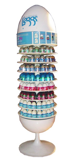
So, the brains at Hanes got together and put together a strategy that would take their department store brand and get it into grocery stores. But in order to this this, they needed new packaging, so they hired the ad agency Dancer-Fitzgerald-Sample to re-imagine the packaging that was common at the time: pantyhose stretched over a piece of cardboard and inserted into a plastic sleeve.

Within months, L’eggs was the top-selling brand in the hosiery market. It became such an icon of its time that it is now featured in the Museum of Modern Art.
And they owe virtually all of this success to the packaging.
Shopping lessons
We can learn a lot from the aisles of the supermarket. According to the FMI (Food Marketing Institute), the average supermarket in the United States holds around 40,000 different items. This enormous number of products relies heavily on packaging to create attention, grab consumer interest, and essentially complete the sale.
But what triggers consumer’s interest and makes one product’s packaging stand out against another’s?
Good designers know most people are hardwired at an instinctive level to respond to certain stimuli, which affect shoppers’ subconscious and generate emotion and action before the conscious part of the brain kicks in. These stimuli include an instant attraction to certain colors, shapes, imagery, and even fonts. Design elements all play an important part in attracting and securing people’s attention. And with more than three-quarters of purchasing decisions made at the shelf, it is vitally important to get the packaging right.
But good design is more than just the sum of its parts. Dennis Furniss, the Vice President of Design at Pepsi and formerly in the same capacity at Unilever, the giant consumer goods company, said great packaging design is somewhat ethereal.
“There’s a physical joy in buying products and picking up a bottle or a box. It’s part of who we are,” he said. “But many marketers and agencies tend to think about design as solving a problem rather than creating an addiction.”
Gaining customer loyalty, he says, not only relies on the quality of your product, but also on the packaging.

Packaging does the heavy lifting
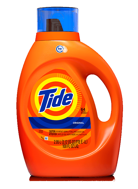
Proctor & Gamble, maker of Tide, attributes much of it success to its packaging. From large bulk-sized boxes and bottles to small packets for budget shoppers, the company uses packaging to attract and retain customers by the millions.
With limited opportunities to advertise, the cannabis industry will rely on packaging to create brand awareness, communicate key product attributes, and stimulate a connection with consumers.
The companies leading their sectors already understand this. Lowell Herb Company, for example, is the maker of Lowell Smokes—the number-one-selling pre-roll brand in California. The company’s packaging looks “natural” and conveys an authentic, old-world feel that immediately connects with customers.
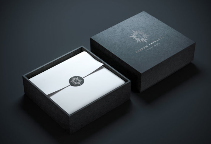
Canndescent, the top-selling brand of flower in California, also expresses its premium quality through its exceptional packaging, with tasteful boxes that hold beautiful jars that preserve and present the flower. The company also has simplified the purchasing of its products by labeling the different varieties in terms of the user experience: Calm, Cruise, Create, Connect, and Charge.
These companies, like the leaders in consumer goods, recognize the race is won by those who understand the role of packaging in creating and building a lasting brand.
The bottom line: Powerful connections are built between the customer and the container, so make sure your packaging is perfectly performing all of its many roles.


