(Sunderstorm is one of the companies featured in The Power of a Brand: Lessons From 20 Top Cannabis Companies, in the June issue of mg Magazine.)
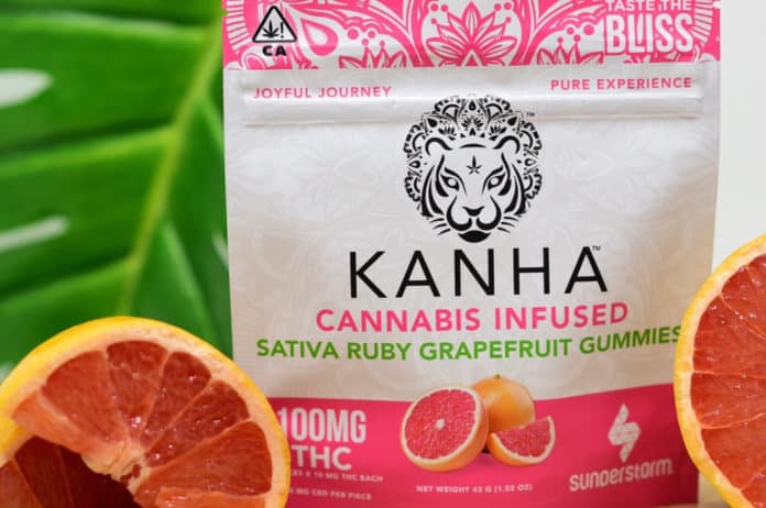
According to Cameron Clarke, a “sunderstorm” is a thunderstorm when the sun shines through the rain clouds. Clarke and Keith Cich coined the term, then realized it perfectly encapsulated the cannabis philosophy they’d developed over years of traveling in India and Asia, studying consciousness, plant medicine, and science.
They co-founded Sunderstorm, a brand built on deliberate consciousness and the harmonious blending of science and nature—with a liberal dash of Eastern mysticism. “We believe the plant can be integrated into one’s day-to-day life to relax, socialize, and heal,” said Clarke, who serves as the company’s chief executive officer. “This philosophy envelopes all our products.”
While Clarke and Cich knew who they and the brand were, the public wasn’t so sure. The corporate image, packaging, and message didn’t resonate; consumers seemed confused by the company’s several product lines that were related but had separate identities, stories, and demographics. So, Sunderstorm underwent an extensive, multifaceted rebranding early this year.
They discovered one hard fact: “Cannabis has something for everybody, but a brand can’t be all things to all people,” Clarke said.
The process was daunting but fruitful. Tinkering with the brand’s personality, expression, and voice forced Cich and Clarke to define their target markets in excruciating detail. They spent many late nights and early mornings working with the team at creative agency Madison 8, concocting ways to portray the brand’s promise through packaging, brochures, ads, billboards, videos, websites, and social media. Everything had to represent Sunderstorm’s motto: “Joyful Journey.”
The result? Four distinct voices with a unified message: “healthy, conscious, and clean.” Kanha infused gummies give off a distinctly Vedic vibe, “reminding adults to enjoy the fruits found on life’s journey.” Wind vapes manifest as both ethereal and dynamic, their packaging an homage to a force of nature. Nano sublinguals take an indisputably scientific approach, and Solara flower is eco-friendly.
“We focused our branding to deliver a message of joy and adventure,” Clarke said. “It’s all about positive vibes for us, and this flows through everything we do and offer.”


