
Packaging has been a critical component of commerce for millennia. From the earliest days of trade and barter, people have used a variety of materials to package and transport goods and effectively differentiate them from competitors.
It’s thought the practice originated in the second millennium BC, when the Egyptians used reed baskets and papyrus to package products for trade, stamping the containers with images and hieroglyphics to indicate their contents and origin.
Many cultures would advance the practical aspect of packaging in the ensuing centuries, but it wasn’t until the eighteenth century a particular creative flair was brought to packaging design. Spurred by revolutionary developments in printing technology and industrial production, suddenly product packaging featured color, illustrations, logos, and slogans that evolved into the kernels of brand recognition.
In cannabis, the evolution from purely functional packaging to form and function has been rapid, and packaging is one of the industry’s most visible signs of maturation. The rapid increase in sophistication has been a joy to observe, as packaging has become the primary vehicle for strategic product and brand positioning.
Today’s shelves increasingly are filled with polished consumer packaged goods whose ability to comply with onerous packaging requirements would make a sideshow contortionist proud. Regulations differ—often wildly—from state to state, and they almost always require a level of child-proofing that can undermine the creative vision.
Getting packaging right is vital for maintaining product quality, particularly for flower. Cannabis is a delicate plant that easily can lose its potency and flavor if exposed to light, air, or moisture. Proper packaging can help extend products’ shelf life and help them maintain optimal condition for consumption.
For this year’s branding issue, we took a look at some of our favorite examples of novel packaging from emerging brands and legacy stalwarts. We picked apart their decisions, competitors, and target audiences in a bid to help you better understand how to beckon consumers from the increasingly crowded dispensary shelves.

Dr. Norms
California
Dr. Norms has been a fixture in dispensaries since 2017, when brother-sister team Jeff Koz and Roberta Wilson founded the brand in honor of their father, Norman Koz, MD. Norm’s face famously adorned the packaging for many years, but the infused-baked-goods company recently revamped its image with a series of clearly delineated mylar bags proudly displaying the brand name that has earned the trust of cannabis consumers throughout California.
We specifically love the Salted Caramel Blondie packaging, with its mouth-watering cascade of gooey caramel goodness. Highlighting the product’s ingredients in a luxurious way is a classic, reliable technique to emphasize quality and get people standing in line at the dispensary salivating at the prospect of tearing into a bag.

Select Squeeze
Arizona, Connecticut, Florida, Massachusetts, Maine, Michigan, Missouri, Nevada, New Jersey, New York, Ohio, Utah, Vermont
Beverage is a challenging category for a variety of reasons, including the space the products take up in stores and on distributors’ trucks. Curaleaf brand Select shrank the product’s form factor by creating a beverage enhancer that can be used to “spike” a favorite drink with a quick squeeze.
The pocket-sized squeeze bottles, which bear flavor-coded color palettes, are a relatively novel concept in the industry. Aimed predominantly at cannacurious consumers looking for something precise, the bottles make the product extremely easy to dose: One squeeze yields approximately 1mg of THC. We would be happy to see other brands adopt the innovative concept.

Plaid Jacket
Washington
Recent years have seen the flower category follow Cookies’ lead toward high-octane, saccharine packaging aimed at hypebeast stoners looking for head-melting exotics. But at the other end of the scale, Washington’s Plaid Jacket appeals to more mature, discerning tokers with its austere, minimal packaging that feels far more appropriately positioned for a market associated with the great outdoors.
The natural card color with tartan design hidden inside calls to mind the timeless aesthetic of high-end fashion brand Burberry, while the brand’s deer-rabbit logo embossed atop the flower and concentrate jars is a subtle signal for quality and attention to detail.
If everyone around you is screaming for attention, there’s considerable value in exuding a quiet confidence.

Coda Signature Chocolate Bars
Colorado, Illinois, Massachusetts, Ohio
While chocolate-based edibles have lost some ground to gummies in recent years, they continue to be a preferred form factor for luxury, delicacy, and self-care.
Colorado-based Coda is among the best-known quality chocolatiers in the industry. The brand’s classy, timeless packaging designs tempting consumers toward with the clear promise of decadence and indulgence. The packages showcase the high-end ingredients in a flat-lay photo format on a black background, which plays a considerable role in differentiating the products from everything around them.
Coda has shown there’s often no need to reinvent the wheel. Merely introducing a familiar, proven aesthetic consumers immediately understand can be enough to stand out and be successful.

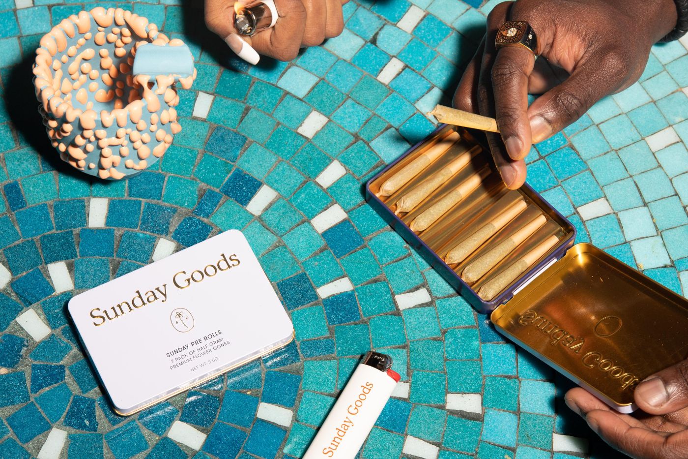
Sunday Goods
Arizona
Sunday Goods emerged in 2018 as one of the chicest members of a new class of brands. The company recognized its context within dispensaries was enough to communicate the product is cannabis, so it shunned green and pot leaves in favor of mellow blues, gold accents, and serif fonts to inject an undeniable elegance.
With its Sunday Pre-Roll line, the brand was one of the first to introduce multipack pre-roll tins. The packaging is subtle enough it could be a tin of mints, which appeals to the cannacurious consumers the brand courts. Inside the tin, a neat line of joints provides an uncommon “unboxing” experience that encourages consumers to slow down, kick back, and partake without worry.

Kurvana
California
Kurvana is another stalwart of the California cannabis industry and a brand that has been out in front with its elevated packaging and positioning as the vape of choice for the discerning stoner.
The packaging for its disposable vape is a visual treat, designed to stand upright on the shelf, command attention, and project an unmistakable quality when held in the hand. A fabric drawcord sits under the vape inside the package to help consumers release their new purchase, a nice touch that reinforces the idea this is a top-shelf product.

Sackville & Co.
Nationwide
A veritable surge in unique, high-quality smoking accessories aimed at those who take their hobby seriously and want to showcase their gear proudly ascended alongside the legal boom. New York City-based Sackville & Co. is one of the outright leaders at the chic-boutique end of the accessory industry, offering stunning grinders, pipes, papers, and lighters to fashion- and design-conscious tokers.
The minimal packaging is emblazoned with the brand’s handwritten and typeset logo and often features an illustration of the product on the side. This meticulous attention to presentation is part of what allows the products to command a high price and infiltrate retailers that once avoided cannabis accessories.

Rose
THC in California; CBD nationwide
Rose Delights is a singular brand in the industry at the moment. Retailing at around twice the price of other edibles, these products sit at the very top of the top shelf thanks to their quality ingredients, attention to detail, and A+ branding.
The brand’s packaging and overall presentation are reminiscent of fine Turkish delights, with a protective flap unveiling rows of sugar-dusted treats. Despite being small in size and relatively minimal, Rose Delights always stand out as little delicacies intended only for those with refined tastes.

Uncle Arnie’s
California
In the past couple years, beverages mostly have followed Cann’s lead in appealing to the cannacurious looking for a safe, low-dose alcohol alternative. Not Uncle Arnie’s. The brand has been surging up the rankings in California with its fun, high-dose iced teas. The bottles’ tie-dyed, psychedelic aesthetic has proved a winner in refrigerators that increasingly seem filled with pastel cans. Uncle Arnie’s is all about tasting great and getting twisted—and the notion resonates with higher-dose (and higher-dollar) consumers.
Carefree Uncle Arnie smiles and winks on every bottle, daring consumers to take a sip. The lesson here: When everyone else goes one way, swerve in the other direction and stand out.

El Blunto
Arizona, California, Michigan, Nevada
Despite being one of the most popular consumption mediums, particularly among high-dollar customers, blunts are relatively few and far between in dispensaries. El Blunto seized the opportunity, borrowing from the classy, gold-trimmed world of cigars. The strategy of collaborating with premium flower producers to launch lines of glass-tipped blunts has been a winner, and the blunts’ gold-crest-on-glass tube design immediately makes them look more appealing than the average pre-roll.
Given the comparatively high bar for quality expected from a blunt, El Blunto uses familiar tropes to speak to its target market and command a higher price.

Miss Grass
California, Illinois, Massachusetts, Nevada, New Jersey
Groundbreaking brand Miss Grass began as a community of women who smoke and blossomed into a popular line of beautifully conceived products. A recent design refresh saw the brand strip elements down to an en vogue typeface and stark block colors like orange and blue to indicate different effects.
The flower jars are especially noteworthy for using the color key while giving consumers a view of the product inside. Flower connoisseurs appreciate the novel approach, and packaging experts approve of the imaginative aesthetic.

Sherbinskis
California
Legendary California-based cultivator Mario Guzman is the creator of the hugely popular Gelato and Sunset Sherbert strains, and his brand, Sherbinskis, is a longstanding leader in genetics and streetwear-adjacent branding.
The simple tangerine aesthetic is immediately recognizable by any seasoned California consumer, but we particularly love the packaging on the company’s line of vapes, which stand out proudly with their vivid pastel-rainbow palette. The hard drop shadow on the strain names calls to mind the style of sign painters for chic French bistros, helping the brand communicate a timelessness and sense of refined quality that live up to the reputation of its products.

Good Tide gummies
California, Colorado, Oregon
Wyld’s gummies are a category leader in the company’s markets, immediately recognizable by their eye-catching geodesic packaging. The latest sub-brand, Good Tide, sees the company introduce a line of edibles that are distinctly less serious than the gummies, leaning more into the recreational coastal-lifestyle vibe.
Housed in a tall, cylindrical cardboard tube, Good Tide urges consumers to pop a gummy and get out into the world to do things. That is communicated in both the form and function of the packaging, which is designed to slide in and out of a pocket easily.

Jeeter
California, Arizona, Michigan
Jeeter’s highly visual, sugary aesthetic overtly communicates how juicy and flavorful the pre-rolls will be. The brand’s gold-capped glass tubes immediately draw the eye to its products among the sea of pre-rolls. Consumers love the flavors, and Jeeter has rightly positioned flavors—not strains—as the key differentiator between their products and others.
The brand also has released a series of sports-themed signature boxes for specific campaigns, including a collaboration with Highsman founder and former National Football League running back Ricky Williams and a soccer-ball-shaped container for the World Cup.

Jetty
California, New York
The latest packaging refresh from ten-year-old Jetty wraps the brand’s cylindrical cardboard tubes with whimsically illustrated paper inspired by strain names like Maui Wowie, Northern Lights, Blue Dream, and Alien OG. At the top of each package, an iceberg bobs in water—a reference to the company’s ice-water extraction method, which differentiates its products from many of its competitors and makes for a neat visual motif.
Jetty owns its own print shop and designs and prints most packaging in-house using sustainable papers and upcycled wood tips instead of plastic. The company uses its packaging as very visible proof of its commitment to preserving natural resources.

1906
Arizona, Colorado, Illinois, Massachusetts, Michigan, Missouri, New Jersey, Oklahoma, Pennsylvania
1906’s elegant cylindrical tins verge on iconic, using pastel colors and effect-based nomenclature to differentiate the brand from its competitors and, internally, the SKUs from one another. Designed to stand upright but branded clearly enough to be legible with vertical text, the packaging is carefully considered for visibility and clarity.
As a brand, 1906 targets consumers who are looking to microdose cannabis functionally and discreetly, and the packaging delivers on that goal in spades.

Ray’s Infused Lemonade
Washington
The beverage refrigerator is home to some of the most interesting brands in the industry today, with most (but not all) opting for cans or bottles. Washington’s Ray’s Infused Lemonade employs an eye-catching bottle design that looks more like a sauce or dressing container. The label has a folksy, farmers’ market aesthetic to it, suggesting craft, small-batch, and quality ingredients. Adorned with bright, vibrant fruit illustrations, the bottles and six packs virtually beg to be plucked out of the fridge, while the cap sheath implores customers to shake before use.

Island
California
California-based Island, one of the original pre-roll brands, also has gone the tin route for its pre-rolls. After seeing a huge consumer group cresting over the horizon—flower smokers who can’t roll—the company began manufacturing singles and multipacks to meet the grab-and-go flower consumer.
We love the brand’s debossed baby-blue tins cradling mini pre-rolls. Minimal, confident, and exuding quality in a carefree, laidback way, the tins also provide ample real estate not only for compliance with labeling regulations, but also to flex the brand and discuss the brand story on the back.


