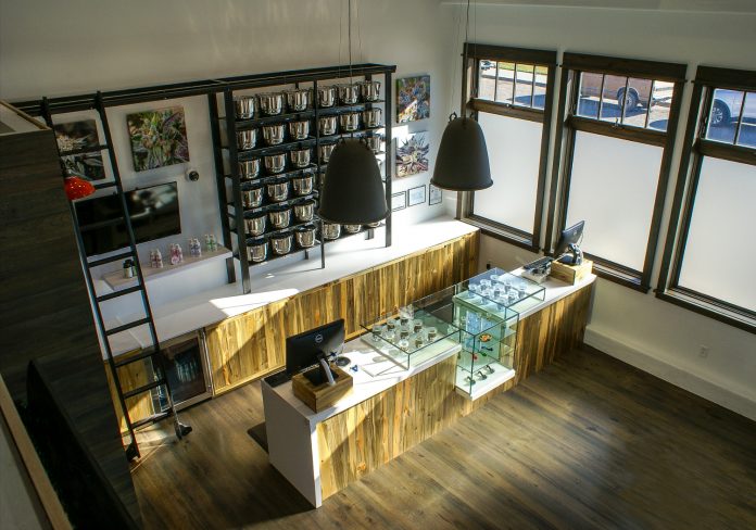
Welcome to The School of Stone. Megan Stone, that is. I have partnered with mg Magazine to share my insights and lessons learned so you can plan for the design of your future dispensary or maybe the rebrand and renovation of an existing space. You’re about to get a crash course on what I endearingly refer to as “the art of #dopedesign.” This is what I do on a daily basis, and what I have lived and breathed for the past five years as founder of The High Road Design Studio.
Since we already talked about the importance of a brand for your business, let’s build upon that and discuss the key moments in the journey of your cannabis customer. In future columns, we will dig deeper into this journey and share specifics about the successful design of these customer touchpoints within your store.
What is the customer journey? It is the sum of every moment of interaction a customer has with your brand, inside and outside your physical location. Each touchpoint presents an opportunity to connect with customers, engage them, and make them loyal members of your brand tribe. Your ability to build this tribe of loyal customers is key to the success of your business.
Here are the key touchpoints we focus on when designing your dispensary.
The Customer Journey
Touchpoint 1: search and find

This initial search-and-find often marks the first touchpoint with your brand. What do potential customers see on your website? What does your collateral look like? What are other people saying about your dispensary? This is why a brand strategy is so important, as the impression established during this search-and-find stage sets expectations for the experience one will have at every other touchpoint that follows.
Touchpoint 2: location and curb appeal
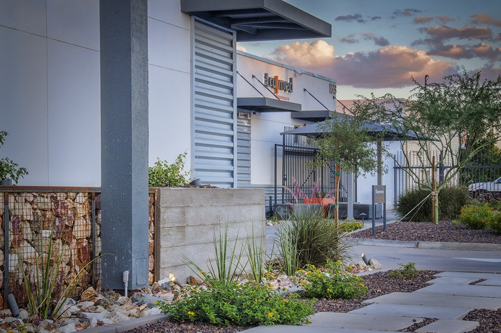
Where you are located, how easy you are to find, and what your dispensary looks like from the street set the stage for the experience. From parking and landscaping to the façade design, how is your brand reinforced from the street? How does it speak to your customers and your greater community? This includes everything from the appearance of your security guard and ease of accessibility through stairways, walkways, and elevators to the look of the storefront and how the door handle feels. I’d argue location-and-curb-appeal is one of the most important brand touchpoints for your entire business, and possibly for our entire industry. Why? Because it is the only touchpoint that some of the most important consumers may ever experience: the consumers who have yet to step foot in a dispensary. Impressions of the entire industry can be based on how a single dispensary presents itself on the outside.
Touchpoint 3: decompression zone
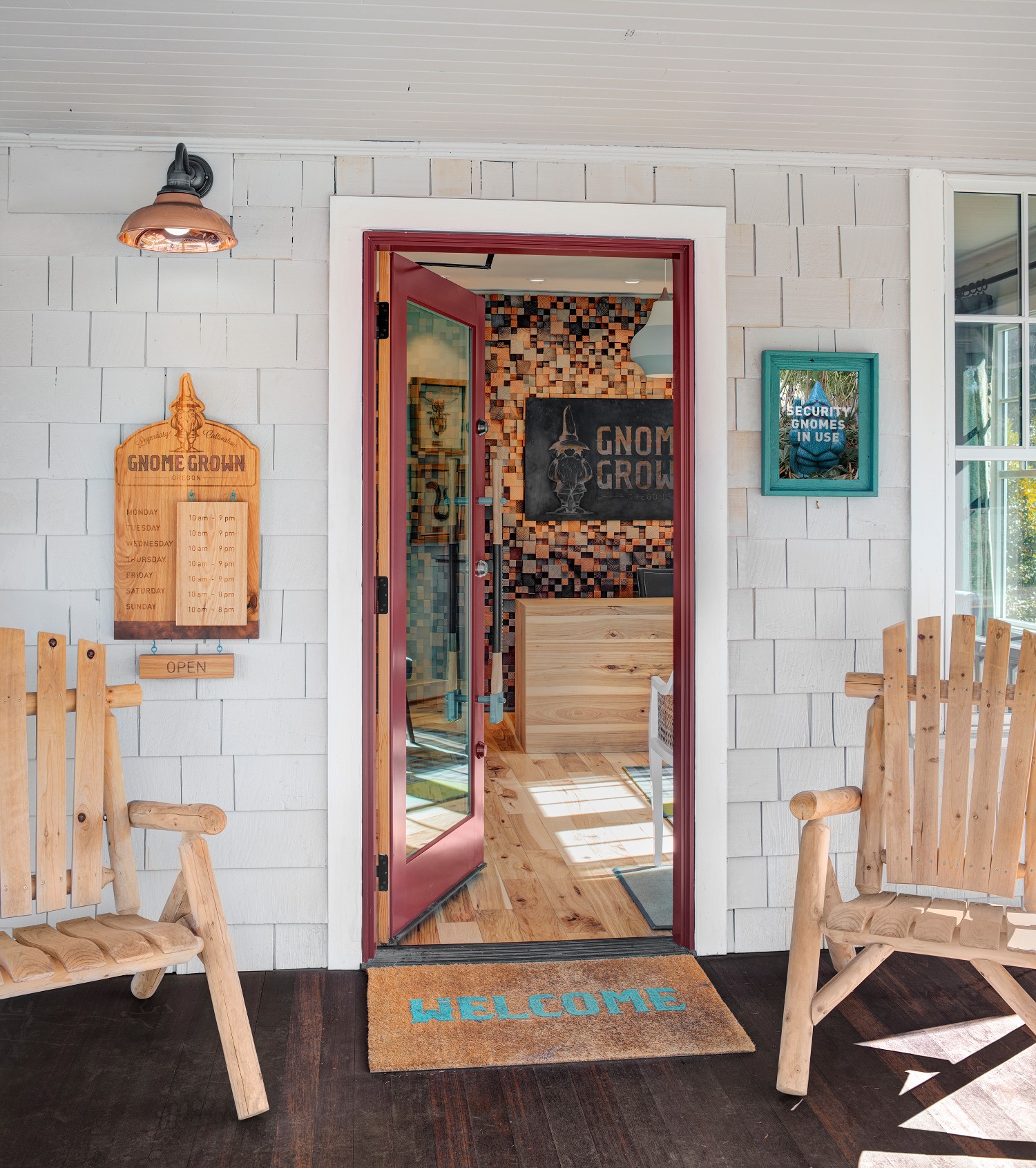
Once inside the front door, people need time and space to acclimate to the interior. This is true for any retailer, not just dispensaries. It’s called the decompression zone, and it comprises the first few feet inside a retail store.
In its most basic sense, the decompression zone is the space and time customers use to adjust from being outside to being inside. This means adjusting to noise, lights, activity, energy, and smells. It’s the step of taking off sunglasses, fixing windblown hair, and figuring out where to go next. In dispensaries, it is also where many first-time patients and customers experience feelings of being unfamiliar, uninformed, and uncomfortable. Thinking about this entry sequence and the psychology of the folks who are passing through it will help you create the right mood for customers.
Touchpoint 4: lobby and check-in
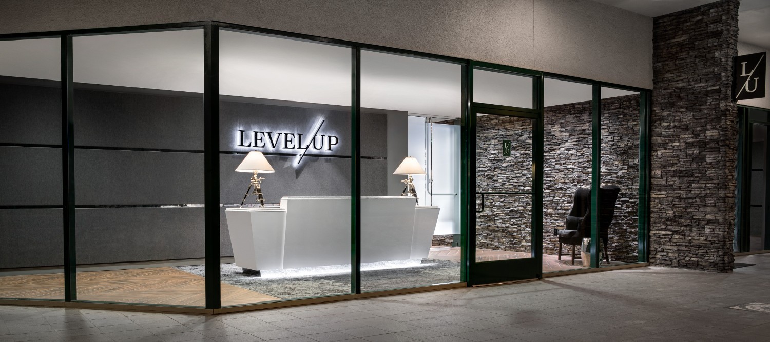
Once customers are inside and through the decompression zone, they look for ways to orient themselves and receive directions for what to do next. The receptionist, lobby design, and check-in process are all part of this experience. This is also potentially an area where they will spend some time waiting, and waiting time is one of the most important factors influencing customer satisfaction. There are many aspects to the design of decompression zones that can influence the sense of waiting. The goal is to use design to make people feel content and provide engaging distractions that eliminate the anxiety of waiting.
Touchpoint 5: private consultation
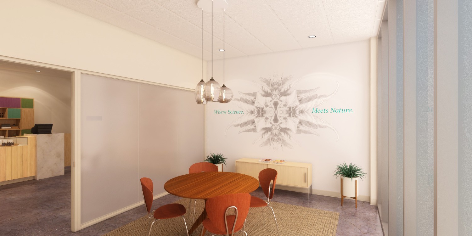
Areas where customers meet with staff one-on-one to discuss personal needs and health concerns offer opportunities for deeper engagement. Privacy and comfort are imperative for these interactions. This is where the brand comes to life in a well-designed space and is reinforced by personal interactions. Training and the ability of personnel to live and breathe the brand are as important as the setting itself.
Touchpoint 6: showroom
Space planning, branding, visual merchandising, and well-trained staff come together to impact the retail experience in the showroom. Is it easy for customers to navigate the space and find the product categories they seek? Are displays enticing? Are product information and pricing well marked and easy to read? Are there opportunities to educate or entertain customers? Is staff attentive and helpful? The height of the excitement and heart of the experience is in this moment. Make the most of it.
Touchpoint 7: point of sale
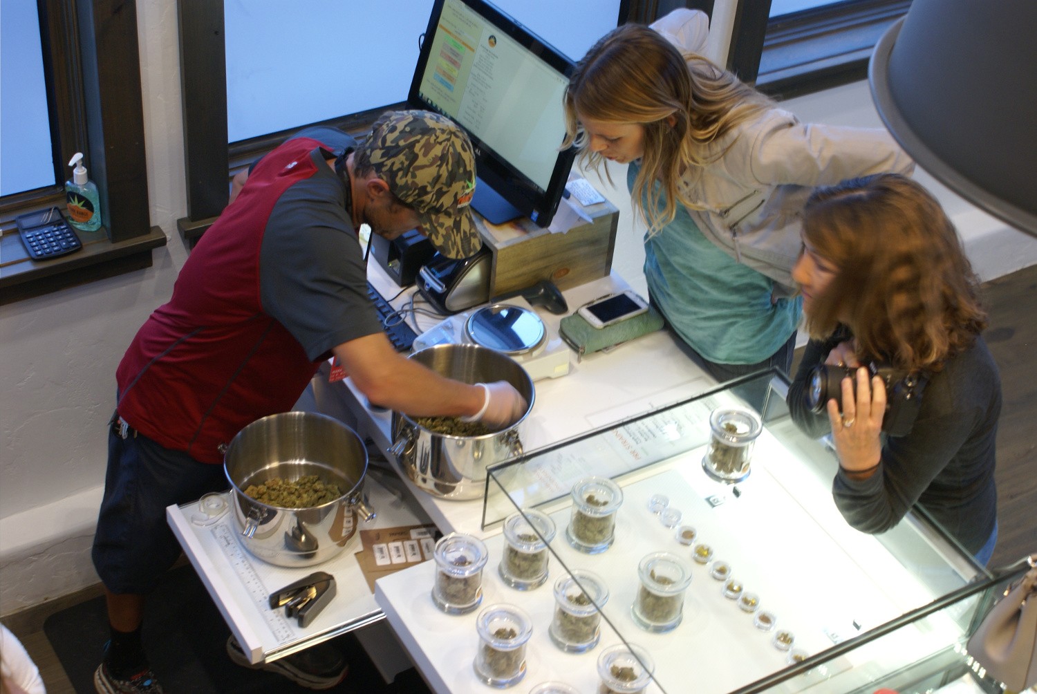
The pinnacle of retail is the place where the money changes hands. I mean, this is what retail is all about, right? From a well-positioned brand moment to the tactile impression of countertops to the sense of privacy (or lack thereof), your customers are bombarded with conscious and subconscious messages during every second of this phase of their journey. When at the register, is there adequate space to set things down and access payment without feeling anxious and crowded?
Just like in the lobby, waiting times at the point of sale can make or break an experience. Customers’ sense of time distorts after 90 seconds in line, so be thoughtful with how your showroom’s design helps them enjoy the time spent waiting towards the tail end of their shopping experience.
Touchpoint 8: order fulfillment
Whether visible to the customer or happening in back-of-house spaces, the efficiency of the process goes hand-in-hand with the point-of-sale experience. When the merchandise is handed over, how is it presented? Do customers leave knowing they have everything they paid for? Do you convey a tone of appreciation? Do you offer them a bottle of water for their ride home? The final packaging and interpersonal exchange will leave a lasting impression.
Touchpoint 9: forgotten spaces
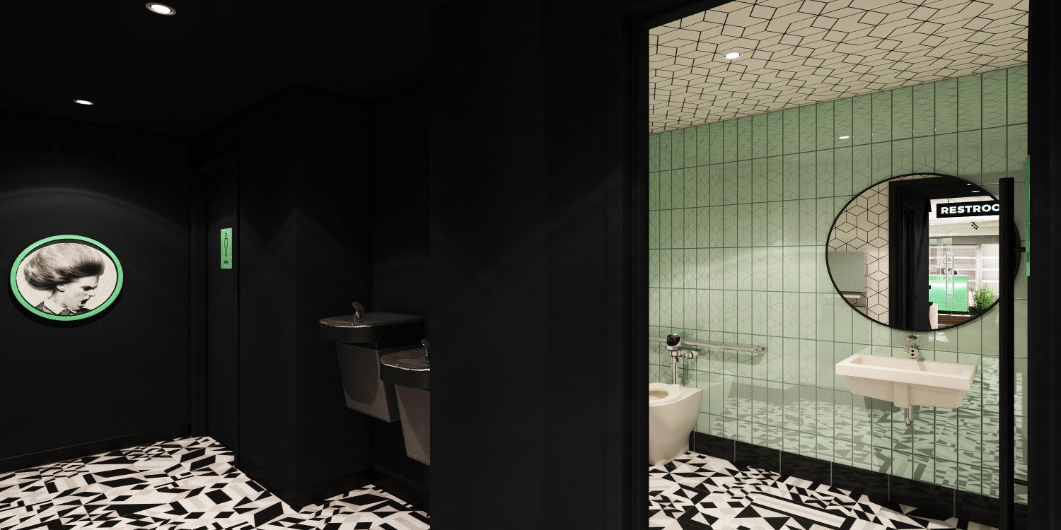
As customers journey through your retail environment, there are spaces with which they may rarely or never come in contact. We refer to those as “forgotten spaces.” We call them forgotten because sometimes people try to save a little money by skimping on these out-of-sight and out-of-mind areas, such as the restrooms and back-of-house spaces.
Never underestimate the impact of a clean, well-designed restroom—especially for your female customers. An unkempt restroom can conjure all kinds of negative feelings about your brand and leave customers feeling disgusted. If it is given the proper attention, it will either go unnoticed (in a good way) or leave a positive memory. The design of the back-of-house spaces is important for efficient operations, as well as employee satisfaction, and will most definitely be felt by your customers in the front-of-house. Happy employees are great brand ambassadors.
Touchpoint 10: exiting
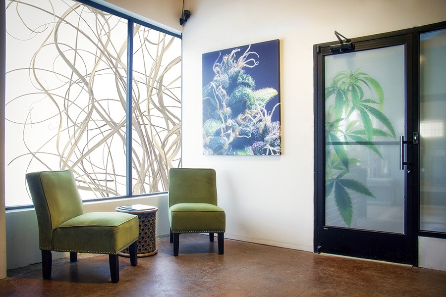
With bag in hand, now what? The store plan should guide customers intuitively out of the store feeling that shopping high with a touch of anticipation for their next visit. They also should be able to reorient themselves easily to the outside, where they are, and how they return to their car. Safety is a key thing to think about in this last leg of your customers’ journey. They’ve likely let their guard down considerably by now, so be sure they have a safe path of travel as they happily leave your store with a bag full of you-know-what.
We did it! We completed the retail store journey! Keep in mind the customer journey will continue as each person returns home, uses the products, shares satisfaction, and decides whether to come back for another experience.
You can see how branding and design play a powerful role in the success of your cannabis dispensary. There is a lot more that can be said about enhancing the experience at each touchpoint, so I look forward to exploring many of these in greater detail with you.

All images courtesy of The High Road Design Studio.


