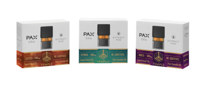
Temple Extracts’ rebranding efforts produced new designs and packaging that more accurately communicate the company’s core values of quality and sanctuary.
Companies with a reputation for excellence know effective design and packaging are essential components of any growth strategy, especially in competitive markets. The process comprises continual perfecting. In that spirit, Temple Extracts believes its new packaging breathes new life into a company that has a well-earned reputation for oil that:
- Is always strain-specific, supercritical-CO2-extracted cannabis oil.
- Is derived from the highest grade,top-shelf source material, ecologically farmed and pesticide-free.
- Contains no additives, ever: no PEG (polyethylene glycol), PPG (polypropylene glycol), coconut oil, vegetable glycerin, or food-grade terpenes.
“We didn’t feel our old packaging reflected the quality of our brand or our values, so we went back to the root of design and found some Italian graphic artists, directed by a U.S.-based design firm,” explained Temple Extracts co-founder Michael Bardin. “They took us through a research process to explore our values as a team and as a brand and helped us materialize them on all our new branded communications, from the Temple logo to the packaging.”
“The beauty and light in these images conveys the quality of our product.” -Co-founder David St Clair
The voyage of self-discovery paid off. “The process of designing the new packaging helped us better understand our values … while designing it,” Bardin said. “The challenge was that there was a small space and we had a lot to say—forcing us to come up with the essentials we wanted to convey. The two key brand values that emerged were first, the quality of our oil. The second, as reflected in our name, is the Temple, or sanctuary, that can be found in nature.”

“Another piece of this is the sustainability aspect of our brand,” he added. “It was very important to find the right printer able to use the most sustainable methods available.”


