Dispensaries could interpret a “travel” theme in a number of different ways. A psychedelic celebration of trippiness could be fun. A jumble of hot air balloons and electric railroad tracks seems literal enough. But these ideas don’t convey the glorious potential of new places, nor that delicious spark of a new adventure. Travel isn’t exactly tourism. At its best, travel is a journey; an experience.
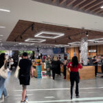
New York City’s Union Square Travel Agency (USQTA) interprets the anticipation with a sweep of softened edges, indirect lighting, and a white-on-white palette that encourages exploration. The design evokes the majesty of flying in an age before security measures leeched airports of their magic. Bits of humor pop up in unexpected places.

Information hubs modeled after airport self-check-in kiosks are clustered in the middle of the space, and vitrines filled with products, resembling the windows of an airplane, line one wall. The small terpene room feels like an airline lounge, and slow washes of color behind the cashier counter suggest a changing sky. That element is inspired by artist James Turrell’s mesmerizing rooftop sky boxes.
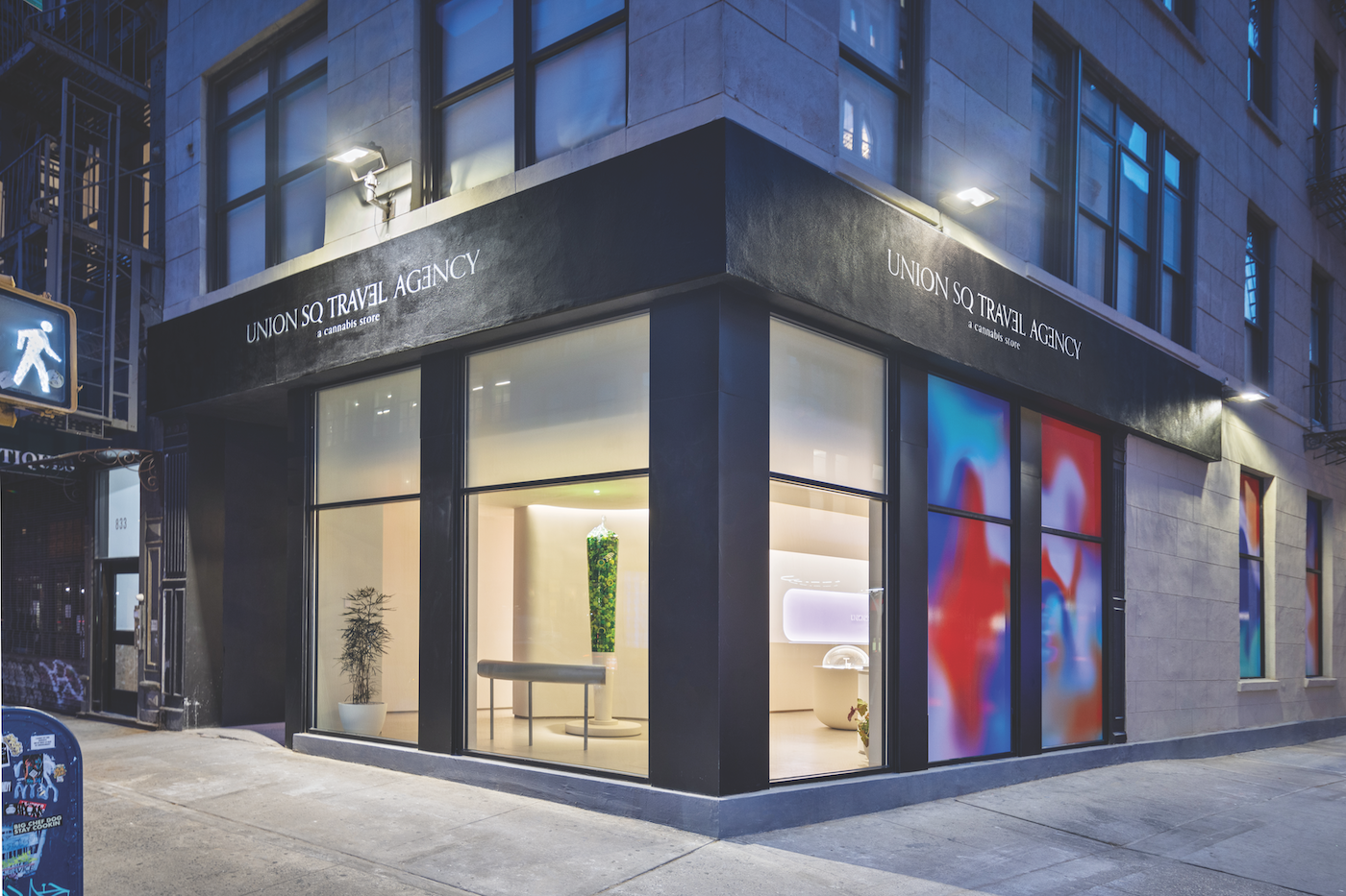
USQTA unapologetically invites comparisons to Eero Saarinen’s 1962 masterwork, the TWA terminal at JFK Airport. Architecture firm Leong Leong adapted that landmark’s graceful white curves and vaulted ceiling to create a clean design that relies on the merchandise for pops of color.
“I was thinking about the geometry and the way light bounces around the really amazing space in the TWA Flight Center,” said Christopher Leong, founding partner at Leong Leong. “It was a kind of moment of mid-century modernism when architecture could be very optimistic.”

The positive environment, with its suggestion of soaring, girds USQTA’s relationship with its not-for-profit partner the Doe Fund, which receives more than half of the dispensary’s proceeds. The thirty-eight-year-old organization has provided housing, training, and jobs to more than 30,000 people, including men returning from incarceration. A majority of participants are people of color, often with cannabis-related convictions.
Doe Fund workers in blue coveralls are a common sight in many of New York City’s commercial corridors, where they keep streets clean and provide other sanitation services. One cheerful “man in blue” who works around the corner from the dispensary said he is looking forward to seeing the shop but, for the moment, is prohibited from entering by the organization’s rules.
USQTA was the third legal dispensary in the state, opening a pop-up shop in February 2023 and the permanent store in August. The “travel” concept was developed in less than two weeks with Fortnite Collective, a loosely affiliated network of branding, advertising, and other professionals assembled for each project.

Located on a bustling corner of Broadway just south of one of Manhattan’s busiest subway hubs, the dispensary is fronted by seven large windows any traditional retailer would envy. Because the state prohibits visible cannabis merchandise, not to mention large signs or brand names, the windows are covered with a light-buffering scrim.
Customers enter through a sparsely decorated circular anteroom, which feels flooded with sunlight instead of saturated with advertising. The dispensary moves people into the store as smoothly as possible, which is why employees quickly scan IDs but don’t collect personal information. As they pass onto the sales floor, observant shoppers see a small stenciled sign urging them to turn loose their imagination: “To go anywhere, come inside.”
Leong’s firm has designed spaces with rounded edges and decorative circles for clients ranging from a Philip Lim boutique and Sweetgreen restaurants to apartment buildings in California and Myanmar. The apartment projects and a critically acclaimed parking garage in central Miami are strikingly rounded.
“The curve is about softness,” said Leong. “I think sometimes it feels a little more welcoming.”

The creative team approached the somewhat awkward 2,100-square-foot USQTA space by emphasizing its length. White Corian display cases are clustered in the center of the room to allow shoppers to browse along either side. The locked counters, which display most of the store’s 320 SKUs, are circular or oval-shaped and topped with thick, transparent bubbles. Illuminated from above and within, even a fan of pre-rolls looks delicious. Information cards for each product are printed in an elegant script that just as easily could invite one to a dinner party as list terpenes and other data.
One dispensary manager expected to wipe off the cases throughout the day but said very few people touch the displays—possibly out of reverence for an aesthetic that is at once elegant and utilitarian.

The longest case showcases edibles, which are displayed in unhurried stacks and mounds that emphasize their shapes and vibrant colors. “The edibles are so sculptural to start with, and then we have this internal illumination,” said Leong, who is particularly proud of the way the display turned out. “I like that it’s very minimal, like a beautiful candy display.”
Other vitrines are sunk into the wall to display sleek accessories without jutting into the space. Even the milky white ATM recedes.
On the opposite side of the store, cashiers stand behind an unadorned counter that runs the length of the selling floor. “It’s a long space, but in terms of visual merchandising, in helping customers, it gives us a lot of touchpoints,” said Jesse Tolz, vice president of marketing for the dispensary.
“The vibe is a surreal sanctuary,” Leong said.
It’s also kind of feminine.
“That’s not an accident,” said USQTA President Arana Hankin-Biggers, who noted women older than forty-nine are the fastest-growing demographic among cannabis consumers. “It was very important to us that we didn’t have a space that was elitist or exclusionary. We want our guests to feel community and comfort no matter where they’re coming from or who they are.”
Tolz said the dispensary’s footprint facilitates customers’ interaction with budtenders and each other. For example, the kiosks are grouped in circles of four, which supports the flow of traffic as well as the exchange of opinions and information. “We see customers talking to each other, and that becomes a one-plus-one-equals-three conversation,” Tolz said.
After placing an order, customers join a line—curved, of course—to pay for and pick up their purchases. The cashstand counter extends beyond customers’ view into a secure back-of-house area lined with tall shelves housing merchandise from sixty brands. Staff members package purchases into baskets, which they pass to the cashiers.
“The counter has a direct connection to the back, so once you place your order, there’s an easy flow to get the product to the checkout,” said Tolz. “There was a lot of thinking about how you work as a store to create this kind of experience.”

At the very back of the dispensary is the “flower lounge,” a small cove devoted to demystifying terpenes. It’s a relatively quiet space that continues the theme by resembling an airport lounge. Small, rounded windows highlight seven terpenes and their effects—an effort to peel consumers away from the highest-THC product they can find and escort them into the world of targeted outcomes and the entourage effect.
“So how do you just distill the concepts?” said Tolz. “How do you turn each [compound] into a paragraph that is understandable and accessible [but] doesn’t undermine the complexity of [the plant]? We are affording the customer a way to navigate cannabis compounds through the lens of the experience they want to achieve.”
This is really another way of encouraging customers to take a journey designed just for them, whether they travel to the ends of the Earth or deep within themselves.
“I think what is interesting about travel is the exploration,” said Leong. “It’s about curiosity.”