It’s another day at the office, and I’m staring at a request-for-proposal that states the brand’s goal is “to empower soccer moms.” My skin crawls. Why do I need to feel “empowered” in order to purchase weed, and who is this mysterious “soccer mom?” Even though the number of stay-at-home mothers is rising, they still represent only 29 percent of women with children younger than 18. That leaves 71 percent of mothers out of the potential market. Last I checked, a diverse pool of women consumers make up the balance, including working moms, fur-baby moms, grandmothers, and yes, even women without children. (Gasp!)
All female cannabis consumers benefit from weed in one way or another, so why limit your product to one quarter of its sales potential? Go beyond designing for the soccer mom by defining your true audience and understanding ways in which you can reach them.
What types of women purchase cannabis?
Before you begin the design process for your female-centric brand, the first thing you need to assess is what type of women purchase cannabis. Shockingly enough, we don’t need to feel “empowered” to purchase weed—we already do. The Cannabis Consumers Coalition released a report showing 53 percent of women consume cannabis, versus 42 percent of men.
So, who are these women? A new whitepaper by Canna Ventures shows females are one of the fastest-growing demographics when it comes to weed acceptance, with the majority of female supporters living in rural or suburban areas. Combining geography with the largest age cohort—21 to 45—provides a pretty clear picture of who smokes pot. Now, instead of “soccer mom,” the framework becomes less stereotypical: “I would like my brand to target suburban women ages 35 to 45.”
However, brands want to carve out a niche and become category leaders, so analysis must go beyond age and demographics. Dig in and discover what your target market likes. What do they do all day? Where do they shop? Do they commute, exercise (and I’m not talking about just yoga), travel, attend church, have ailing parents? Before beginning the design process, personify your brand. Give your ideal consumer a name, give her hobbies, give her a story, give her a favorite strain. Personifying your brand lends authenticity to your product and prevents superficial design decisions.
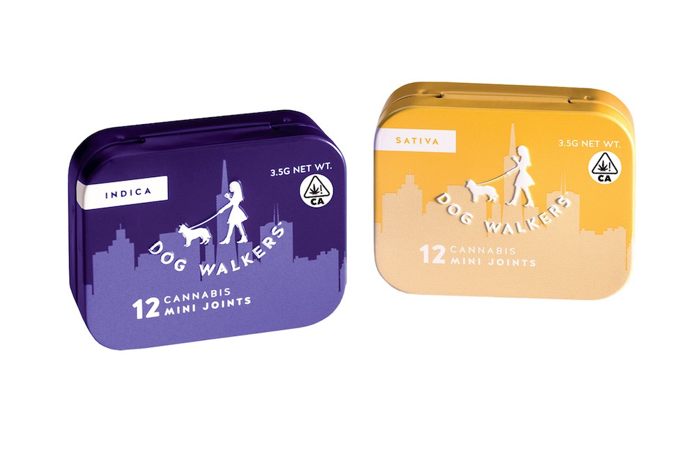
We started by featuring a normal woman in the logo. Women in cannabis branding and advertising routinely are shown as voluptuous and scantily clad and are objectified to sell product. We wanted to break this stigma, so instead we featured a woman of proportional stature smoking a pre-roll and walking her dog. We call her Carolyn. Through personification, Carolyn became an approachable person to whom other women can relate. She normalizes cannabis smoking, so women don’t feel uncomfortable buying the product. The combination of sans-serif font and neutral colors helps keep the design from looking gender-specific so as not to alienate other potential customers.
Why do women use cannabis?
Another component of brand personification is understanding why someone would use the products. A recent BDS Analytics survey conducted in four states where cannabis is legal found 37 percent of women consumers feel “consuming marijuana gives me a sense of personal control over my health.” The survey also discovered 49 percent of women cannabis users feel “marijuana is medicine for me,” indicating a nearly half-and-half split between medicinal use and recreational use. Also, according to the survey, menstruation, menopause, and sex are listed as the top reasons for female cannabis self-care.
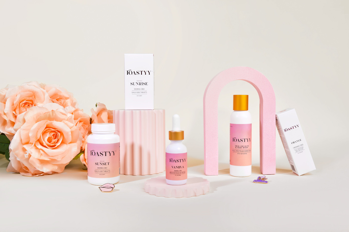
Given so many women are attracted to cannabis as medicine, it’s important a brand’s design communicates medicinal legitimacy. Don’t make packaging pink and splatter flowers all over it so it looks like a teenager’s tampon box. If your product proposition is about healing, quality, consistency, and effectiveness, then the design should be elegant in its approach.
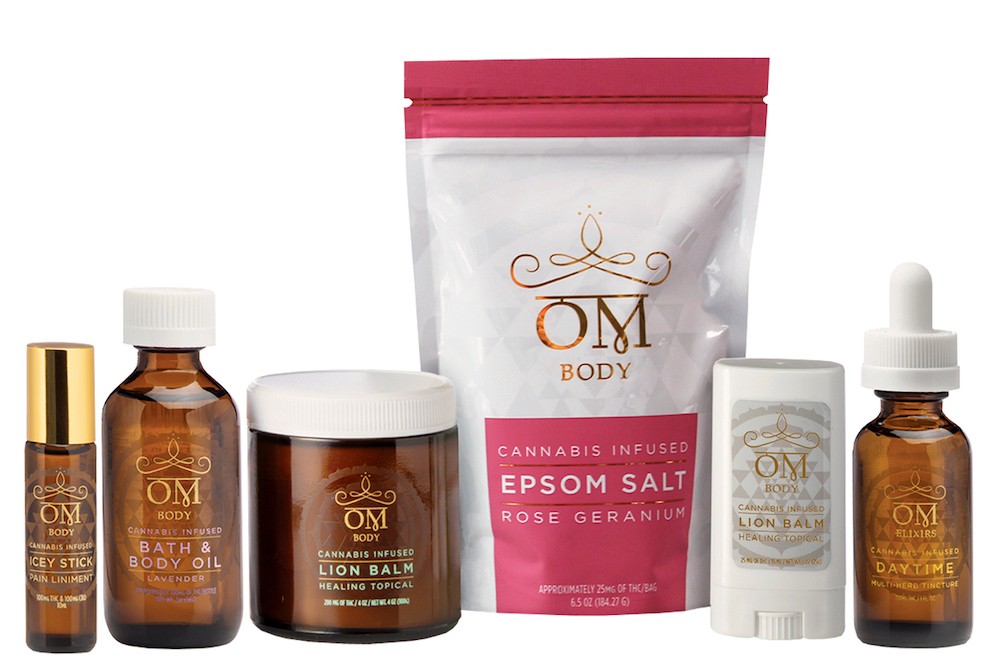
We went with all-white packaging, as the color white signifies cleanliness, sterility, and peace. White is also a color used often in cosmeceuticals, so it’s familiar to the female consumer. Our addition of gold elevates the offering so the consumer feels she’s getting something special. The crown over the gold logo incorporates an infinity symbol, representing timelessness of the Om brand. Beyond basic brand elements, we used a spot gloss Sri Yantra pattern in the background to add further visual appeal. The result is timeless medicinal packaging that communicates quality and subtly appeals to all women.
Consider form and function
So, now you know who’s buying your products and why, but have you considered how a woman incorporates your product into her daily life? Does she smoke it or eat it? Does she consume at night or during the day? Does she hide it from her kids or her friends?
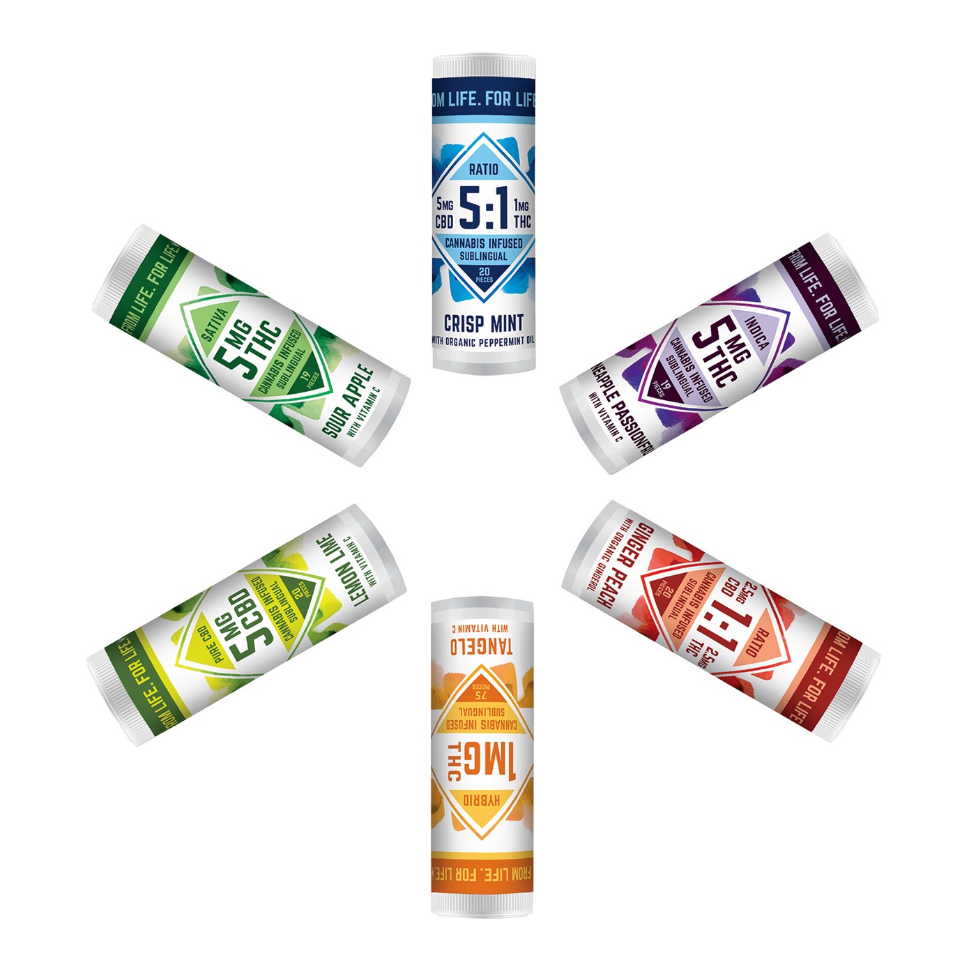
Van der Pop recently conducted a survey to better understand the motivation of female cannabis consumers and found 70 percent of women believe cannabis consumption carries a stigma; 66 percent hide their use for fear of being judged. From a packaging perspective, this means discretion is critical. Think about putting your product in a small, sleek package that can slip into a woman’s purse.
Women also tend to have smaller hands and features, so when you are researching hardware, look for items that would fit nicely into a woman’s palm.
Validate your design
Once you clearly identify your female consumer and invest time and money in design and product development, the final piece of the puzzle is to validate the design. Don’t throw money into sales and distribution before validation and then wonder why you don’t attain shelf velocity. You need to ask a woman why and if she would choose your brand over the competition. This is called market research.
One of my favorite ways to conduct market research is through Survey Monkey. You can upload your imagery along with the competition’s imagery, customize survey questions, and then choose the age, gender, and even geographic location of survey participants. If you can’t afford Survey Monkey, you can create your own informal survey and email it to connections on LinkedIn, your sister, your aunt, your grandma, and any other women you know. Receiving direct feedback from your target consumer is worth the cost and will help improve brand performance.
One more thing
There is no doubt women are starting to play a key role in cannabis consumption, considering the gaining popularity of weed and the growth of women’s portion of cannabis consumer spending. However, in general, women still feel undervalued in both the marketplace and the workplace—which brings me to my last point. If you truly want to reach female consumers, the best thing you can do is hire female executives. If you want to reach more women, you need to have more women in leadership and decision-making roles. People don’t want to be designed at; they want to be designed for. That key conceptual difference will give your brand true authenticity and brand loyalty across any market.


