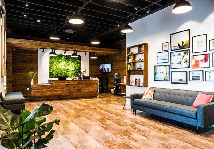
The outcome of the recent elections demonstrates the nation’s shifting perception of cannabis use. With the passage of new recreational cannabis laws in several states, our industry is poised to see unprecedented growth in retail. Moving forward, we have a golden opportunity to design enticing environments that create a unique shopping experience. How can we make sure that our patients and customers will come back for more?
GET THEIR ATTENTION
Every time we walk into a store, we have an experience, sometimes memorable, sometimes marginal. A forgettable retail experience is a missed opportunity to connect with the consumer on so many levels. Today’s customer wants to be captivated and engrossed. They want an all-in representation of their culture, as well as an interactive experience where they can see, touch, smell the product. If it’s their first time in a dispensary, they’ll want an intelligent, safe, sensory satisfying encounter set in a visually pleasing and comfortable space.
The store’s flow and layout should be intuitive and clear. The customer needs to feel welcomed upon entering and understand where to go. Having a reception counter or sales station visible from the entrance helps to draw a path. Creating a lounge area invites the client to linger and learn, providing a space to relax and hang out. Including books, literature, art and imagery will add impact to the space, vividly support the vibe you’re setting, and make the experience more intimate.
MAKE IT PERSONAL
The cannabis culture is as diverse as the states supporting new legislation so it’s important to know your local community and their expectations. Creating the right vibe is key. Years ago, I was designing an optical store based in Waikiki. During the first round of concepts, the owner reminded me, “When people are in Hawaii, they want to feel like they’re in Hawaii.” His simple statement had a huge impact, and continues to resonate with me whenever I consider design direction for a new location.
A store in Santa Barbara will feel differently than a store in Las Vegas. The store’s aesthetic should reflect the local vernacular. The Santa Barbara store will cast a laid back, breezy, and carefree sensibility. We’ll incorporate organic materials, natural fabrics, and deconstructed furnishings with an emphasis on comfort. We’d use relative imagery: local surfers at Rincon, art work from the Funk Zone, shots of the coast and mountains.
Alternatively, the Vegas location might play off a more urban or desert oriented vibe. The materials may be a mix of gritty and polished, with sleek, minimal furnishings. We might commission a mural from a local artist, incorporate vintage iconic shots or use more provocative imagery.
KEEP IT REAL
Whether you’re developing a brick and mortar location, a pop-up shop, or p.o.p., you need to be authentic in your space. Know what you want to convey emotionally and visually to your customer and how you want them to feel when they walk in your store, your shop or see your product displayed. It’s important to be on trend without muddying what you’re saying.
Make that first impression count and then continue cultivating the relationship. You both are looking for a long term commitment.


