As customers journey through a retail environment, there are spaces they may rarely or never come in contact with. We refer to them as forgotten spaces. We call them ‘forgotten’ because sometimes people try to save a little money by skimping on these out-of-sight and out-of-mind areas, such as the restrooms, ATM areas, or the back of house. We want to make note of these areas because lack of attention to these spaces can impact your brand reputation. Special attention to Touchpoint #9 – Forgotten Spaces is an opportunity to create memorable impressions, in sometimes the most unexpected ways.
Restrooms
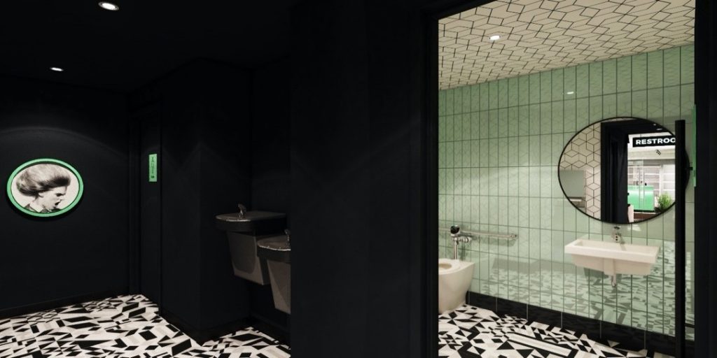
Never underestimate the impact of a clean, well-designed restroom—especially for your female customers. An unkempt restroom can conjure all kinds of negative feelings about your brand and leave customers feeling disgusted. If given the proper attention, the space will either go unnoticed (in a good way) or be a positive memory of the experience.
Whenever possible try to locate restrooms off the beaten path of the customer journey. This supports a sense of privacy, including minimizing sight lines that disrupt the shopping rhythm. Sometimes the building infrastructure may dictate the placement, but it is important to develop a space plan that protects the heart of the retail experience and positions the ol’ loo in a location that is as discrete as possible.
While you don’t want to break the bank in the restrooms, there are many budget-friendly material options that meet code requirements and provide opportunities to creatively express your brand. For example, think about selecting a brand influenced grout color. Custom graphics and brand patterns from the retail design can be repeated in this area as well—such as using the fun wallpaper from the lobby focal wall on the bathroom ceiling to create a moment of surprise and delight. And think outside the box with code required signage. Custom solutions can interject a little humor and reinforce the brand experience.

In addition to the aesthetics, provide items of convenience. Locate a trash receptacle near the exit so customers can use a paper towel to open the door and then throw it away as they return to shopping. Have you considered places for purses? A hook, custom shelf or piece of furniture offer the perfect spot for personal items, putting your customers at ease. And don’t forget about a signature scent, so no matter the business at hand the room remains fresh and inviting.
ATM
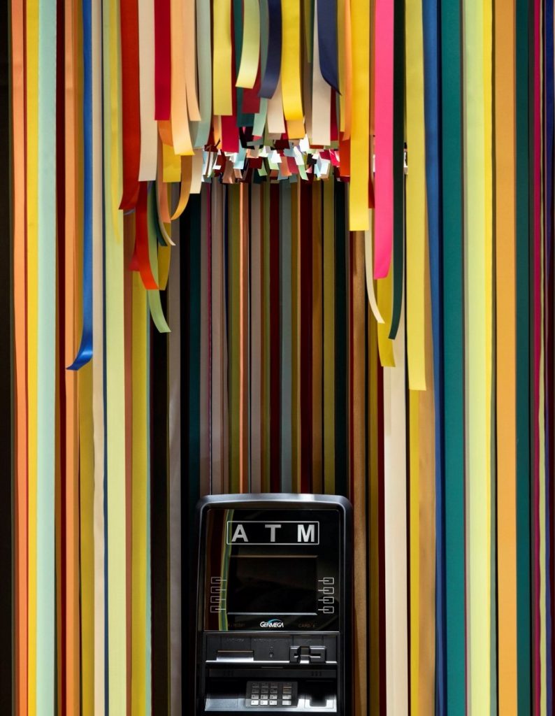
Often an afterthought, but almost always a necessity in the dispensary journey, is access to an ATM. Due to the nature of dispensary cash transactions, the ATM plays an important functional moment in the customer journey. With the understanding that this is often a leased piece of equipment, sometimes little can be done to the machine itself. However, the experience of using it doesn’t have to create a disconnect in the overall experience. At Maitri Medicinals in Uniontown, Pennsylvania, the ATM area was transformed into an Instagrammable art installation. An assortment of 1,466 on-brand colored ribbons attached to a seven-foot diameter metal grid hangs from the 14-foot showroom ceiling. This colorful curtain provides a sense of privacy for ATM transactions while punctuating the customer journey.

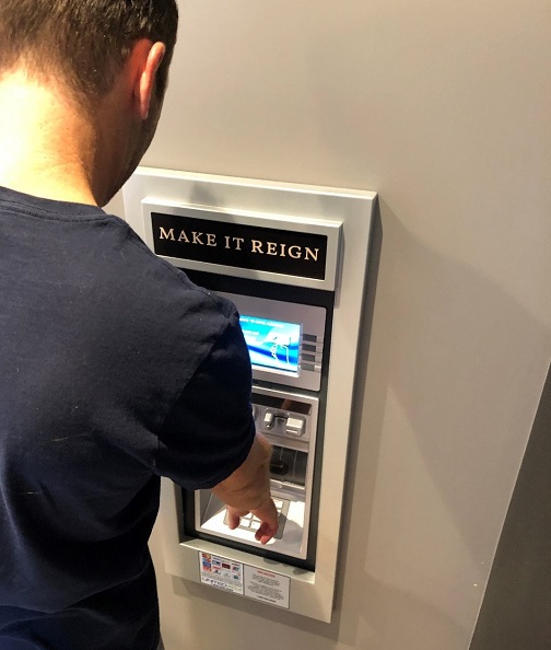
In addition to freestanding ATMs, there are also wall mounted options or models that can be integrated into the wall. This is an architectural opportunity to support secure processes and procedures. Integrating the ATM within the architecture with access from back of house provides a safer and more efficient way to handle cash. Wall graphics and brand messaging can be used to highlight this experience—or think about clever signage to mark the location. No matter the ATM solution, be sure to provide a trash receptacle close by that fits the store décor so that ATM receipts don’t litter the area. This helps keep the space tidy and adds a final signature touch.

Back of house
The design of the back of house area is important for efficient operations and employee satisfaction. While this space is often completely out of sight to your customers, the design of this area will most definitely be felt by your customers and/or vendors. Happy employees are great brand ambassadors, so making these operational spaces efficient supports employee satisfaction and productivity. And don’t forget to provide a comfortable space for your team to take a mental break or enjoy a meal. Use vinyl graphics to invigorate the break room with inspirational messages, an employee of the month shrine, or mission statements. Whether with vinyl tile, rubber base, or a focal wall, add a spark of personality to the space by infusing pops of your brand colors. Strive for a variety of comfortable furnishings and even a TV. While employee comfort is a priority, be mindful of the proximity of the break area to the customer areas. You don’t want to interrupt the customer journey with raucous laughter or the smells of reheated leftovers.
In addition to the employee only areas, the back of house is also a place that may be seen by vendors and important stakeholders. Whether a small conference room or vendor receiving area, this is an opportunity to reinforce your brand. Provide adequate space for conversations, product review, and demonstrations. Comfortable chairs and good counter or table space is important for this area. Also be mindful of sight lines, make sure that what vendors can see supports a positive, branded impression.
Final brand moments
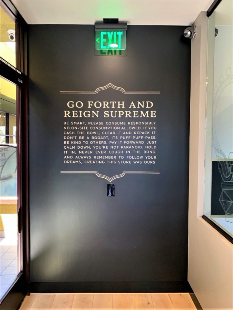
In any retail experience, great care and consideration is given to the moment of arrival and everything a customer sees as they proceed through the shopping journey. But what happens after they make a purchase and turnaround? Now what do they see? As Anne Marie Luthro of AML Insights often evangelizes, merchandising and messaging back-to-front is important. As customers walk from the point of sale to the exit, are they looking at unsightly backsides of signs, blank walls and other empty areas? If so, fill them up. Brand these blank spaces, entice customers to support your social media efforts and encourage them to return with messaging about weekly specials, member benefits, and referral programs.

The journey as customers leave the store can be one of the most memorable experiences. They have completed their purchase—their shopping mission—so they can be a more captive audience as they exit. This final moment of the shopping journey deserves special attention, so stay tuned for the last article in this customer journey series—Touchpoint #10 – Exiting.

A disruptor, innovator, and entrepreneur, Megan Stone is the grand dame of dispensary design. As founder and owner of The High Road Design Studio, she has helped arm cannabis retailers with the power of design to combat stigma, overcome stereotypes, and reinvent people’s perceptions of cannabis and its users. Her unprecedented work has helped usher dispensaries onto Main Street and into the mainstream and has forever changed the international conversation about the retailing of “vice.” Her work has been lauded for altering thoughts, feelings and behaviors worldwide, blazing a trail and earning awards and commendations for design excellence along the way. She is a frequent speaker and contributing editor in both the cannabis and retail design industries.


