
Aerīz
Designed in-house

Aerīz takes a minimalist approach with most of its packaging, employing simple elements on a white background to create a sophisticated, understated aesthetic. The boxes containing flower jars, pre-rolls, concentrates, and vape carts stand out on shelves precisely because they have so few flourishes.
When the company launched its full-spectrum hash drops, Creative Director Dillon Arloff and his team felt the product demanded bolder, brighter—though still relatively minimalist—packaging. Reusable tins stamped with the company’s logo add a long tail to marketing efforts. The clean, reflective look plays on light and mist, two key elements of Aerīz’s signature aeroponic growing process.
EcoPro

Packaging companies must promote themselves, too, but few go as far as Mill Rock Packaging’s LeafLocker brand. The firm has created eye-catching child-resistant containers for brands including Ascend Wellness, The Lab, Common Citizen, Rythm, Escape Artists, and Charlotte’s Web, but LeafLocker’s capabilities really shine in samples crafted for its EcoPro line. The sleek die-cut boxes embossed with spot-gloss-coated flowers are an exercise in elegance that practically begs to be caressed.
Domestically produced from raw materials sourced in the United States, EcoPro is 100-percent recyclable and production creates nearly zero landfill waste. The customizable inner trays employ no plastic or foam inserts, and a unique locking mechanism is secure yet easy for adults to open.
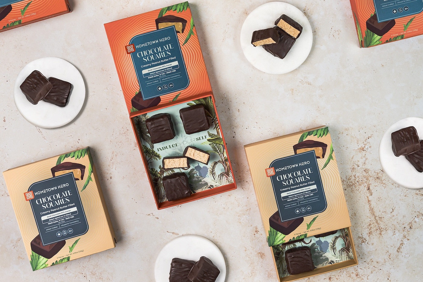
Hometown Hero

Hometown Hero’s rigid boxes are almost too intriguing to throw away when the goodies inside are gone. On the other hand, polishing off the fudgy brownies or chocolate squares is the only way to reveal the playful designs and inspirational phrases on the inside of the slide-out tray. While the paperboard boxes aren’t as durable as metal, plastic, or glass containers, their bright colors and fun graphics—made more vibrant with a shimmery, raised spot-UV coating—convince some customers to use the empties for storing trinkets.
Hometown Hero’s packaging is part of the company’s mission to normalize cannabinoid use in a particularly conservative state. By creating packaging that mimics more traditional consumer packaged goods, the company not only removes stigma but also sparks conversations about legalization.
Clone Goddess
Hippo PremiumPackaging

Women-owned cultivator Clone Goddess’s new eponymous flower line bounded onto the retail scene in folding cartons that allow consumers to peek at the product inside the package through a corner-wrapping window. Cradled inside a clear pouch, the delicate buds are protected from harm yet easily visible.
The boxes stand out on shelves not only because they eschew the more common jar or bag presentation, but also because of the uncommon die-cut, corner-forward design and a dark base color. A bold, masculine, stencil-like typeface balances the femininity of swirling graphic elements and a curvaceous logo. Finished with soft-touch and raised-UV coatings, the overall impression is remarkably polished and gender-neutral.
Maison Bloom
Hippo Premium Packaging

Nominated for a 2024 PAC Global Award (winners will be announced in February), Maison Bloom’s packaging is wowing more than cannabis retailers and consumers. The company’s new four-packs consist of stock bottles nattily dressed in colorfully printed shrink sleeves that echo the look of the original bottles. Each branded carton is refrigeration-proof and topped with a sturdy handle for portability. A window allows the bottles to peek through.
The “garden-to-glass” infused beverage maker’s product has roots in Michelin-starred dining, but its external trappings bear witness to a founder’s experience in the luxury-fashion biz. The new packaging adds a whimsical, more casual note that in no way detracts from the young brand’s upscale aesthetic.
Jerry Garcia Wellness

Few images are more iconic among cannabis aficionados than Jerry Garcia’s four-fingered handprint. Combined with the legendary guitarist’s signature and rendered in countercultural tie-dye patterns, the brand identity for Jerry Garcia Wellness, brought to life by Hippo Premium Packaging, makes the company’s products easy to spot even on crowded retail shelves.
Founded by Garcia’s youngest daughter, Keelin Garcia, Jerry Garcia Wellness is devoted to the health of consumers and the planet they inhabit. Consequently, all containers are crafted with sustainable materials like bamboo and natural rubber, avoiding plastics and other petroleum-based products. Graphics were direct-printed on white glass bottles and jars, thereby conserving production resources. The result is packaging that is beautiful, easily recognizable, and kind to the Earth.
Squeeze-and-Turn Tin

Pacific Coast High is not a real product, but the retro graphic design on Dymapak’s brand-new packaging innovation illustrates how easily a brand could create durable marketing with durable containers.
The ergonomic tins are remarkable in several ways that will endear them to consumers and brands alike. First, the all-metal, airtight construction keeps products fresh. A button on the side of the lid provides audible and tactile feedback when opening or closing the child-resistant, senior-friendly seal. The tins are 100-percent curbside recyclable, but they’re designed to be reused. Finished with inside printing, outside printing, and/or embossing, the product provides brands with meaningful ways to continue spreading their marketing message well beyond the sale.
Kelia

Kelia’s striking cans play a starring role in the company’s mission to normalize cannabis and the people who embrace the plant as part of a healthier lifestyle. Minimalist, colorful, and elegant but with a playful side, the recyclable cans are an intentionally crafted expression of the six-month-old brand’s vision.
The graphic design employs negative space and limited decoration to create a packaging experience that feels clean, healthy, and high-end. While the can is taller and more slender than a standard beverage can, a traditional pop-top imparts familiarity and makes opening easy. The result is a sleek, stylish look that appeals to all ages and genders.


[…] dispensary takes the experience through to final unboxing with exquisite wrapping that creates a haute high. “We include printed cards and gold foil,” Farnsworth said. “We […]
[…] less expensive than buying a purpose-built storage container or dispenser. Brands benefit, too, especially when the container is attractive. Beautifully branded bottles like Maison Bloom’s, for example, make charming bud vases. Bright […]
[…] retail buyers, and marketers are putting more emphasis on brand presentation than ever before, with the results often playing a large role in a product’s success. So how do […]
[…] suggested brands consider their packaging early and often, a sentiment Kane, Gordon, and Wilson enthusiastically echoed. All recommended operators work […]