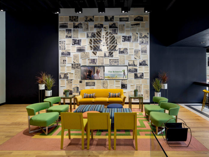
In our last “class” we discussed curb appeal and ways to use your dispensary storefront to get people excited about what awaits beyond the front door. In this session of The School of Stone, we are going to continue along the Customer Journey by stepping foot into your store and talking about the ever-so-important part of the cannabis shopping experience that is the Lobby & Check-in Area.
Whether we’re discussing an actual room or just a general area around a podium, lobbies and check-in areas are worth dedicating an entire column to, and then some. Why? The lobby is the preface to the in-store experience—the opening chord of your song, so to speak. This is a great opportunity to show the general public just how dope a dispensary can be. No matter the size, it is the threshold to shopping in your store—and an opportunity for really great design moves.
Here are five things to lobby for when you’re crafting your dispensary’s lobby and check-in area (opportunistic pun intended).
Respect the decompression zone
Shopper behavior experts will tell you that people need a little space and a hot minute to acclimate to any new environment. They need a “Decompression Zone” to do human stuff like take off their sunglasses, put their keys in their purse, grab their ID, or to pause and savor the fact that they’re in weed wonderland–YES! It takes a few square feet to orient oneself and prepare for our next move whether we’re strolling into a grocery store, Tiffany’s, or your dispensary.
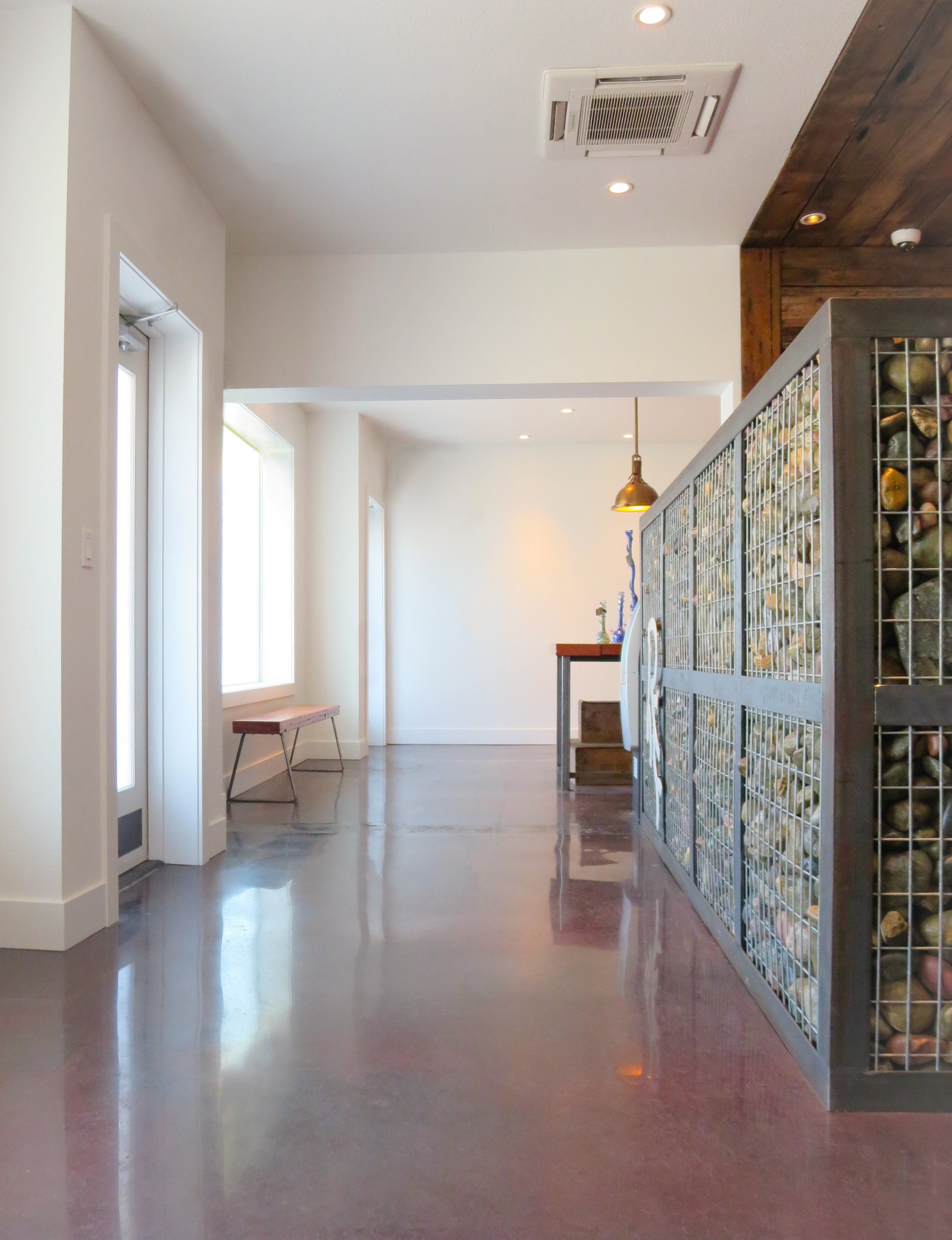
Whether you have an entry vestibule, a lobby, or just a few square feet of space for your Decompression Zone, the best thing you can do for your customers in this area is nothing besides a few subtle brand cues. Don’t greet them yet, don’t tell them anything, don’t sell them anything, just let them be to do what they naturally have to do. Simply create space, enough to get fully inside your front door, a few steps worth to fidget and adjust without bumping into anyone. It’s great to subtly appeal to the senses here, but don’t overdo it. Finish materials, lighting, signature smells and sounds can create a sense of place, setting the mood for their journey ahead.
After those first few steps, you need to make it easy for your customers to figure out what to do next. Once I look up, can I easily orient myself and intuitively know what my next move is? Your reception desk or check-in station should unmistakably be the next stop.
Do right by your reception desk
Now that you know the importance of the Decompression Zone, you can understand why it’s not good practice to position a reception desk or check-in station immediately inside your front door. The placement of check-in is critical to the traffic flow of the entire dispensary, as dozens of people are typically coming and going through the same door every hour.
Orient it in a way that avoids bottlenecks for staff and guests. Provide for discretion but also make it friendly and approachable. We try to avoid the use of bullet proof glass at all “design” costs because it’s a privacy killer and often times doesn’t convey “safe and friendly”. But, if you’re required to use it, design it. Think about being bigger and bolder with it instead of creating a small ticket-taker type window, allowing it to better blend in with the rest of your welcoming lobby.
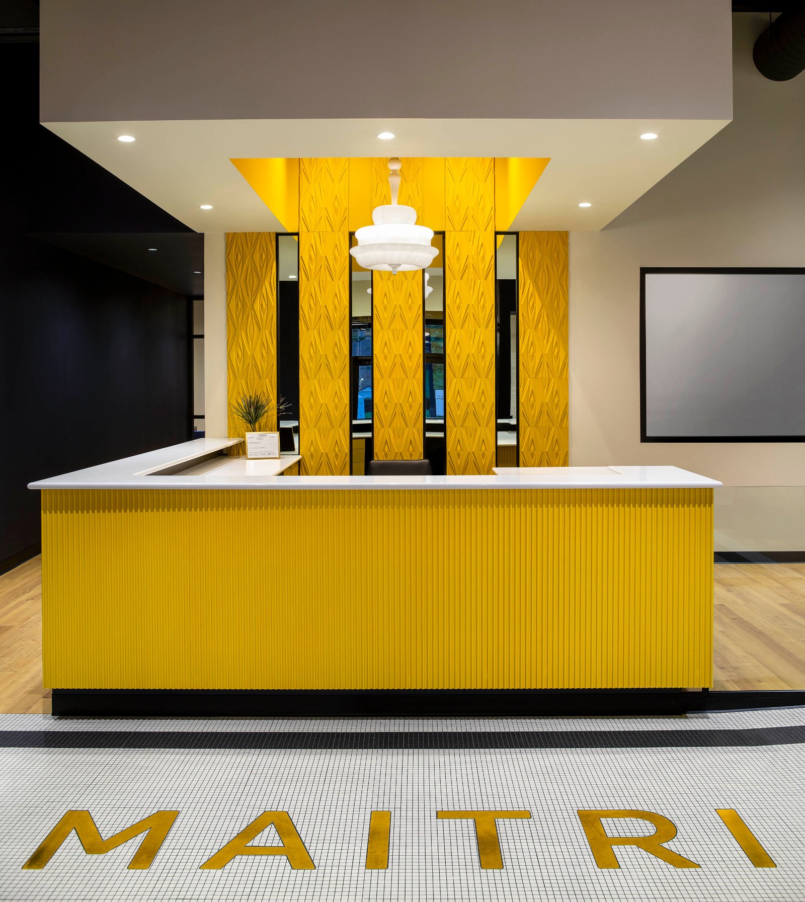
This reception desk or check-in station is a key destination and should be a statement piece within the space. From an aesthetic perspective, it needs to grab attention, so make it brand-worthy and even Instagrammable. The desk’s design should be ergonomic for customers and staff. Create space to set a purse down, provide adequate counters at varying heights to maintain a little privacy and to address accessibility. Since your receptionist may also handle administrative tasks from their lobby post, the design of the desk itself is critical for efficiency and organization too. The proper placement of the desk also helps to maximize the usefulness of this employee. Position it with clear sightlines of the entry and as much of the retail space as possible to allow them to surveil customer activity.
The receptionist is often the first point of human contact with your brand, as well as being a place where people have to stop and pause for a moment. Make everything about the interaction with the receptionist feel comfortable, welcoming, and memorable. One of the best ways to do this is to bring on some brand!
Brand yourself to near-shameless proportions
It should go without saying, but your lobby is a space where your brand should be clearly felt. In dispensaries, your lobby is one of the only areas where your customers may have a moment to sit, and it may be the only time they’re not accompanied by an employee. The lobby is the first and last moment in most dispensaries. What better opportunity than this to immerse guests in your brand and get them to buy into everything about you. Think about every detail, from furniture and artwork to the content on your TVs. Pay attention to your playlist and the mood that is set when all of these elements combine.
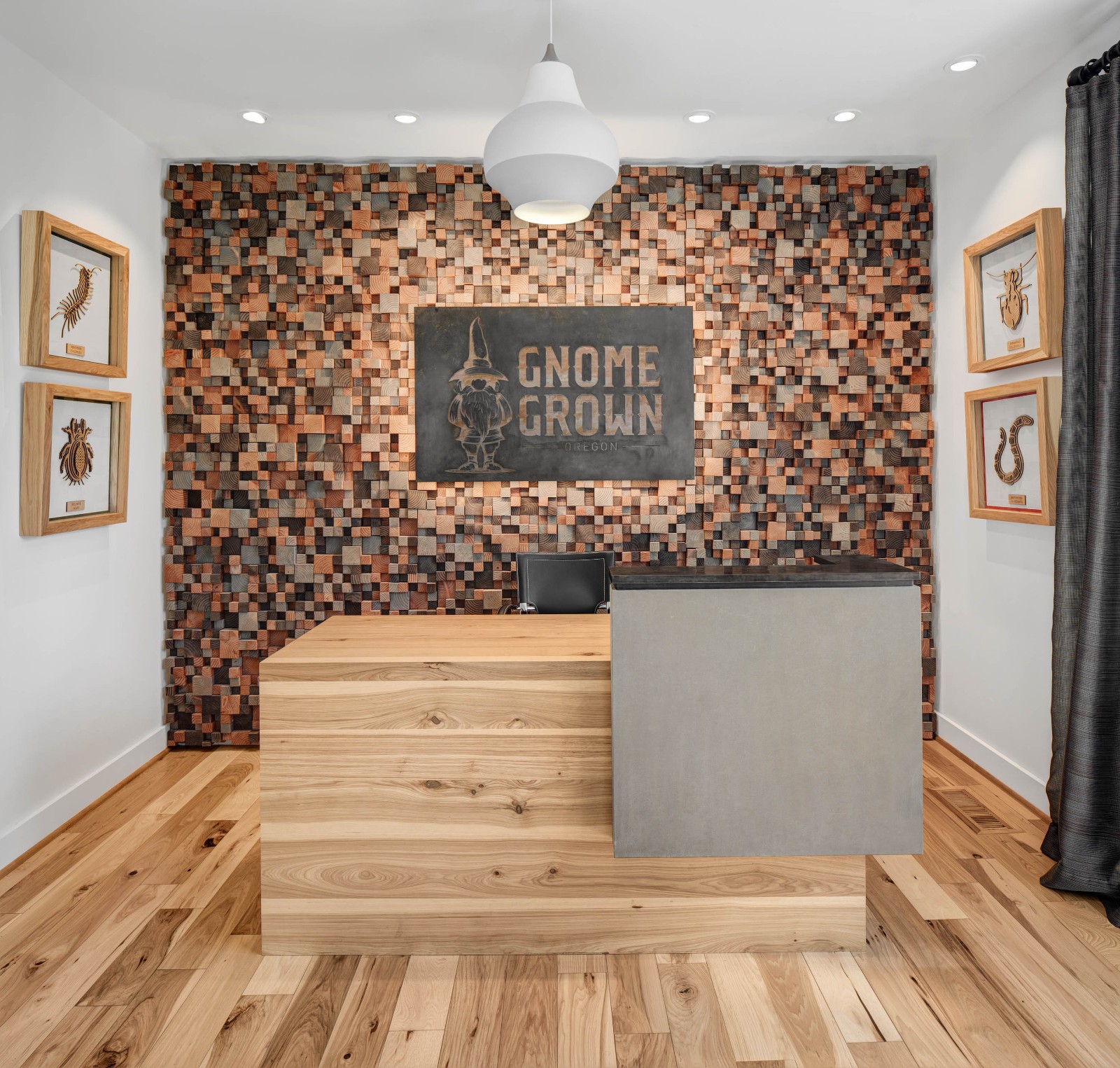
Think about all of the possibilities for making memorable brand moments. Instead of an industrial walk-off mat at your front door, opt for a custom one that combines your brand identity with your own way of saying “hi”. The wall behind the reception desk is another area to have a little branded fun. Explore material applications or enlarged graphics and artwork. What will speak to your customers and infuse excitement into the experience? Ceiling details and statement light fixtures can add drama as well. Also think about what is visible from the exterior. If your exterior signage options are limited, use your interior lobby as a billboard for those passing by outside. No matter how you accomplish it, invest in a well-branded lobby for a memorable first and lasting impression.
Take the wait out of waiting
Remember this quote from Paco Underhill, author of Why We Buy: The Science of Shopping: “Waiting time is the single most important factor in customer satisfaction.”
Think about the lobby as a place to cleverly capture customers’ thoughts and emotions so they don’t notice that they’re waiting. Make them comfortable and distract them with design. Cushy lounge furniture to relax in as well as a feast of visually stimulating details are great places to start. Let their minds wander while they’re admiring your wall finish or picturing your chairs in their own home. Again, do it for the Gram! Do something memorable that everyone has to photograph and post on social media.
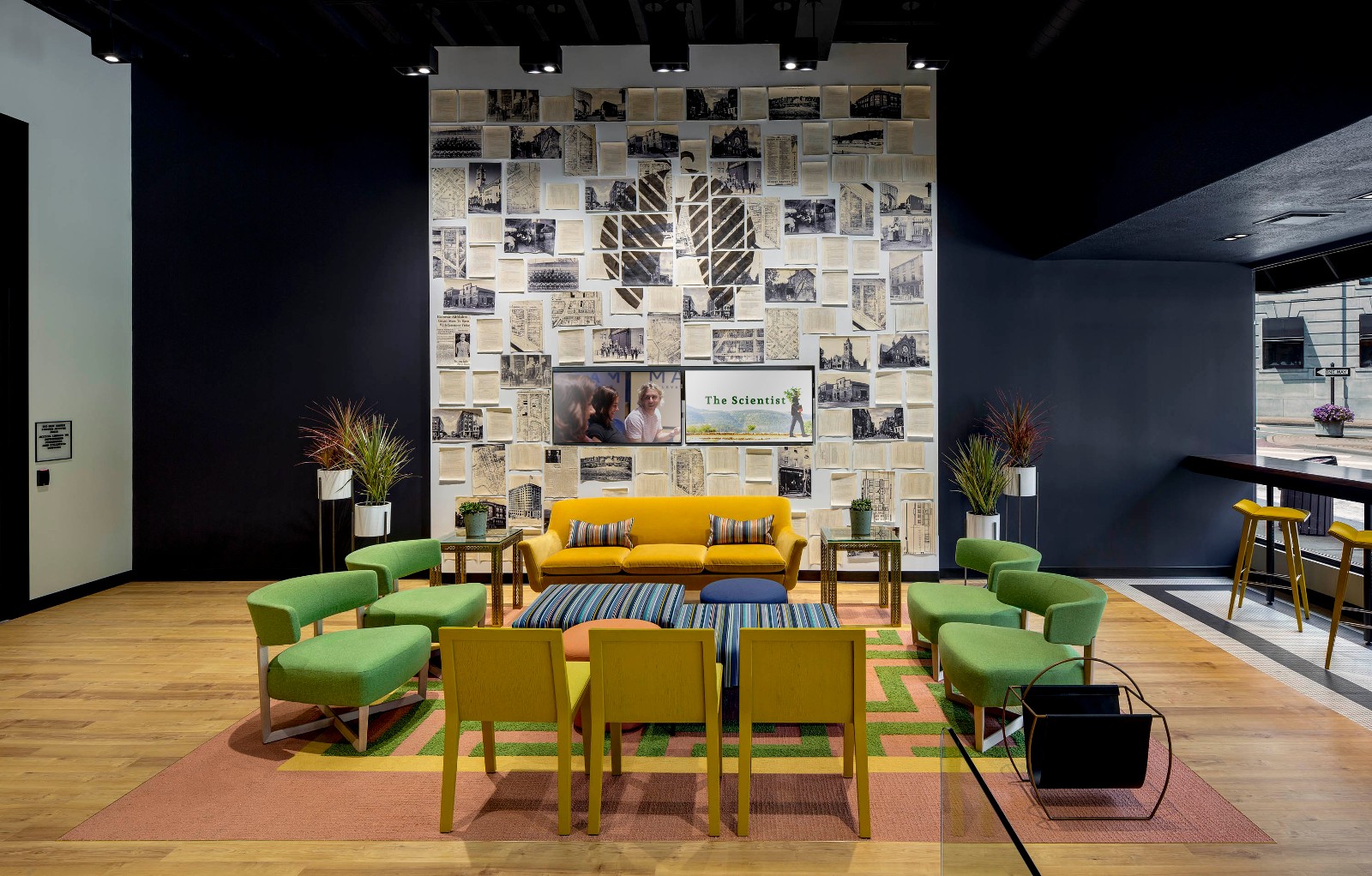
Mix in engaging literature and entertaining digital content. While some of the information can be about cannabis and your specific product offering, think beyond that to magazines, television shows and playlists that reinforce your brand and speak to your customers’ lifestyles. Music videos, blooper reels, how-to clips—what type of content will engage your guests and fit your vibe? If you have an interactive website or app, remind your customers to check that out during their wait instead of checking their email.
Or, get them in the shopping mood by displaying branded apparel, accessories, or lifestyle products. Engaging displays of branded merchandise will attract attention and make them forget they’re waiting.
I can go on and on about Waiting— check out my two-part series on the topic.
Be cool by being clean
You know that saying, “Cleanliness is next to Godliness”? I can’t emphasize enough the importance of maintaining a clean shop and doing so requires some advance planning. Think about this during the design process when materials and finishes are being selected, so consideration can be given to cleanability and durability. It needs to stand up to the wear and tear of your customer traffic and your climate.
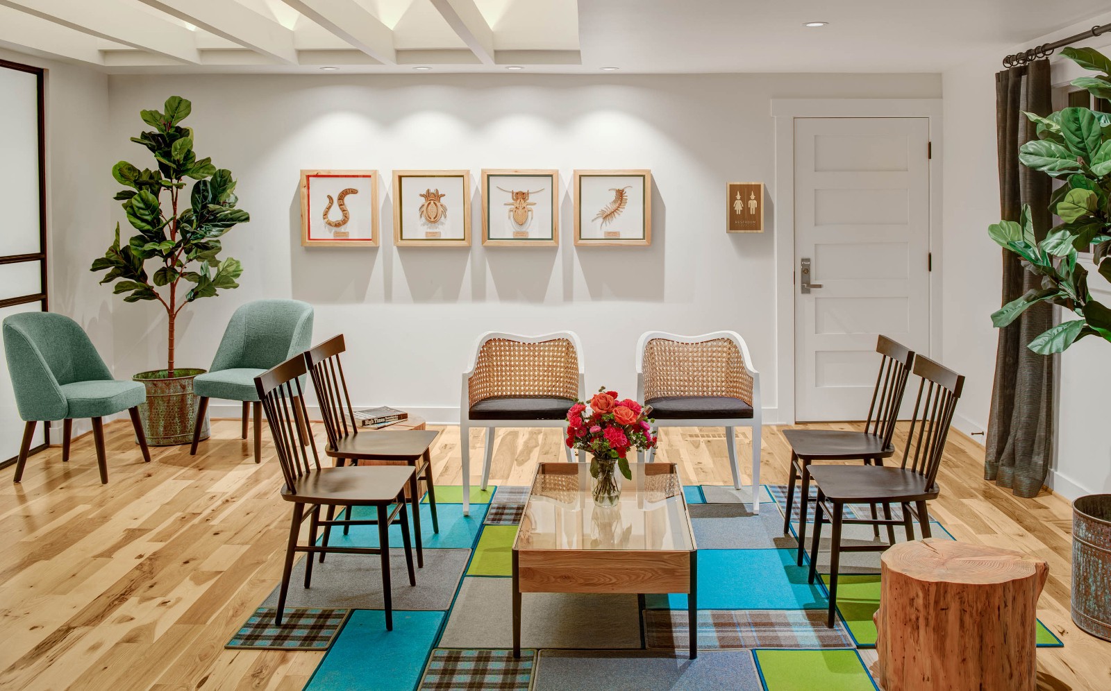
Once you’re up and running, make sure you clean daily. Dust, sweep, and wipe down– and around your furniture. Clean all the nooks, crannies and corners because seeing dust bunnies makes people internally say “yuck”. Whether customers are standing or sitting, make sure what they can see is clean. If you happen to have a bathroom within sight of your lobby, take extra care to make sure it looks, and smells, nice. In the lobby, your customers often are left to their own thoughts, so don’t let poor shopkeeping ruin an otherwise happy moment.
Walk through your own front door, check-in at your desk, and take a seat in your own lobby. What do you think? Are you impressed? Now you know what you can do to always make that a “yes”. Due to the nature of dispensary design, customers may start and end their retail experience in this area. Make sure the planning, branding and atmosphere creates a positive first as well as a lasting impression, an experience to remember and a place they want to visit again.
Got a design question for Megan? Submit it, and she’ll answer in a future column.


