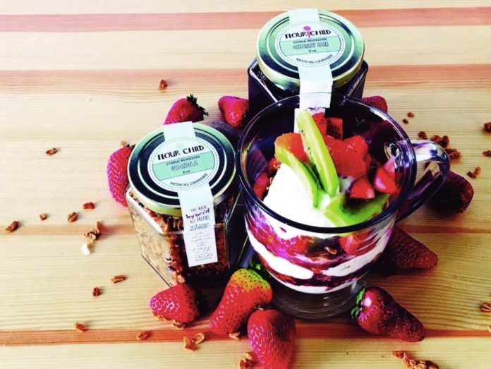
The jars looks like a hexagonal vintage jam container from a Vermont bed and breakfast.
It’s emblazoned with trees, snakes, figures from Greek mythology, and groovy Reefer Madness-esque Art Deco fonts. Flour Child launched its cannabis jams in June 2015. The company’s mission: to create jams using organic fruit and solvent-less, full spectrum ice water hash that support small, local family farms—and, of course, catch consumers’ eyes.
THE JAR
“We get the jars from a company called Specialty Packaging,” said Flour Child co-owner Stephany Gocobachi. “I loved the hexagonal jars but initially thought they might be too fussy for labeling. Our designer immediately came up with a wonderful label design for it.”
LOGO
“I originally came up with the concept for the logo while working on the first-ever business plan,” Gocobachi said. “I wanted a kind of a round tree or flower at the base of the design to echo the name, concept, and ingredients. Cannabis is commonly referred to as ‘trees, colloquially, so it was a subtle hint at that, but I also wanted the logo to resemble a flower. A lot of my favorite flowers also have that round shape—alliums, dandelions, drumsticks.”
LETTERING
“The lettering was inspired by the original Reefer Madness movie,” noted Gocobachi. “The opening credits had the most gorgeous Art Deco-era font, and I knew instantly that had to be the font for Flour Child.”
GRAPHICS
“The graphic design and the brilliant addition of the snakes to the base were done by my close friend Alex Bulloch, who was studying design at Parsons School of Design,” said Gocobachi. “His fiancé, designer Devon Rufo, is the brains behind all of the product and label design.”
SYMBOLS
The snake symbols originated in Greek mythology. The single snake wrapped up the staff—the Rod of Asclepius—is used to indicate medical practice,” Gocobachi pointed out. “The double-snake caduceus was originally a symbol of commerce but is often used as a medical symbol. The modern cannabis industry sits at this fascinating crux of medicine, tradition, and commerce, so we chose to use the snakes as a way to reference the medicinal and historical roots of Flour Child.”
ESSENCE
“We hope our packaging and design convey who we are and what we do at a glance without having to read it closely,” said Gocobachi. “We work hard to source the best possible ingredients and make them into the most therapeutic and delicious products possible. We are a tiny company and make every single thing by hand. I hope that comes through in our packaging.”
FOR WHOLSESALE ORDERS: FlourChild.org


