The green rush for cannabis ignited by adult-use legalization in Colorado and Washington state ten years ago has more and more companies looking to cash in every year. New Frontier Data predicts sales of legal recreational cannabis in the United States will reach $18.4 billion in 2022 and rise to $25.1 billion by 2025. Brightfield Group expects CBD sales to skyrocket as well, forecasting an estimated $7.8 billion in 2022 will grow to $14.1 billion by 2025. And as Forbes reported, many CBD companies are positioning their businesses for marijuana sales. CBD brands possess both the existing cash flow and customer-sanctioned products to finance the transition and ease the stigma for those ready to make the jump to recreational use.
Whether promoting the recreational effects of marijuana, the wellness benefits of hemp-derived CBD, or both, the only companies bound to soar above the boom are those that can shine as clear, concise, and consistent brands. Case studies of brands preparing to dominate their markets reveal the phases of brand positioning, naming, logo development, packaging, and merchandising that can build a compelling corporate identity.
Uncovering the roots of a growing brand
Crafting a brand identity for Sweet Dirt began with digging into the discovery process to discern the spirit and nature of the Maine-based cannabis brand. That exploration started with a ground-up identification of three unique aspects of the company’s core crop: 1) a proprietary mix of nutrient-rich living soil; 2) the custom-crafted heirloom-strain seeds planted within it; and 3) cannabis flowers cultivated to meet the strict Maine Organic Farmers and Gardeners Association standards that certify exceptional natural purity.
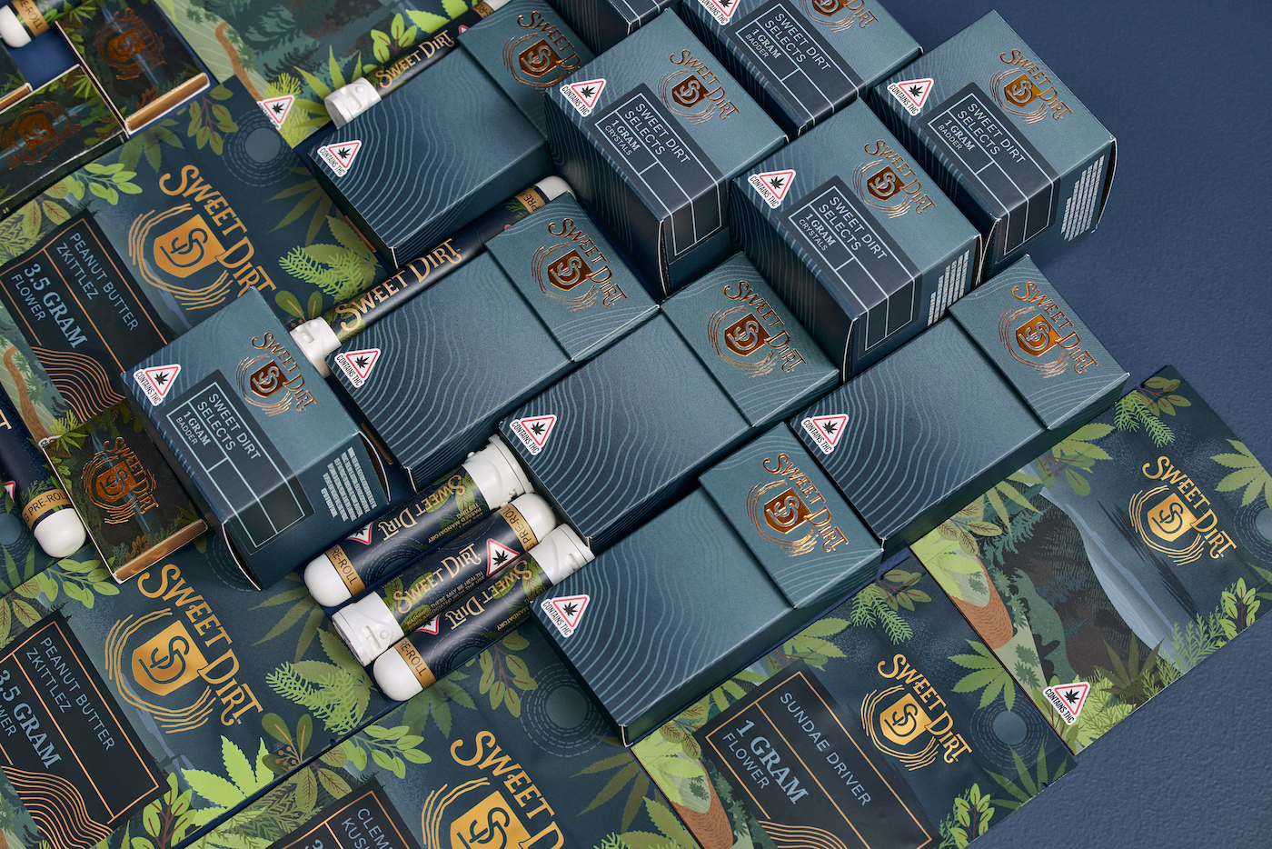
Those principles nurtured a brand position told through foundational communications that could share the Sweet Dirt story with the world. Taglines explored ways to capture an origin “rooted in the richness of Maine.” A concise brand statement grew from this concept: The company’s headline, “Nature knows how to grow,” gave rise to the corporate mission of creating “cannabis crafted for body and mind.” The company’s background story completed this suite by memorializing the ecological philosophy of Sweet Dirt’s botanist and herbalist founders as the reason to believe in the brand.
Every aspect of Sweet Dirt’s visual story was crafted to complement this verbal tale, from a spade-shaped logo to a full line of packaging featuring cannabis leaves flourishing within a Maine landscape. The brand honors the company’s core value of environmental sustainability with a packaging system using boxes produced, printed with wind power, and sold within a 100-mile radius of where the source materials were grown.
Scouting territories for the name game
Gulfshore Holdings knew its corporate name could do little to signal the clean quality of the plants the Michigan company grows in its state-of-the-art greenhouses. It sought a title that could instantly announce the benefits of its products to the newly expanded audience of consumers seeking both medicinal and adult-use flower.
Initial discovery sessions revealed three themes that promised to inspire consumer interest and sales. Naming territories included the “stigma-stopping embrace of cannabis benefits,” “subtle celebration of psychoactive effects,” and “promotion of a naturally derived product.”
A team approach to name-generation included vetting any proposed name in searches through Google and the U.S. Patent and Trademark Office’s database of trademarked terms. As trademark attorney Andrew Kraus of Opticliff Law explained, “The landscape around trademark clearance searching and trademark infringement in the cannabis space is really muddied right now. Even though brands cannot register their trademarks federally in relation to cannabis products, they could still face a trademark-infringement claim by owners of similar trademarks in separate industries.”
After several rounds of exploration, the brand landed on the natural purity evoked by the name “Everpure.” Final packaging used that title as the north star to guide the creation of a clean, color-coded design reflecting the natural benefits of Everpure’s “Drift Off,” “Uplift,” and “Unwind” strains.
Crystallizing a corporate icon
Purity was also the watchword for a company whose CBD skin and body care products were formulated to promote “whole-body wellness.” For Pure Dharma, a corporate identity reflecting the brand’s mission of “bringing harmony to mind, body, and spirit” was key. The creative evolution of that concept passed through multiple investigations of the forms, colors, and typography to arrive at the signature image that embodied the ideal.
After the creative team shared their initial ideas on the visual manifestation of the theme, continuing sessions of internal critiques, client reviews, and collaborative graphic design resulted in a mark refined by the potent process of peer review.
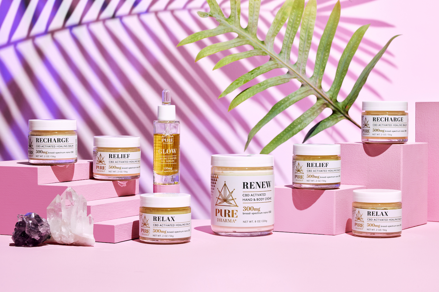
The final image was anchored by a triangle symbolizing the balance of mind, body, and spirit, born from the benefits of the seven-pointed cannabis leaf nested within that frame. A clever marriage of the “U” and “R” letterforms in the word “PURE” created a unique but legible wordmark, mirroring the distillation of natural power that defines the ethos of the brand.
A primary three-color palette of warm gray, gold metallic, and gold foil complemented by a soft peach hue reflected the refined nature of the company’s products. The final logo set was optimized for maximum flexibility, ensuring the Pure Dharma spirit resonates through every consumer touchpoint online, in print, and in an array of package designs.
Packaging crafted to spotlight CB-Delights
Pure Dharma’s upscale elegance was a far cry from the sassy style needed to channel the brand voice established for Suck On This’s CBD-infused chews. The taffies presented a sweet study in contrast, offering a real-fruit sugar rush delivering the mood-mellowing benefits of low-dose CBD.
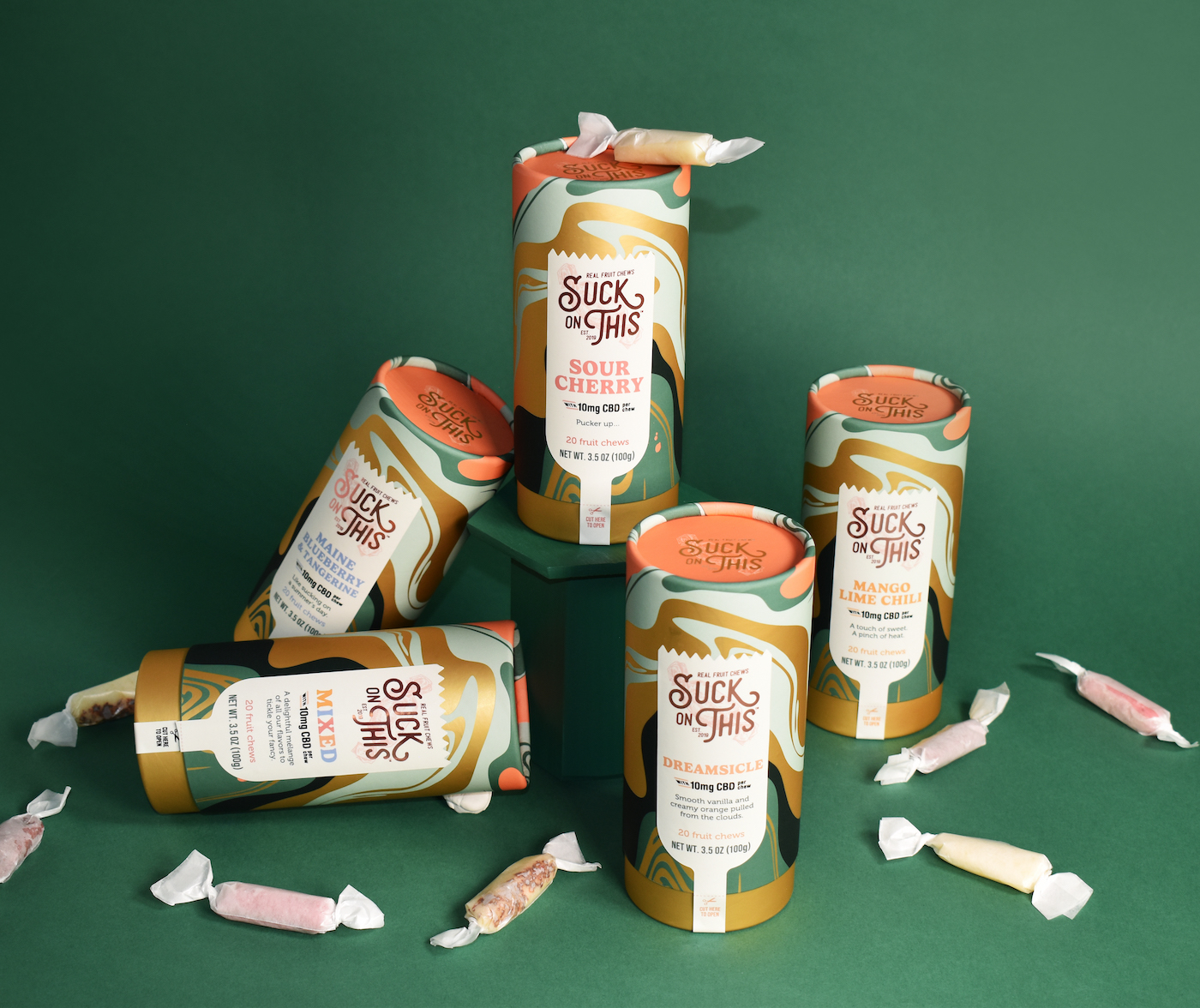
The creative exploration of the treats started with a dive into the company’s past. The vintage taffy pull that inspired the brand’s birth captured the twists and turns needed to plot a compelling packaging story. Punchy swirls of distinctive colors stretched and flowed to mimic the mechanics of the old-school machine. Those patterns circled canisters with rounded edges, soft finishes, and inset tops, all crafted to tempt a customer’s first touch.
Though a cannabis-derived ingredient earned a starring role in the brand’s story, the design system also was engineered to respect those still wary of CBD’s mild effects. Clear color-coding established a second CBD-free product line, still sporting the wavy flourishes and back-of-pack quips that kept all products consistent.
Fitting the lifestyle to a T
With eighteen states currently sanctioning legal recreational use and the House’s passage of a bill decriminalizing its use on April 1, a national shift in attitudes toward cannabis is at hand. Now that the stoner stereotype is going up in smoke, more recreational users are ready to wear their passion for responsible use on their sleeves.
Creating the brand and merch to let customers do just that was the job Bask Cannabis gave to Pulp+Wire’s creative team. The company’s “sun-raised cannabis” tagline provided the spotlight for both the look and feel needed to honor a brand built on eco-friendly environmental controls and sustainable growing practices. The final T-shirt set presented five spins on the solar focus that makes Bask’s plants’ potency shine. The mix of illustrative scenes and symbolic graphics was printed on carefully curated garments.
Seeking the high ground for an enduring brand
When looking at the legislative future of cannabis, attorney Kraus highlighted the coming competition for sustainable spots in the multibillion-dollar market. “It’s safe to say if the federal government legalizes cannabis in the United States, there will be a race to file federal trademark applications given how many brands are proliferating in the marketplace already,” he said.
Any brand that’s taken the time to discern its authentic identity and define it in a distinctive style stands the best chance of rising to the top of the crop in the next wave of growth.

PulpAndWire.com


