San Francisco’s Mission District is an exuberant sector of the city that stays stubbornly true to its Latino roots. The owners of the district’s Union Station dispensary approached their recent project with the past in mind, aiming to pay homage to the business’s surroundings through design. They tasked dispensary design master Gi Paoletti of Gi Paoletti Design Lab with creating a space that would both entice the average consumer and accurately represent the heartbeat of the neighborhood, which has played a significant role in California’s cannabis culture since before legalization.
Like many buildings in the district, Union Station’s has a colorful history. The original owner operated a successful furniture company in the space from the 1930s to the 1970s. Since then, the edifice has hosted a variety of other establishments—most recently the San Francisco College of Cosmetology—before eventually settling into its new life in a brand-new industry.
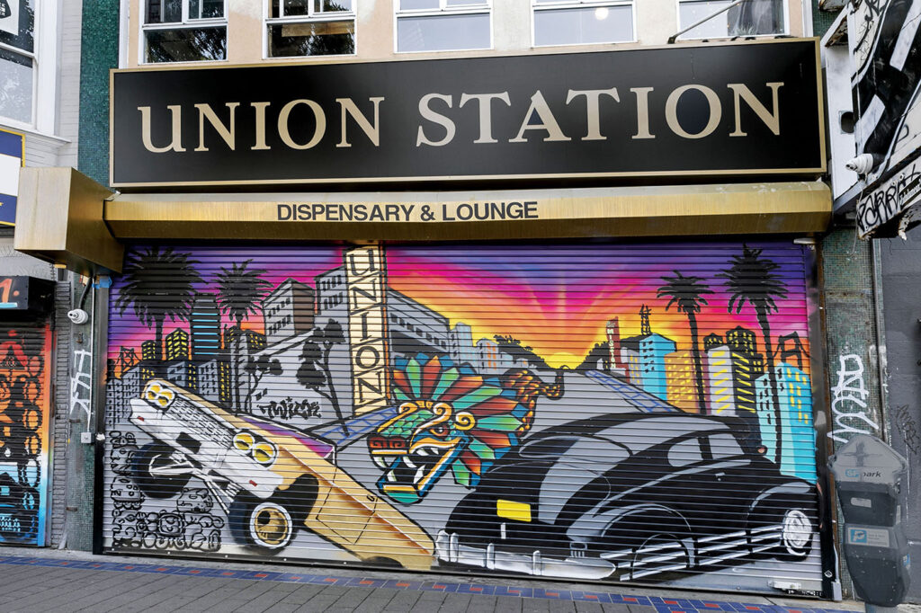
Almost every dispensary team goes into the concept stage with the goal of designing a space that not only is beautiful and functional but also creates a memorable experience for customers. For Union Station, though, the brief was more specific. After finding a vintage sign bearing the words “Union Station” during renovation, the owner was determined to use that name as a central inspiration. He wanted the shop to have the sort of kinetic, on-the-go feel experienced in bustling mass-transportation hubs while accurately portraying the history and culture of the surrounding community.
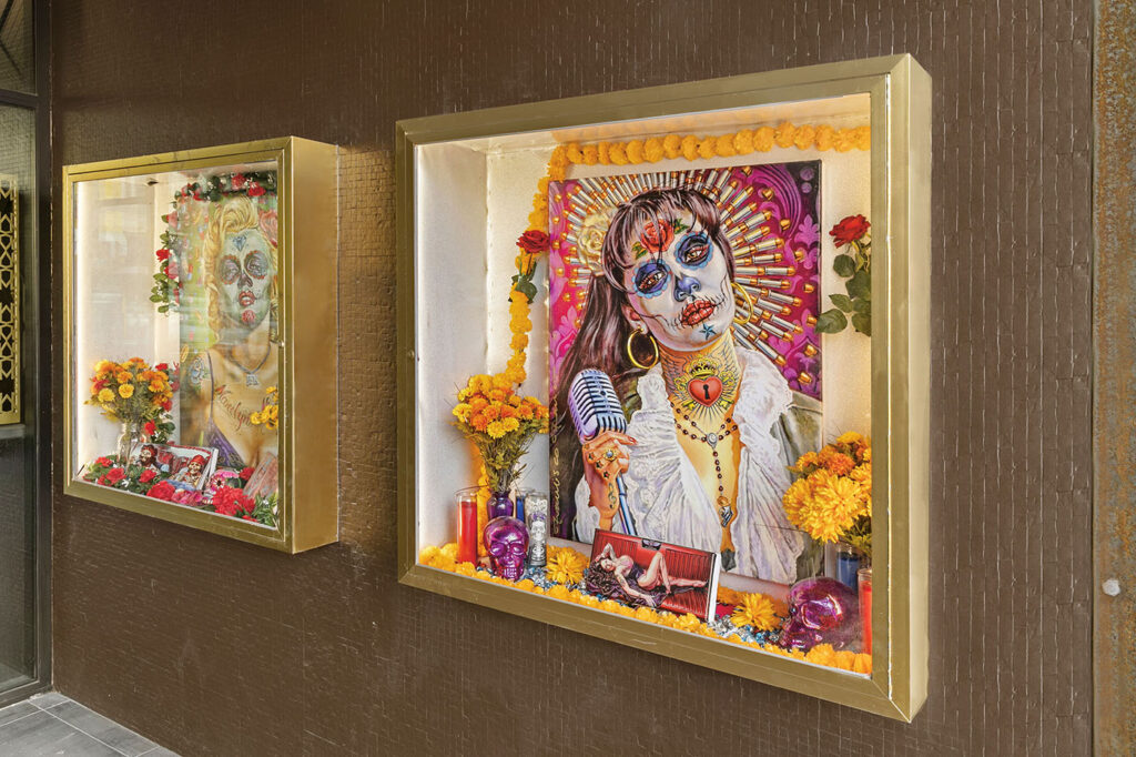
Paoletti got to work, fusing the excitement of the anonymous passing-through sensation that is characteristic of historic train stations with the calm people seek from cannabis.
“The owner also owned a medicinal dispensary [at a different location] by the name of ‘Mr. Nice Guy’ that closed down years ago, so I wanted to work that in,” Paoletti said. “After speaking with him in more depth, we decided to take his logo from Mr. Nice Guy and tie that into the Union Station design. So we ran with his previous logo as inspiration, combined with the neighborhood’s history and the original idea of a train station.”
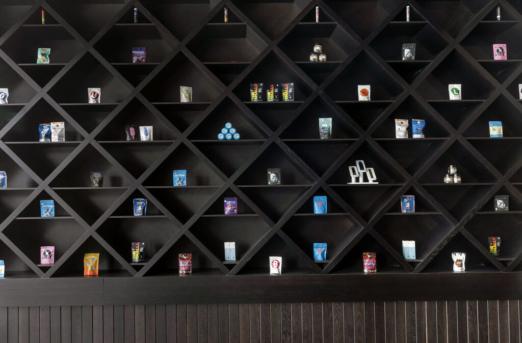
The buildout required a complete gut and remodel, transforming the space into a welcoming way station that evokes a bygone era but exudes a distinctly contemporary edge.
Mission District businesses famously solicit community participation as they develop new concepts or remodel existing enterprises. Consequently, Union Station’s owner invited locals to weigh in on his plans.
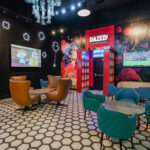
“There was a lot of neighborhood outreach—several meetings with local business owners to ask them what they’d like to see in their neighborhood,” Paoletti said. “We wanted to tie in aspects of the neighborhood, its roots, and its Hispanic and Latino influence. That’s especially present in the social consumption lounge, which is a comfortable and inviting space that makes people want to hang around for several hours.
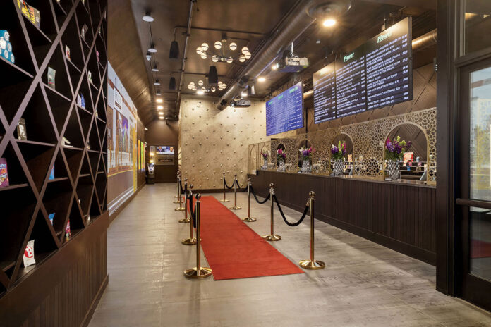
“We also did a life-sized projection wall, so when you walk in, you have twenty-five feet of this engaging, moving imagery,” she continued. “There’s footage of a bustling train station and other images and clips from scenes around the neighborhood. Because the projection is so big and forever changing, the owners can do whatever theme they want in there. But so far, everything is based on the neighborhood and the idea of transportation.”
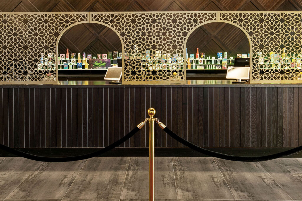
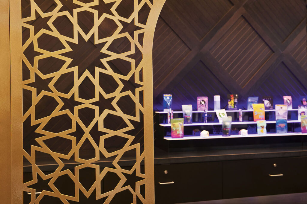
Paoletti designed gold-patterned, laser-cut arches that loom over the point-of-sale station, making the checkout stands resemble grand old-school ticket counters. “When you have gold arches and walls on one side and an art projection showing the hustle and bustle of a train station, you really get the feeling that that’s where you are,” she said. “There are also large chandeliers in that area for the same reason.”
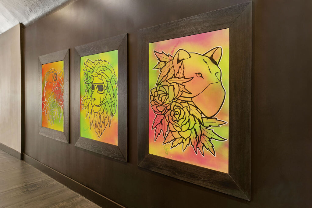
Locals constitute the majority of the dispensary’s customers, and they have embraced the store, Paoletti said. The business keeps interest alive by showcasing local artists’ work and inviting local performers and restaurateurs to host events on the site.
One of Paoletti’s favorite aspects of the space is the consumption lounge, which is discreetly located in the back and is open for hanging out, passing around joints, and hosting events.
The location hosts live-jazz Sundays, San Francisco 49ers game watch parties with food and cannabis sampling, karaoke, trivia, yoga, and more. The activities tie together the loyal community, marrying the energy of the Mission District to cannabis’s storied ability to help people chill.
“The lounge is hidden from the front, so it has this exclusive, speakeasy-like feel to it,” Paoletti said. “We replicated the medicinal logo—which features a healthcare cross—with resin, painting it gold to accompany the gold French doors the consumption lounge lives behind.
“Having the lounge set farther back in the space gives it a more comfortable feel,” she added. “You’re not sitting right on the street. You’re able to take a little rest from the outdoors and get a whole new experience.”
Paoletti succeeded in designing a space that is as inviting to the local cognoscenti as it is to tourists and newcomers—a cue more designers will follow as creativity and uniqueness become increasingly important for brands determined to set themselves apart from the competition.


