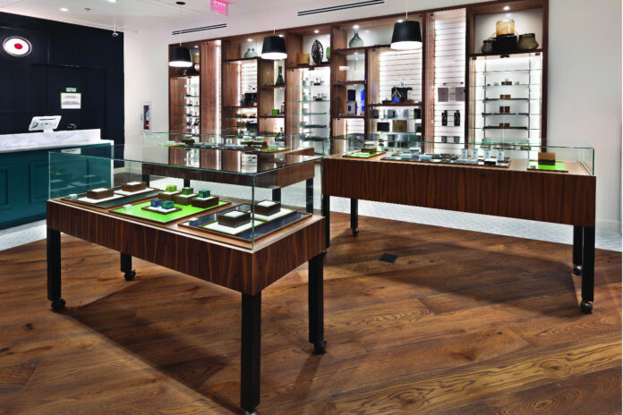
In certain retail industries, engaging with a salesperson usually is required to close a sale. Car dealerships, cell phone stores, and real estate transactions are good examples. Thanks to the relative youth of the cannabis market, business in a dispensary often requires a bit more customer interaction. Whether interacting with a floor sales associate or a budtender, there’s a good chance the customer has questions or is curious about different items, benefits, drawbacks, and so on.
In the dispensary world, it’s important to value these conversations. In fact, you’ll want to arrange your store and merchandise in a way that nurtures them. Currently, Grand View Research values the cannabis market at about $17 billion, a figure it estimates will top $70 billion by 2027. Merchandising and store layout can go a long way to help you garner your share of that business.
To that end, consider these five best practices when evaluating your dispensary layout and merchandising.
Value the first impression
It’s important to set the right tone when customers enter your store. Keep in mind they’ve likely engaged with your brand through a web or mobile channel and, depending on how that experience went, they may have expectations when it comes to your professionalism and knowledge. Cannabis has distanced itself from its dark headshop days and embraced sophistication. Customers want a safe, professional environment, and you can achieve that in simple ways.
Use clear lighting and simple signage to nurture curiosity. A clean, open floorplan invites customers to inquire about what you have and can start them on the right path toward trusting your brand and what it offers. In fact, the 2019 Edelman “Trust Barometer” special report found 67 percent of respondents believe in order to continue buying a product, they must trust the brand. The same is true of dispensaries. First impressions go a long way when it comes to the trust factor.
Don’t feel like you need to embrace a woodgrain or “organic” look and feel, either. There are plenty of dispensaries with minimalist décor, some with a masculine speakeasy feel, and others with vibrant, fun looks. Be creative, but make sure that at the end of the day, the look steers away from anything questionable and more toward a vibe that demonstrates a level of authority on the subject of cannabis.
Use the periphery of the store
When a customer enters, you don’t want them to be overwhelmed by product displays. Use the store’s periphery as the visual target to allow the eyes to scan and wander to areas of interest. Often, cannabis consumers enter stores with no agenda and want to let the product offerings guide them.
You can use the center space for furniture or to create an area in which to congregate or discuss products. Some use the center of the store for kiosks and even add technology elements or literature to allow those who like to read on their own to take a deeper informational dive.
Organize products with a purpose
Above all, you want items to be easy to find and spaces to be uncluttered. Dispensaries are an experience, so they tend to have fewer aisles, endcaps, and point-of-purchase displays than might be found in other retail environments. When you place products along the periphery, mix in small vertical displays to break up horizontal shelving and organize merchandise by brands or product categories: tinctures, drinks, concentrates, edibles, oils, skincare, and so on. Don’t forget the subject matter lends itself to senses like smell and touch.
Make sure employees are clear about what’s available to sample and what can be touched. In addition, don’t underestimate the value of unique, quality imagery around products to lighten the mood and inform or expand thinking.
Maximize checkout space
Cash register and fulfillment areas are a great opportunity to increase the likelihood for impulse buys with complementary products or add-ons. You can use small display cases or integrate products into a cash register wrap. Just make sure the checkout doesn’t disrupt the flow of the space and there remains plenty of room to wander. It’s a great place to add accessories or books.
Also, make sure your point-of-sale system gathers information about buyers and transaction trends. This is a great time to ask about email addresses for promotions and to get other buyer history information to target the right promotions for future sales. Reports also can inform you about what’s moving and what’s not. This can influence changes to layout and merchandising.
Experiment and stay informed
When it comes to store layout and merchandising, never let things get too stale. Experiment with different product placement. Moving products around retail spaces is an age-old tactic that keeps spaces looking fresh and vibrant. Dispensary owners should tinker with their merchandising strategy as they gather customer feedback and buyer-journey data.
Since cannabis exited its prohibition stage quite recently, it’s important to educate your team constantly about new products, industry news, and changes. The coming years will be as much about dispelling misinformation as about growing market share. The more your brand is seen as a knowledge leader, the more likely your customer base will continue to grow.

Ray Ko is senior e-commerce manager at shopPOPdisplays. Located in New Jersey, the company is a manufacturer of retail point-of-purchase merchandising systems. With more than twenty years of experience in branding, content, and search engine marketing, Ko is an expert in formulating and implementing e-commerce strategies to drive traffic, improve user engagement, and increase revenue.


