Welcome back to The School of Stone! In past columns, I’ve touched on the importance of a brand and gone over an overview of the customer journey — core concepts for successful cannabis retailing. Now it’s time to dig deeper into the nitty gritty details of the cannabis retail experience and share my top tips for creating kickass retail stores. This series of articles will cover the ins and outs of the physical brick-and-mortar dispensary experience while providing some best-practices, shining examples, and a few lessons I’ve learned doing #dopedesign from sea to shining sea.
Touchpoint #1, as you may recall, was the initial Search & Find experience — the process through which customers find you. The important thing to remember about that initial touchpoint is that it is the first impression of your brand; it sets customer expectations for the experience at every touchpoint that follows.
When customers are ready to find you, are you ready for them? Where you are located, how easy you are to find, and what your dispensary looks like from the street all combine to set the stage for the rest of the experience. Thus, Touchpoint #2 is Location & Curb Appeal, and I’d argue that this is one of the most important brand touchpoints for your entire business, and possibly for our entire industry.
Why? Because it is the only touchpoint that some of the most important consumers may ever experience: the consumers who have yet to step foot in a dispensary in the first place. Impressions of the entire industry can be based on how a dispensary presents itself in its community. Here are my tips for making a good impression on consumers whether they walk inside your dispensary or not.
Maximize the site and architectural design
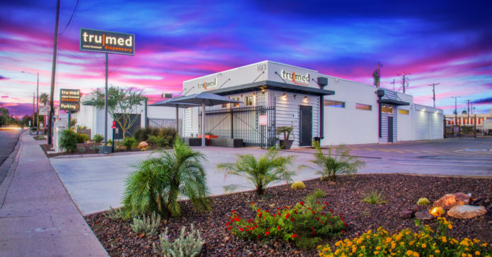
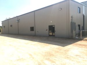
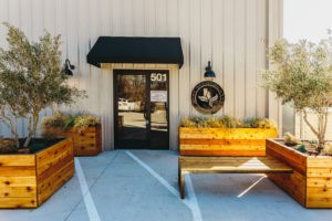
Do whatever you can to make the most of your actual building and your actual property, to the greatest extent of your ability. If you are part of a multi-tenant building, there may be limited options but there are still opportunities to be seized. This starts with parking. Is it easy to find? Does the parking lot have good striping, ample lighting and even trash cans? Is there a clear path from where customers park to the front door? Does the landscaping provide pleasant surroundings and even create a little privacy? At the very least, is it clean and safe? When it comes to the storefront of your building, a fresh coat of paint or an entry canopy can help refresh the exterior and create a distinct sense of arrival. And if you have more freedom, a unique façade design with interesting material compositions can serve as a billboard for your brand. Think about all of the details that give your façade and surrounding site a professional, safe and welcoming appearance.
Make a statement with exterior signage
The right sign says it all. It accents the façade while reinforcing your brand. Are you going to carelessly hang a vinyl banner or invest in a backlit laser cut steel sign? Get where I am going with this? Believe it or not, there are endless possibilities for cool signage. Not only can you play with a palette of materials that reinforce your brand, you can enhance it with the presentation and lighting. Carefully consider the placement so you can maximize visibility. Will it be easy to see on the face of the building or do you need to consider a blade sign that projects from the façade in order to capture attention, or maybe both?
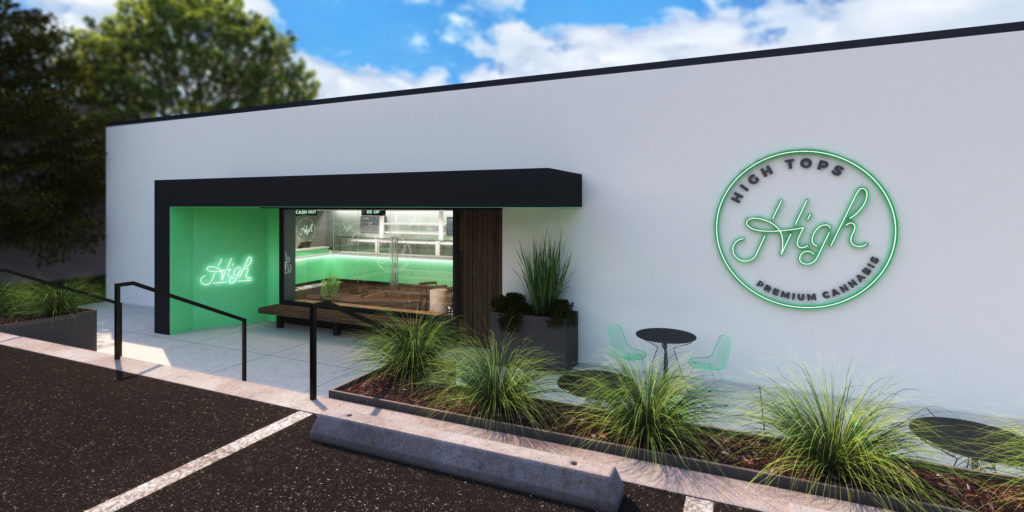
Building signage aside, you typically also have regulatory statements and signage that must be posted outside of your dispensary in public view. From emergency contact information, ‘card-carrying customers only’ notifications, and security camera postings, think about the presentation of this communication. Being compliant is important and handling it with a branded sensibility reinforces professionalism and a sense of security.
Make the most of your point of entry
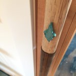
The previous tips have all set the stage for the true moment of arrival, the entry into your dispensary. How do the storefront windows emphasize this entry point? Do they tease with information or glimpses of what’s inside? How are you making your customers feel like they’ve truly arrived? Whether a single or double door—I always vote for double whenever possible—is it unobstructed and easy to open? And what about the door handle? Yes, the actual door hardware. This is the first thing your customers will physically touch. What does it look like? How does it feel? Designing or installing hardware that is so cool, on brand and memorable creates priceless subconscious moments of delight that breed that cult-like loyalty all retailers crave.
Use accessibility as a design feature
The majority of dispensary owners are acquiring existing real estate which in most cases requires an investment in building upgrades to meet current codes and accessibility requirements. This doesn’t always have to be a drag on the budget and the design process, sometimes it is an opportunity. Functional, mandated enhancements can be addressed to achieve well-designed, high impact moments. For instance, a wheelchair ramp can be slapped on a plan and just “made to fit the site” or it can be carefully considered as part of a memorable entry sequence. This can make the approach to your dispensary a cool experience for everyone.
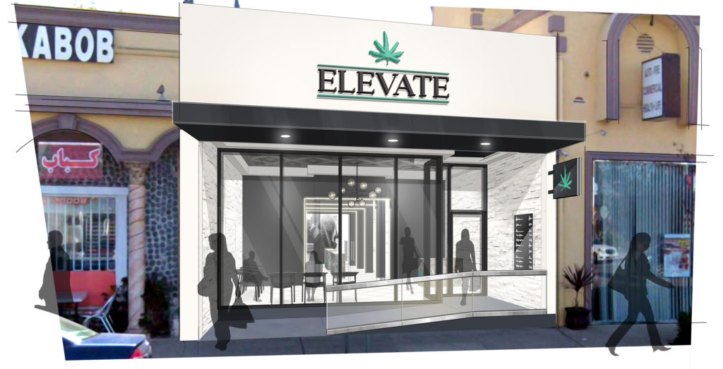
Keep in mind, accessible design isn’t just for the benefit of those in wheelchairs. Accessibility, ergonomic comfort and ease of operation, including everything from door handles to sink faucets and easy to read restroom signs, are for everyone. Chances are, if you’ve ever been temporarily handicapped by a sore back, broken arm, or debilitating migraine and found yourself in a building other than your home, you benefited from accessible design and building codes.
Make safety and security design-savvy, too
Another aspect of street presence that many dispensaries need to think about is how to communicate that you’re a safe place to shop. If you have to protect your windows with bars or physical barriers, don’t allow them to be an off-putting afterthought. Design them to be an attractive feature like a screen or perforated façade. If you have to surround your property with a security fence, think modern wrought iron instead of rusty chain link. For some of my clients, 3M’s security film is enough to provide the right level of security for their glass. This solution allows you to maximize all the natural lighting and views that windows are so great for.
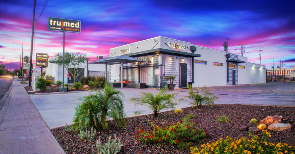
For many, security may also come in the form of an actual person, a security guard. If so, this will be the first human contact with your brand. Think about what the security guard is wearing, and how this person is positioned professionally outside of your establishment. Think about a branded uniform or a nice podium and umbrella, like the valet at a high end restaurant or hotel. Whether or not this is your own employee, some customer service training is important in order to create a positive first interaction.
From parking and landscaping to the façade design, how is your brand being reinforced from the street? How is it speaking to your customers and your greater community? As I mentioned, this includes everything from the appearance of your security guard and ease of accessibility to the look of the storefront and what it feels like when a customer grabs the door handle. Street savvy design grabs attention and lures people into your retail experience. It is an essential component to the customer journey that is all about creating anticipation to what awaits beyond the front door.


