As the quintessential birthplace of the modern legal cannabis movement, California has a heavy and unrivaled influence on the industry nationwide, preemptively setting the tone for each new trend and change of pace in the market.
However, this presents one minor (but notable) caveat for operators in the Golden State: As the home of the Emerald Triangle and the center of the legal United States market, California suffers from a massive oversaturation of brands and dispensaries, making it nearly impossible for operators to stand out from the blurry herd.
Los Angeles-based interior design firm Caisson Studios is dedicated to providing its clients with sustainable, cost-effective, and tone-defining designs that prioritize individuality—like Project Cannabis in downtown Los Angeles.
Urban designs for classic Los Angeles cannabis culture
While operators in the cultivation sector consider Northern California’s Emerald Triangle to be the mecca of cannabis production, the plant’s culture undeniably is defined by Los Angeles. And as the city becomes increasingly populated with brands and dispensaries, retail operators are required to take as niche and defining of an approach to their product distribution and store layout as possible.
Caisson Studios has a wide range of architectural experience in the commercial and residential arenas, and the diversity of their designs allowed the team to elegantly move into the cannabis space a few years ago.
The Caisson team’s philosophy is simple: With each design they approach, their aim is to cut costs and the need for new materials without sacrificing quality and refinement, all while bringing the client’s vision to life in a way that optimizes profit and customer satisfaction.
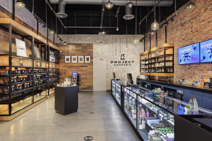
One of their most recent dispensary designs is Project Cannabis, an award-winning dispensary located in the heart of downtown Los Angeles. The location’s owners wanted the design team to construct a spot that was authentic to Southern California’s ethos as the birthplace of the cannabis movement, with a touch of DTLA urbanity, youth, and the specific brand of rock-and-roll culture native to Los Angeles.
“Our approach was one that remained true to the urban culture of Los Angeles, speaking to the dispensary’s younger crowd and allowing for ease of sale, which is always a priority for us,” said Alice Kuo, Caisson Studios’ founder and principal designer.
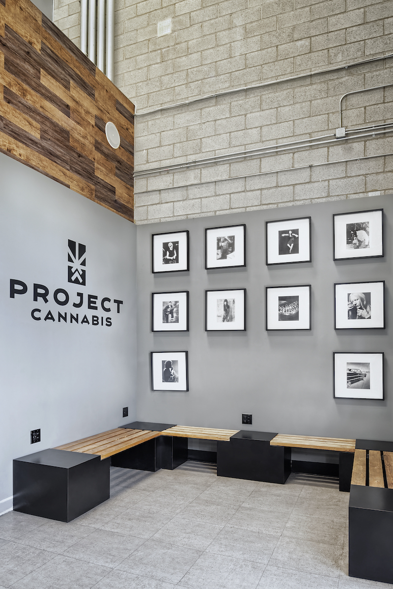
“The owners also wanted a design that paid homage to LA’s rock-and-roll past and present, featuring vinyl records of local bands and highlighting the works of emerging visual artists and spoken-word poets in the area.”
The dispensary, located at 1555 Newton Street, is a 36,000-square-foot warehouse facility that produces 600 pounds of flower per month. Because of this, Kuo and her team wanted the location to remain amenable to high-quality production while also being able to appeal to young, hip consumers.
The Caisson team kept many elements of the structure intact, making a few simple but impactful and stylish tweaks to transform a basic high-ceilinged warehouse into a hip spot for young cannabis consumers to explore new brands, listen to cool new music, and experience LA’s decades-old scene.
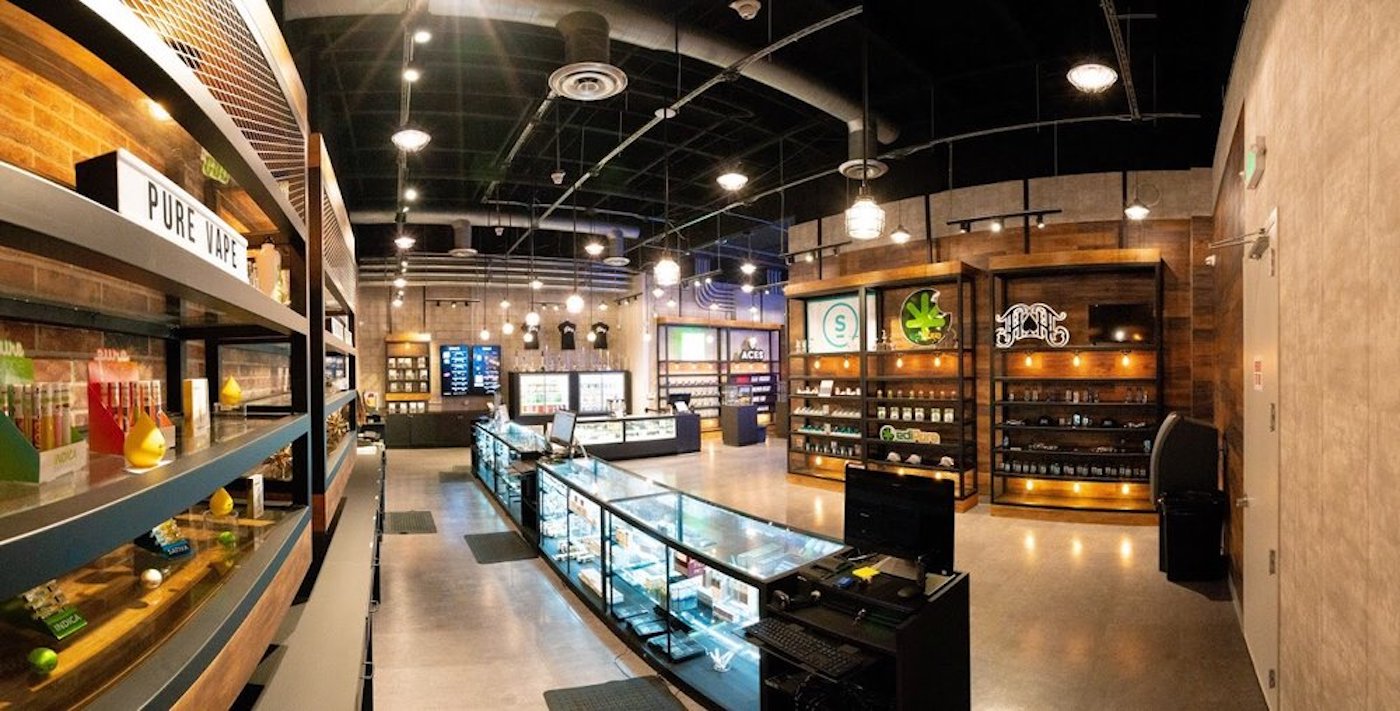
“The ceiling is pretty high throughout the entire building—around twenty feet. The warehouse also had exposed pipes above, so we kept that and inherited aspects of the concrete floor in a way that was better for acoustics,” Kuo said.
“We wanted to keep the really high ceiling for the flower production and HVAC system, but when you have really high ceilings, it will make you feel cold and detached, like you’re in an elevator shaft. We wanted to visually bring down the height of the wall without bringing down the ceiling, so in order to achieve that, we used wall-material separation as a sort of optical trick. We added wallpaper material to stop at twelve feet, and everything above that was painted black.”
The team also chose an exposed HVAC system that blends in with the exposed piping and ties the urban feel together. They also kept the warehouse’s suspended light fixtures, adding some softer light bulbs for warmth and accentuating the exposed lighting and electrical wires to emphasize the industrialism of the space.
Caisson’s strategic layout plans
In every project Caisson Studios takes on, the layout plan prioritizes ease of sale for both the budtender and the consumer.
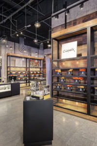
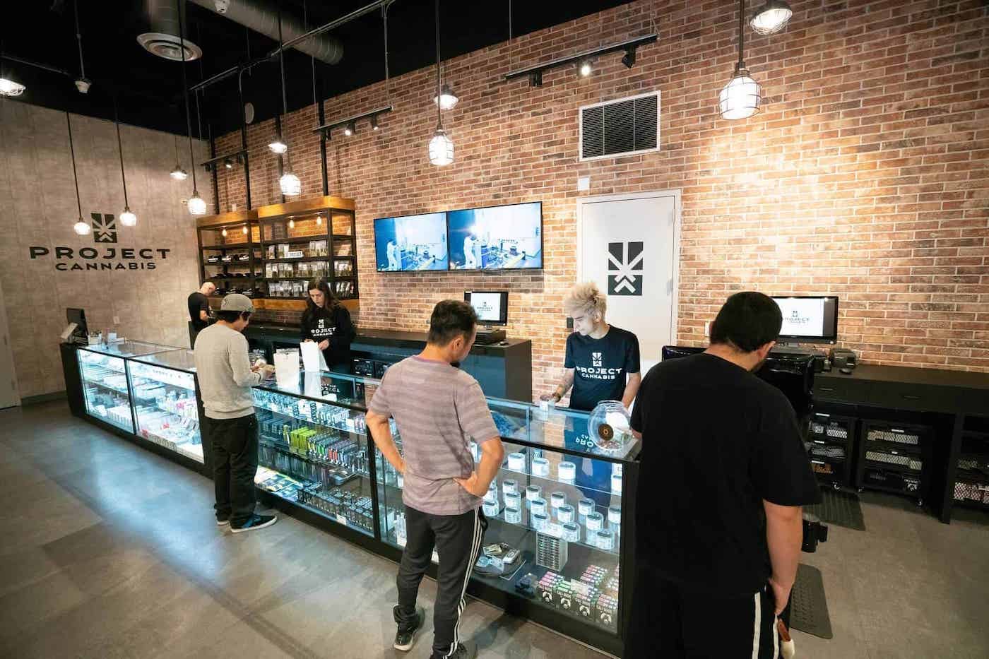
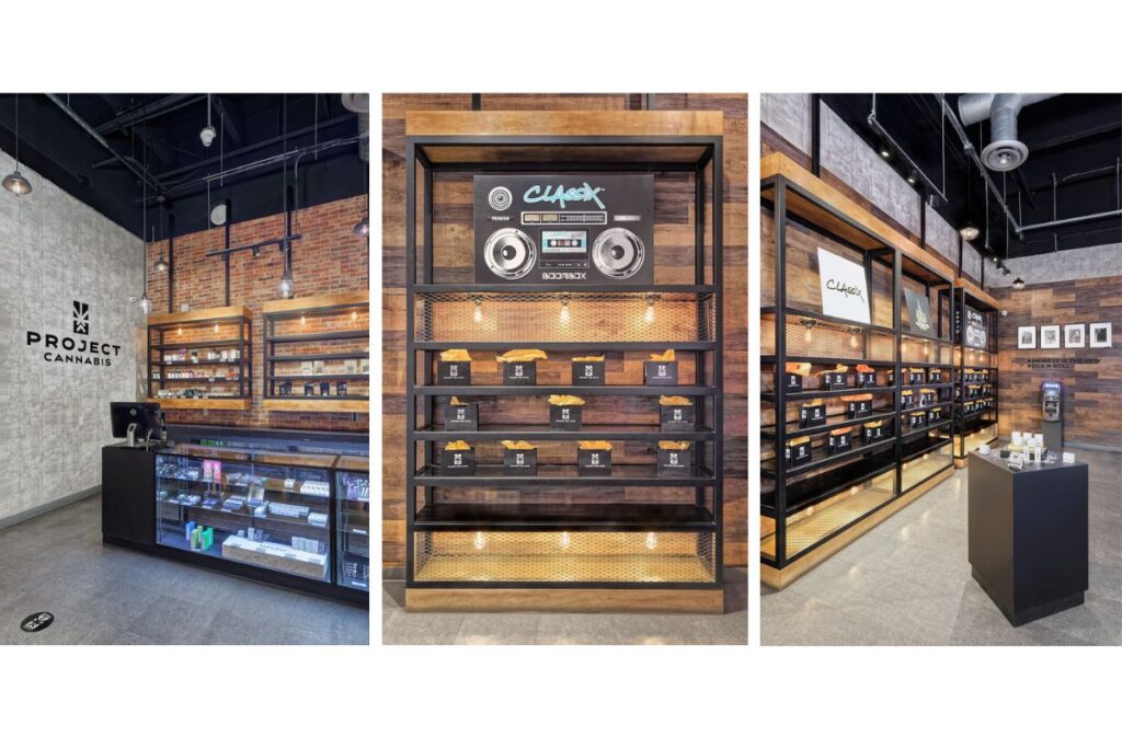
Project Cannabis features three different types of layout: 1) A more traditional behind-the-counter experience with glass displays and a menu on the back wall; 2) An open and accessible display on the left-hand side that is utilized for vendor appreciation, special promotions, and opportunities for education and recommendations; and 3) Freestanding island displays for consumers to peruse on their own time.
This combination of shopper experiences under one twenty-foot roof allows for consumers to really live through every aspect of LA cannabis culture—and allows operators to provide a variety of purchase methods to consumers based on their preference and comfort level.
“We used a roll-a-cart system behind the counter on the right-hand side so budtenders can fill orders more quickly and keep track of inventory with ease. The open display on the left allows for vendor exposure and discovery, and it also helps the location avoid theft because someone will always be stationed at the display to answer questions, educate, and protect the loose product,” Kuo said.
While all of these details are vital to the overall aesthetic and layout of the location, Kuo and her team couldn’t stop there as far as consideration goes. The real brilliance of Caisson Studios’ approach lies in the details that aren’t exactly eye-catching but are absolutely essential for a sublime shopping experience.
Finishes, fixtures, and equipment
Keeping things as close to the original warehouse location as possible sounds like a great idea for both the urban rocker aesthetic and cutting costs, but one major thing Kuo and her team had to consider was sound.
“When a space has a really high ceiling and existing material like concrete and metal, the problem with the acoustics is they’re going to bounce off each other … a lot. And when you’re using that space for retail with everyone talking and walking, the sound is going to bounce around even more, creating a resounding echo that can be incredibly distracting and overwhelming for shoppers, especially if they’re prone to sensory overload,” Kuo said.
While Caisson wanted to keep that look of industrial urbanity, they also had to choose their materials carefully to help with the deafening of all that sound. To achieve this, the team covered the exposed concrete floor with luxury vinyl tile (LVT), which looks just like concrete but helps with the sound tremendously.
They implemented the same approach with the walls: Instead of keeping the exposed concrete, they opted for wallpaper with a concrete look to soften and even absorb the consistent sounds of the retail experience.
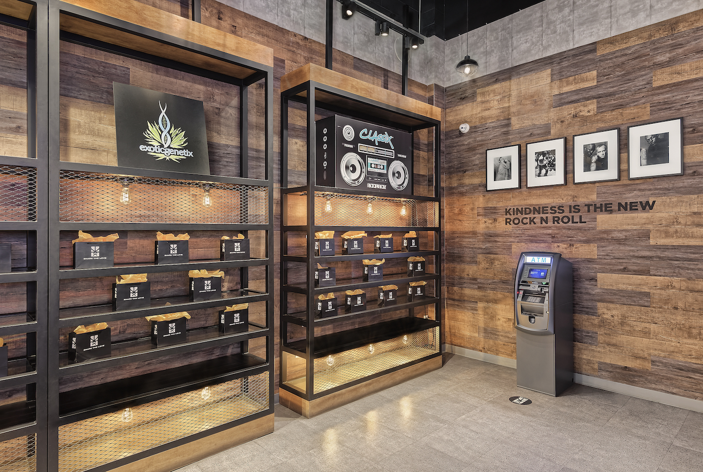
As for the wooden displays, Kuo wanted to incorporate the material for an element of warmth, but actual wood would present the location with the same echo problem as concrete. To remedy this, Caisson chose luxury vinyl plank that looks like real wood, blending a variety of colors together for an authentic aesthetic. This cut costs for the owners and muffled sound for the location overall.
Another thing Kuo and her team considered was color. Much of the building was gray and black, which presents a cold, almost sterile and non-human feel.
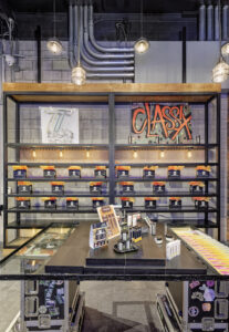
“To warm the space up, we added the warm wood colors, a red brick veneer behind the retail display, Edison light bulbs to bring warm lighting into the space, and to tie it all together, a warmer shade of gray paint and wallpaper,” Kuo said.
Of course, the team couldn’t forget to address the sought-after rock-and-roll vibe.
“To add that touch of LA rock, we added artwork, photographs, themed quotes on the wall, neon signs, and graffiti art,” Kuo said.
With Caisson Studios, no detail goes untouched, no budget goes unconsidered, and retail profit remains the number-one priority throughout the entire process.


