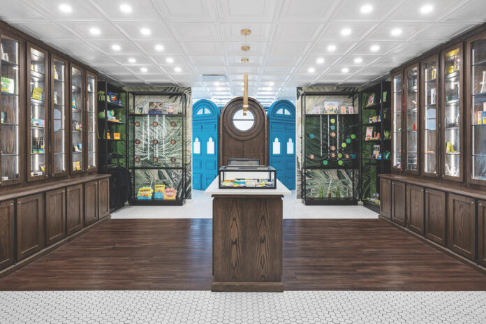
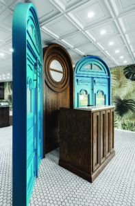
With deep apothecary cabinets, scalloped-tile ceilings, marble countertops, and sketches that could as easily adorn a botanist’s notebook as dispensary walls, Canadian chain The Herbary transports modern consumers back in time as soon as they step through the dramatically massive, blue front doors.
But that was the goal of co-founder and Chief Operating Officer Richard Fuller when he and his team came up with the idea for the charmingly eccentric stores. The Herbary is a fine example of quality collaboration between owner and designer, resulting in a dispensary with a personality perfectly matching its physical structure: vintage yet modern, elegant yet casual, and inviting to consumers of all kinds.
The Herbary’s founders have a long history in retail financial services, so they already were accustomed to operating in a tightly regulated environment. Once Canada legalized adult use, the team saw an opportunity to destigmatize retail cannabis.
“We wanted consumers to be able to walk through the door and not feel like they’re in a pot shop, but we also didn’t want to alienate that core customer by being too fancy,” Fuller said. “The Herbary is an attempt at casual professionalism, with casual always coming first.”
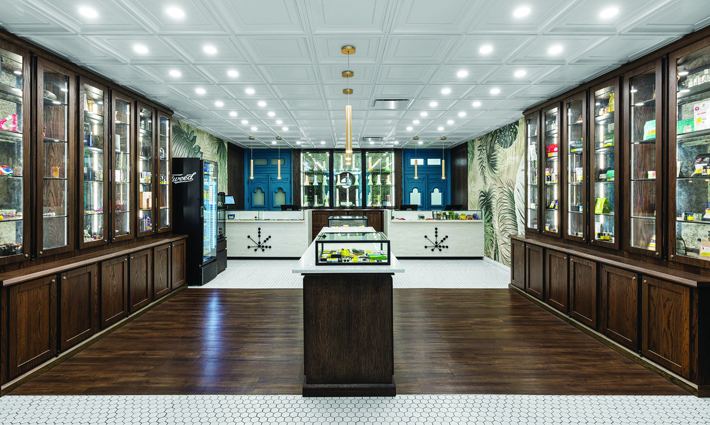
Elaborately designed to evoke a modern apothecary, the five-location chain was conceptualized by Fuller’s team and brought to life by international interior-design and fixture-manufacturing firm SevenPoint Interiors. The Herbary team was intent on creating a dispensary that offered a welcoming, old-timey feel—from staff to merchandising.
“Centuries ago, my great-great-great-grandfather was the apothecary to the Marquess of Queensbury,” Fuller said. “I remember growing up in Montreal, and my mother would still say, ‘Let’s go to the apothecary.’ This inspired me to settle on the name The Herbary, because herbs in general have been used for cooking, medicinal purposes, and general mellowing out since the beginning of time, and the same can absolutely be said for cannabis.”
The vibe begins with the dispensary’s decor and is carried throughout by the staff. The Herbary doesn’t employ budtenders; instead, “herb masters” don tweed vests and jeans before providing customers with extensive, but friendly, education about the plant.
“There aren’t too many points of differentiation in retail cannabis, so I thought it would be nice for us to go down a more professional-looking route with the staff, if for no other reason than to ensure customers these guys look the part of someone who would be able to really help them out,” Fuller said. “Layered on top of that look is enhanced and extensive employee training. Our herb masters don’t just tick the box to sell products.
“And all of that goes back to our initial idea: Low prices and beautiful stores with well-trained staff don’t have to be mutually exclusive,” he added. “From a design perspective, SevenPoint totally got it.”
“One of the first images we showed The Herbary’s team was a ‘parliament of plants’—a drawing of plants that look like members of the English Parliament voting on items,” said SevenPoint designer Jano Badovinac. “We wanted to have that happy, silly moment that set us on a journey with the team. From there, we were ready to launch.”
The SevenPoint team focused on cabinets as a defining motif. The Herbary’s look as though they might contain decoctions and potions and other handmade remedies. Double doors with glass fronts ensure stock is clearly visible in the wooden cases. SevenPoint’s modular system makes the design portable and easy to scale across future locations.
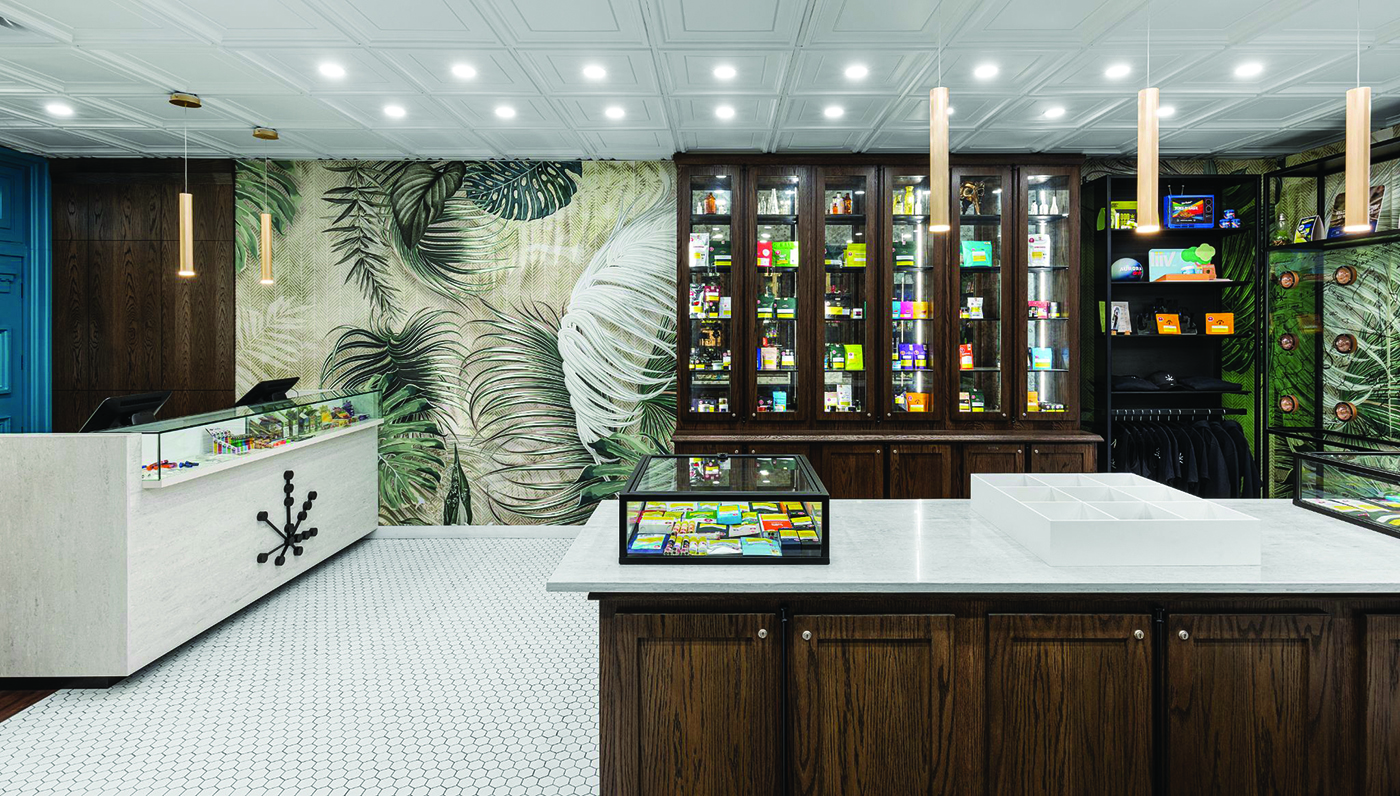
The Herbary features a careful blend of modern touches and vintage references, with illustrations resembling botanist notes on the walls and copper accents with rich patinas throughout the locations. The designs achieve a warmth and depth that feels like an extraordinary botanical experience rather than an ordinary trip to a dispensary.
“For the floors, we used smaller hexagonal tile as an homage to old pharmacies,” Badovinac said. “We didn’t want the place to feel cold and sterile, so we integrated wooden floors in the center of the space.
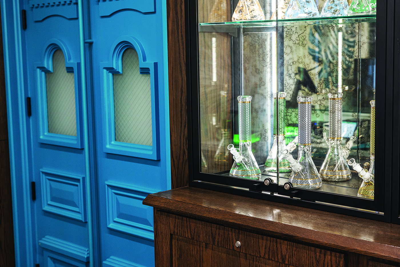
“Essentially, we took a retro apothecary and inserted it into a modern space,” he continued. “That’s seen in the marble-topped counters and the old-school scalloped-tile ceiling. We also used antique glass behind the cabinets. We wanted it to feel like some of these pieces were found, vintage pieces. We wanted to play with color and light as much as possible.”
SevenPoint also had to navigate a few unique challenges during the design process, such as factoring in scalability with different potential floor plans and allowing for street-view discretion.
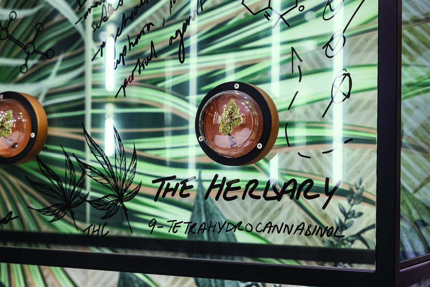
“We didn’t necessarily know what the floor plans would end up being at the various locations, so we had to make sure we could adjust them to be bigger or smaller if needed,” said Randy Simmen, SevenPoint’s head designer. “Also, the legal industry in Canada is still relatively new, so we needed to make sure visibility from the street into the store was blocked so passersby couldn’t see products or transactions taking place.”
Once these minor bumps were smoothed over and the dispensaries were ready to launch, The Herbary’s team was thrilled with the final design: floor plans that passed the vibe check and have held up beautifully over time.
“Our staff takes pride in maintaining our stores, because the build quality is so fantastic,” Fuller said. “SevenPoint Interiors went into the process with a win-win attitude, and that really shone through every step of the way.”


