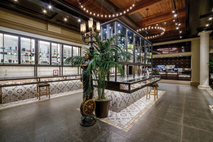
Not long ago, cannabis dispensaries were functional but hardly stylish. Nowadays, poorly lit establishments selling “pot” from funky jars in shady parts of town are rare. And good riddance. As the industry sheds the trappings of yesteryear, the emergence of multimillion-dollar, award-winning dispensaries speaks volumes about where the cannabis industry is heading.
Megan Stone launched The High Road Design Studio in 2013 and has had a front-row seat to the extraordinary evolution of dispensary design. Stone, whose award-winning work can be seen in dispensaries across several states—Arizona, Texas, California, Oregon, Florida, Colorado, and Washington state—said comparing today’s design trends to what existed two years ago is like comparing “apples to oranges.” As the industry matures and brands begin to become powerhouses, retail brands and the way consumers experience them will drive new customers to shops and keep current customers coming back. “A well-positioned brand and a well-executed retail experience are sellable assets,” Stone said. “With the recent flurry of mergers and acquisitions taking place, we see examples of this in the market all the time.”
“A well-positioned brand and a well-executed retail experience are sellable assets.”
—Megan Stone, founder & owner, The High Road Design Studio
Good business all around
Stone said many of her clients are paying more attention to their back-of-the-house design and how products make their way from the vault to the exit. Increasingly, retailers want behind-the-scenes workspaces that support order fulfillment and efficient operations. “They also want space that can accommodate vendor meetings as well as provide opportunities for vendor pop-ups,” said Stone.
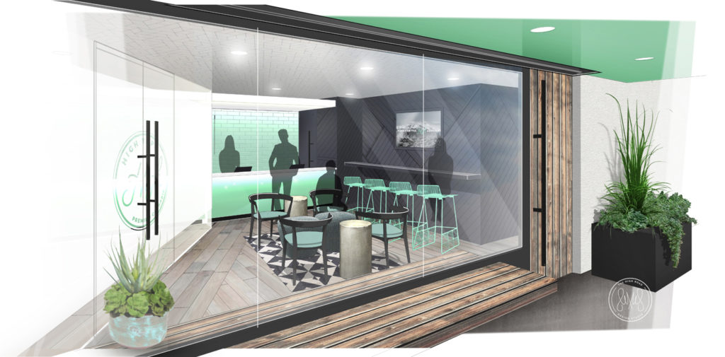
Having designed both medical and recreational shops, Stone has learned to appreciate their different needs. For example, when designing adult-use stores, the key often lies in creating a balance between appealing to the curiosity of those who have never visited a dispensary and creating efficiency for regular customers. “The [recreational] setting needs to accommodate browsing and encourage questions while also providing an easy way to navigate the showroom and purchasing process,” she said. When it comes to medical settings—where patients have gone through considerable effort to become qualified—they’re not visiting the store to shop but to buy a specific product. According to Stone, medical design is less about pulling people in and more about providing a fulfilling, painless experience.
In newer, medical-use-only states like Florida, Maryland, Texas, and Pennsylvania, where the primary products are extracts and concentrates, Stone’s clients focus on creating standard-setting retail experiences showcasing the positive impact a dispensary can have on the community. “They are demonstrating that this is a program for sustainable business and setting the stage for solid industry expansion and growth,” she said. “They also are positioning themselves for inevitable expansion and change in their business—from medical to eventually adult. Designing a space that is relevant now without becoming obsolete in the future is a must.”
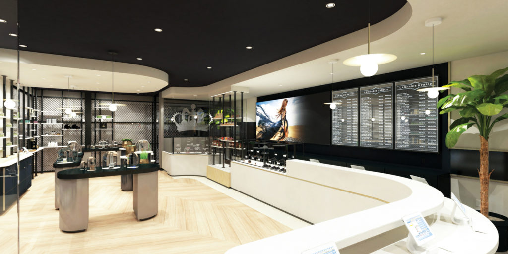
In many places, that future is now. Danielle Marzarella, vice president of business development at Toronto-based design firm SevenPoint Interiors, said clients are becoming more aware of the importance of integrating branding into their store design and creating an “in-store experience.”
“Branding is not just a name or a logo,” she said. “It is a look, energy, and vibe created by good store design starting from the moment you stand outside the entrance to entering the lobby and then into the showroom. Owners are understanding this concept and looking for creative ways to communicate their brand through education, technology, textures, colors, bespoke fixtures, visual merchandising, local town influences, and lighting.”
Lobby for a lasting impression
One trend that exploded in 2018 is interactive technology. By combining menus with marketing, education, and entertainment, interactive screens have become a must-have to create an experience that leaves a lasting impression. The effort begins with the lobby.
Once a simple, semi-sterile place to wait while passing time staring at a cell phone, the lobby now is part of the store experience. Lobbies give customers their first taste of a retail brand, so the spaces need to be heavy on the “wow” factor. “You want that first touchpoint to be a warm and inviting space that also offers creative and unique opportunities for visual merchandising and education of what lies ahead in their journey,” said Marzarella.
Stone agrees, adding the lobby represents a great opportunity to show the general public just how “dope” a dispensary is. “No matter the size, the lobby is the threshold to shopping in your store—and an opportunity for really great design touches,” she said. “The lobby is all about branding yourself to near shameless proportions and taking the wait out of waiting. Lobbies are a chance to educate, entertain, and engage. This is the place where you need to create a positive first and lasting impression.”
Part of that impression is color, which always has played a significant role in the world of retail design because colors can trigger an unconscious emotional response. The psychological effect depends on color choice as well as the color’s temperature. “This plays a vital role in our approach to developing and achieving the look and feel of a retail brand,” said Marzarella. “The right color selections can evoke excitement and creativity or bring on a feeling of calmness and wellbeing.”
Stone uses various color psychology approaches. For instance, when designing the medical shop Salvera in Maryland, she painted soothing hues of green and blue on the walls to relax patients, the majority of whom are seniors. For Florida’s Trulieve chain, which serves a younger demographic, she splashed the shop with oranges, yellows, and pastels to evoke the Sunshine State ethos. “I’m a huge fan of color,” she said. “It’s one of many design tools. Color, along with texture, proportion, scale, and line, are the elements and principles of design.”
“Branding is not just a name or a logo. It is a look, energy, and vibe that is created by good store design.”
—Danielle Marzarella, vP of business development, SevenPoint Interiors
As California Regional Director of BDS Analytics, Tamar Maritz spends a lot of time waiting in dispensaries for meetings. Over time, Maritz has seen lobbies go from dungeon-like to exciting hubs of high-tech wizardry and interaction. “The lobby has changed a lot,” she said. “There are now displays with brand and product ads plus promotional videos, and interactive touch-screen displays that allow consumers to browse and learn about products before going into the showroom.”
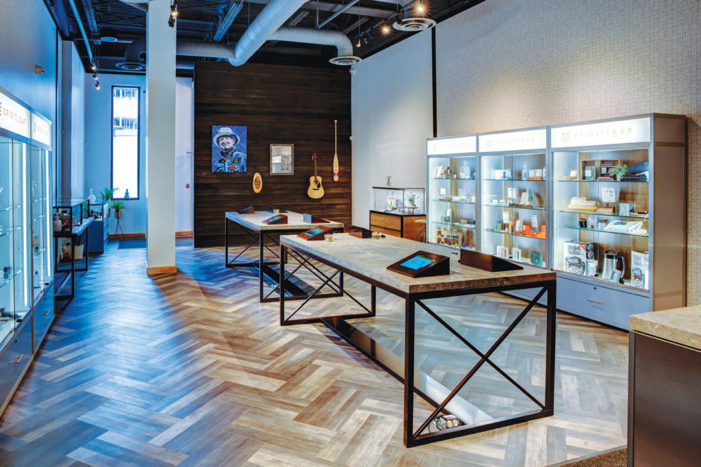
In some states, like Illinois, early dispensaries didn’t even have a lobby or waiting room. “If you weren’t already a registered cardholder, you couldn’t even get through the front door,” said Dispensary 33’s general manager, Paul Lee. “Thankfully, that’s changing.”
In Washington state, the lobby concept has come a long way from its early days when the spaces were populated by a few chairs and a flat-screen or two. According to Jeff Anderson, co-founder of Evergreen Market, many older shops were designed to open from the front door directly to the sales floor. “[Identification] checking gets a bit sticky, as does controlling the number of customers in the store,” he said. “Evergreen has split the difference. We have a unique willow wall that creates a lobby between the front door and sales floor.”
A different view
Not all dispensary owners see the lobby as vital. Aram J. Stoney, co-founder of Big Sur Canna+Botanicals, feels the cannabis lobby has become antiquated and unnecessary…despite Big Sur’s plush leather chairs, wood-paneled walls, and hanging industrial lights providing a cozy-country-cabin environment. “From what I have seen, it would appear that the lobby or waiting area is becoming less popular,” Stoney said. “The size of the space will ultimately be a deciding factor, if in the future there is a choice in having one or not.”
In addition, the concept of merchandising has morphed exponentially. As regulations relax, there becomes the possibility of a browsable atmosphere in the retail buying process. Fixture design and merchandise displays are now less restrictive and more flexible. Jesse Henry, executive director of San Francisco’s Barbary Coast, said some shops have taken on the supermarket model, where everything is displayed on shelves, allowing customers to grab what they want and pay for it at a checkout stand.
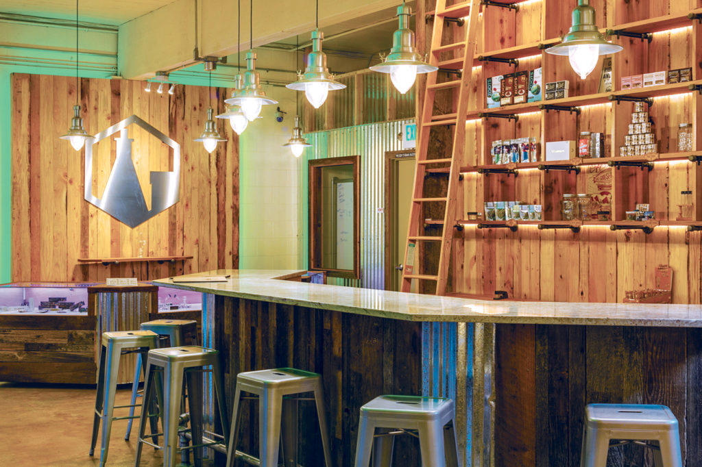
At Chicago’s chic and modern Seven Point dispensary, products are showcased in branded wooden boxes and glass humidor-like islands. “It has really allowed the dispensary to carry a large variety of products in a cool and different way,” said Nina Grondin, founder of design firm Curioso, the company responsible for Seven Point’s sleek look.
Product selection and the way shelves are stocked also is changing now that pay-for-play—a standard operating procedure in grocery retail—has entered the market, according to BDS’s Maritz. “There are shops that charge brands for shelf space,” she said. Maritz believes the practice will become commonplace as the brand landscape becomes more competitive.
Pay-for-play isn’t the only retail trick cannabis is borrowing from mainstream. Stoney said dispensary owners are beginning to adopt Apple’s in-store approach. For example, some stores now use roving customer service reps with iPads to take orders. “There is definitely a move to make use of all the digital platforms and technology with ordering,” Stoney said. “It’s all about efficiency.”
Checking in on checking out
One of the biggest concerns both Stone and Marzarella hear from their clients is, “How can we make the check-out process the best part of the retail journey?” As more patients and consumers visit dispensaries, checkout lines could become frustrating and time-consuming customer traps. The good news is, as the industry moves toward allowing cashless transactions there will be more opportunities for loyalty programs, technology integration, and normalization around the purchasing process.
According to Marzarella, the checkout experience is the most important aspect of dispensary design. It is, she said, the last point of contact the customer will have with a brand. “Creating a nicely designed, well-lit, and memorable area should offer good customer flow and continue to communicate the brand. Through creative visual merchandising techniques, the customer can continue their journey experience. It’s also a good idea to offer impulse purchases at the [point of sale]. It’s a great way to boost [units per transaction].”
Fancy façades and ambiance
Building exteriors also have undergone a creative metamorphosis. As zoning laws continue to change, dispensaries now can exist on Main Street—literally—next door to worldwide luxury brands like Burberry and Louis Vuitton. “This has provided tremendous opportunities for the evolution of the storefront,” said Stone. “The ability to frame views of the interior is a big marketing opportunity for dispensary owners. From using the exterior as a billboard to creating enticing glimpses that pique curiosity, there are endless possibilities for taking advantage of the dispensary exterior.”
Each state, city, county, and country has its own idiosyncrasies. For instance, in 2016 and 2017 Apple Store ambiance was all the rage in San Francisco; the trend has since run its course. Barbary Coast’s Henry believes as big corporate-funded shops come to market, dispensaries will cut back as much as possible on design expenditure. “I think we will begin seeing more of a cookie-cutter look with an emphasis on sales—not just on ‘experience.’”
Marzarella encouraged dispensary owners to take note of the experiential aspect of tailored retail establishments when working with a design partner to identify brand- and geographically appropriate opportunities. “It’s probably not a good idea to put [an over-the-top façade] on Main Street in the Midwest,” she said.
By traveling California and meeting with retail owners, BDS’s Maritz has found the novelty of purchasing cannabis at a “dispensary” is slowing, while delivery service is increasing. This shift affects scale, scope, and design investment. However, she believes California dispensaries nevertheless will evolve to provide more experiences. “These experiences range from on-site consumption to wellness and yoga classes, educational seminars, even shows and performances—anything that gives consumers a reason to keep coming back to the shop,” she said.
In Chicago, it’s all about sophistication. Larger brands are acquiring prime commercial real estate and designing dispensaries that look and feel like the oft-replicated Apple Store. “Design matters,” said Curioso’s Grondin, “and good design is no longer synonymous with larger investments. Design has become much more democratic. We’ve been seeing that trend across the hospitality industry, and it’s now permeated into cannabis.”
The trend has directly translated into sales. Seven Point and Dispensary 33, both stylish and smartly designed, have grown at a steady rate while others have had a hard time retaining their customer base. “Consolidation is starting to happen in Illinois, and several of our clients have been able to cash out nicely,” Grondin said. “I may be biased, but I do firmly believe design had a lot to do with those buyouts.”
The more things change
In Washington state, the current trend is to remodel rather than build a brand-new shop—but that is a catch twenty-two. “The problem with redesigning is that it is a hassle,” Evergreen Market’s Anderson pointed out. “It is easier to do nothing than to design and build a new layout while your store is open. The other option is to shut down for a period of time, and nobody likes that.”
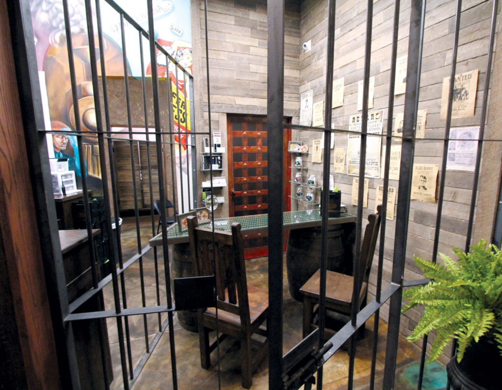
Colorado area designer Chad Daniels said he no longer is seeing bold dispensary design in the state, unlike in 2016 when he designed Smokin Gun Apothecary in Denver. His concept of a western speakeasy dotted with prohibition museum artifacts, a vault-like showroom with vintage prison cells, and historical “wanted” posters splattered on the walls probably would not fly today. “What we are seeing in Colorado is a movement toward modernism and minimalism,” he said, adding overall design in the state has improved nonetheless. “Brand identity is much stronger as well as packaging, apparel, and interiors,” he said. “While some places do focus on the classic hippy and artsy vibe, others dress up their image with a more sophisticated and minimal approach. There is definitely a much wider variety of styles now.”
At Denver’s Diego Pellicer, the owners bucked the hippy-artsy and modernist trends and undertook a $1 million gut-and-rebuild they said evokes “affordable luxury” and a “connoisseur’s paradise.” Bushels of foliage and dark, rich plantation woods hint at turn-of-the-century tropical balminess. Vases sprout fragrant roses, and products are displayed in handsome wood-and-glass retail islands.
“Diego Pellicer stores were designed to provide our customers an upscale retail environment with a Spanish-architecture-influenced aesthetic,” said Greg Quist, who designed the stores. “Our goal was to refine the experience and spare no expense in outfitting the spaces.”
In Oregon, there’s been an uptick in new dispensaries. While they vary greatly in design, ranging from twists on high-end jewelry shops to woody reflections of the Pacific Northwest to quaint farmers’ markets and even frat-house chic, the one commonality is niche clientele. Michael Green, owner of SpaceBuds the Dispensary—a sci-fi-themed shop in Eugene, Oregon—has even seen traditional headshops convert to dispensaries. “Mirroring the interests of your location’s demographic seems to work well in the state,” he said. “Location also plays a vital role. With so much competition, it is vital to stand out.”
While the state has a few big chains such as thirteen-store Nectar, traditional franchising has its challenges and limitations because marijuana remains a federally illegal Schedule I drug. Green doesn’t believe Oregon consumers respond well to chains anyway. “Chains are not always well received,” he said. “This may be due to the fact that much of the marijuana culture was founded on an anti-establishment culture. Larger brands with unknown or out-of-state proprietors may sometimes be perceived as ‘the man’ and turn off customers.”
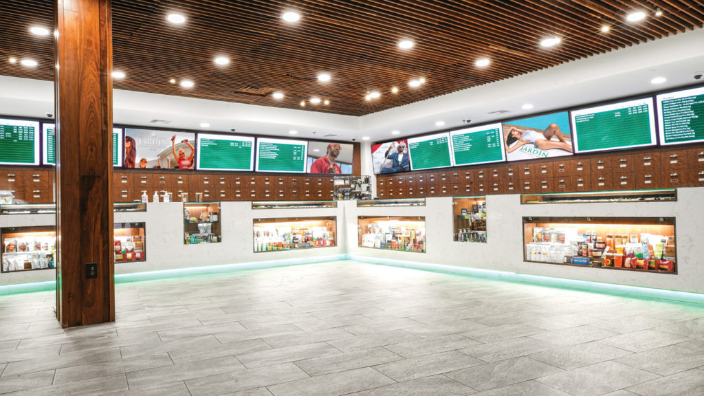
In Las Vegas, it’s all about kitsch and theme-driven experiences—the bigger and bolder the better. Whether emulating a high-roller-wood-paneled-backroom-parlor aesthetic like The Apothecary Shoppe; the hyper-modern, high-tech feel of Jardin; or the old-school jewelry store ambiance of The Apothecarium, there’s no town doing cannabis with more panaché.
Full steam ahead
So, what does the future hold? No one really knows for sure, but Stone is excited to partake in the journey. “2018 proved to me that a well-designed dispensary is truly a force to be reckoned with,” she said. “The cannabis industry is growing so fast, and dispensary design is a thriving business. We have provided consumers with a rare shopping opportunity: a welcoming place to walk in and talk openly about something that changes their life. And we are just getting started. The future is full of exciting design possibilities.”
Marzarella is equally buoyant. “The industry itself is changing rapidly and allowing for more variety in the retail market,” she said. “While it is difficult to predict trends, I believe we will continue to see a variety of [retail location sizes] geared to individual markets. However, most shops we have been working with are averaging in the 1,500- to 2,000-square-foot range. I think they are finding they can offer a great assortment of product if the merchandise is planned properly during the design stage.”
See more pics, below:


