Ryan Roebuck started in cannabis as a money guy. His early success in investment banking led to a lucrative stint at XDL Capital Group, a private equity firm founded by respected Canadian entrepreneur Dennis Bennie, before Canada’s new cash crop came calling. As a founding investor and director of the Cronos Group, Roebuck got in early on several of the most prominent licensed producers in the North American market, and today the fund counts luxury CBD giant Lord Jones and its sub-brand Happy Dance among its flagship holdings.
As a venture capitalist, Roebuck was trusted to find, vet, enable, and guide the creative work of others, not to create things himself. His latest venture, however, is the most personal and revealing work of his career to date: Edition, a pair of immaculate, high-design dispensaries in his own backyard, downtown Toronto. The hyper-minimal retail concept is informed by his long-standing affinity for contemporary design, architecture, and streetwear and sees him step into a new form of curation and creative direction. But while Edition represents the convergence of Roebuck’s passions, it is far from a passion project.
Roebuck has been participating in and analyzing the adult market’s maturation for almost a decade and now sees the demographics widening and dividing enough for him to find an audience for his creative vision. Edition’s particular target—the affluent, decadent, hypebeasts of downtown Toronto—already intersects comfortably with cannabis culture and could be seduced by something intimately familiar yet completely different.
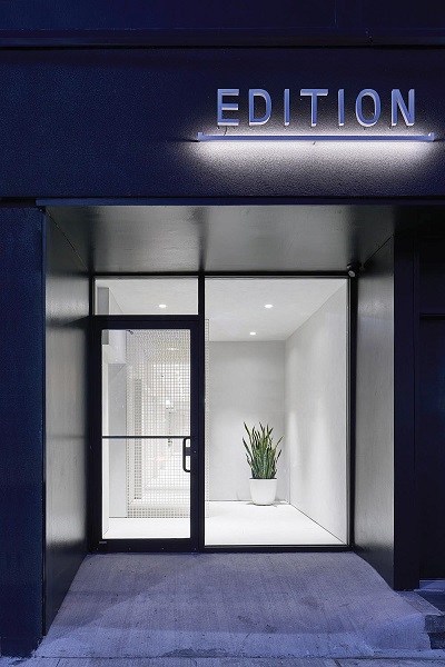
“It didn’t make sense that no one was creating a cannabis store that truly reflected the high-end retail experiences that already exist in our day-to-day lives,” said Roebuck, pointing to Montreal’s brutalist fashion hangar SSENSE as a point of inspiration for the stores. “We felt there was space for something truly special.”
The dispensaries are located in The Annex, which also is home to the University of Toronto’s St. George campus and Forrest Hill, the neighborhood where Roebuck lives with his wife. The residents of these dense and upwardly mobile communities shop locally in the area’s many independently owned stores, and Roebuck sees space for a local pot shop that’s both special and part of the weekly rounds.
“We’re close to their local butcher store, which is next to their LCBO [state-run liquor store] or their pharmacies,” he said. “We’re part of the community.
“Also, I live in Forest Hill,” he explained. “If anyone was going to put a cannabis store in my backyard it should be me, and it should be done in a thoughtful and meaningful way.”
Given the pedestal upon which Roebuck places elegant design, he thought it important to bring in the right architects to shape his ideas into a cohesive retail concept. Roebuck had worked with rising local architecture firm StudioAC on a personal project in the past and forged a strong bond with its young principles, Andrew Hill and Jennifer Kudlats. He drafted them to bring forward a concept that would “evoke feelings of intrigue and curiosity” but also would be a safe transition for people new to cannabis. “There is a lot of trust involved in giving people the creative freedom to come up with a bold concept,” Roebuck said.
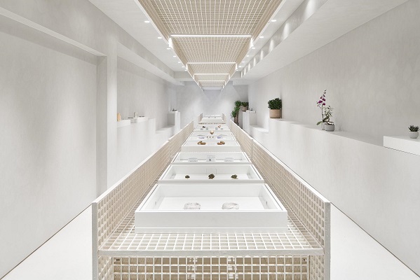
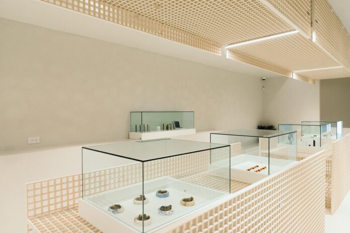
The StudioAC team brought their signature less-is-much-more style to confront the problem of stigma and trepidation about conventional cannabis retail spaces. “With legal cannabis consumption still in its infancy [in Canada], we imagine a cross section of customers being overwhelmed or intimidated when they go to one of these stores,” said Kudlats, co-founder of the Toronto firm. “We wanted the interiors to be almost gallery-like; allow the products to draw the eye and produce a comforting atmosphere for patrons to speak with experts.”
The Annex location is a bright, meticulously arranged tunnel with pastel concrete walls, abstract bench-shelves, and the odd sultry sansevieria, lending the space the curious aura of a modernist Greco-Roman bathhouse. Products are presented and lit like objects d’art, to be appreciated visually before being enjoyed psychoactively, and are displayed in a long central console that gives the space it’s subtle flow.
“Our layout pushes customers to do a full lap around the store and experience all the accessories and cannabis products we’ve curated within it,” said Roebuck.
Edition is intentionally inventory-light, preferring instead to present value in tight curation. With fewer than half the SKUs an average dispensary carries, Edition asks its customers to trust the same passion and attention to detail that went into the interior also informs the menu. The store opened with brands like California natives dosist and BIG Extracts and local strain Lords Carmel (with which Edition has a forthcoming collaboration). Roebuck also hinted Edition’s own line of products would be rolling out very shortly.
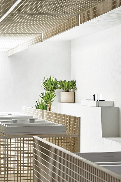
Edition’s dominant design feature is the functional and ornamental application of graded fiberglass. All around the store, an orderly repetitive grid reveals and obscures, creates boundaries and opens space in a playful yet orderly way. StudioAC’s architects were particularly eager to experiment with the material, which they previously had used for public art pieces and temporary installations. “Getting to use industrial grating in a permanent application after learning more of its structural, reusable, and aesthetic characteristics allowed us to put together the main display ‘sculptures’ quickly and accurately,” Kudlats said.
The novel material also allowed them to work through restrictions on product visibility from the street, which would have robbed the interior space of a lot of natural light. By using the grating to create a snaking entrance, sunlight pours through to the shop floor while sufficiently hiding all the cannabis.
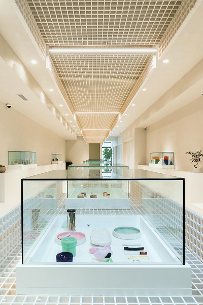
Like its Portland, Oregon, and Los Angeles counterpart Serra, Edition delivers on the breadth of luxury accessories it carries. Roebuck wanted to consider the lifestyle of its customers beyond the direct consumables and offer the necessary extras that complete the experience, all while arousing the measured hedonism Edition seeks to stir. “There were very few cannabis accessories in the marketplace that reflected the ethos of our store and our community,” said Roebuck. “We wanted to present accessories as art that can sit on someone’s coffee table.”
The accessories run the gamut from affordable and useful ($24 for a Red Eye glass pipe) to expensive and esoteric (a $200 lighter sleeve by Goyard). Among the collection are pieces like ceramic bongs and pipes from California artisan designer Summerland and custom-scented candles by Murphy & Jo, the fragrance of which permeates the air throughout the store. A collaboration with edgy Canadian fashion designer Mr. Saturday is coming later this year.
“Collaborating with these like-minded individuals that already have an existing following that is already consuming cannabis in their daily lives is a key part of our strategy,” Roebuck said. “We hope Edition will sort of close that loop, and we thought the best way to do that was to thread all of these concepts together through high design.”
With Edition, Roebuck presents a concept that could exist only after the cannabis market entered a new and important stage of its evolution. Diversity of users means diversity of experiences, and many of the consumers Edition entices perhaps haven’t had the right kind of familiar experience to convince them it’s time to see what the fuss all about. So far, the response from patrons has been incredibly positive.
“It is very fulfilling to see the reactions and hear the comments of those visiting Edition,” Roebuck said. “We tried to break the stigma of the traditional dispensary and have created something that resonates with our community.”




[…] Edition X | Toronto | February 2021 […]
[…] undeniable elegance and sophisticated minimalism—including in its intentionally small, tightly curated inventory—Edition X in Toronto’s tony […]