Humans have a complicated relationship with convenience. We’re forever chasing shortcuts and quick fixes, implementing them wherever we can to move faster and accomplish more. Perhaps that’s why some minimally designed dispensaries find success: Their interiors don’t attract attention or intentionally engage consumers, providing little distraction from the products on display. However, streamlined shops, while great for in-and-out shoppers, cannot rival the allure and “stickiness” of craftsmanship, creativity, and eye-catching quirkiness, even if these elements take longer to create.
When seeking an unforgettable retail experience, seasoned consumers turn to brands that invest considerable time and resources into crafting something unique and compelling. The following dispensaries have mastered this kind of delivery, at least in small ways. This list of trailblazing retailers celebrates noteworthy quirk because each has dared to be different with its interior design. The shops declined to embrace the status quo and, for them, the decision to be different proved worthwhile. From old-school apothecary references and 1950s diner-style checkout counters to infused airport terminals and one of the world’s tiniest museums, these shops used their surroundings to create an experience so unforgettable, customers likely decided to become regulars without fully understanding why.
While humans may perk up at the idea of convenience, the unusual and enigmatic are remembered. Why? Because thoughtfully eclectic designs emit a powerful vibe that’s hard to resist. Such designs speak subliminally, whispering, “This space was curated with love, compassion, and practiced expertise. We know what we’re doing, we care deeply about your experience, and we’re here to help. You can let your guard down now.”
Grass Monkey
South Portland, Maine
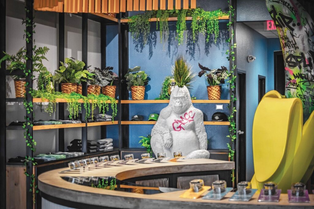
After conducting competitive analysis at numerous West Coast dispensaries, the team at Grass Monkey pinpointed two descriptors they aimed to avoid: sterile and boring. From the giant banana guarding the cash stand to the gorilla standing sentinel at the flower bar, it’s evident they achieved their goal, ultimately creating an environment that entertains. The first visit to a dispensary can be daunting; rather than address this unease with overly enthusiastic budtenders or an overwhelming amount of information, Grass Monkey attracts consumers with whimsical, cartoon-like elements. The approach serves as a reminder that fun can be a powerful marketing tool.
The Apothecarium
San Francisco, California
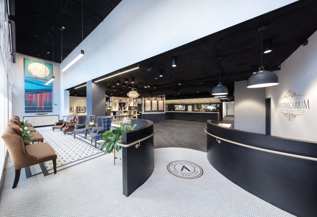
With sleek lines, moody colors, and meticulous tilework at the entrance, The Apothecarium in San Francisco’s Castro district exudes elegance without veering into pretension. Launched with a goal to define the cutting edge of design, the dispensary employs neoclassical architecture while maintaining a cool, casual atmosphere. Striking this balance is challenging: too laid-back, and the shop might be dismissed as just another convenience-focused brand; too elegant, and some visitors, particularly newcomers, might feel intimidated, overwhelmed, and reluctant to return. However, The Apothecarium mastered the delicate equilibrium, ensuring customers feel uplifted by their experience rather than alienated by an aura of exclusivity.
Serra
Portland, Oregon
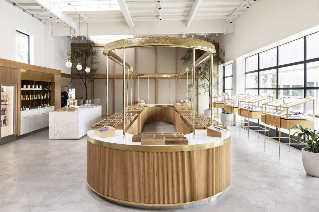
The cannabis market’s current aesthetic was influenced by two distinct themes: high-tech, Apple-like minimalism and a bohemian head-shop vibe that felt more legacy than legal. Serra’s founders viewed their concept as too elevated to be constrained by the prevailing dichotomy, so they set about creating a space with a Louis Vuitton-type appeal, drawing inspiration from luxury fashion retailers like Barneys and Henri Bendel where boutique-like mini-departments draw a chic clientele. Essential to the concept is Serra’s prominent central counter. Resembling a cosmetics counter at Bloomingdale’s, the fixture is designed to provide service with the ease, visibility, and a welcoming ambiance typically associated with high-end department stores.
Airfield Supply Co.
Redwood City, California
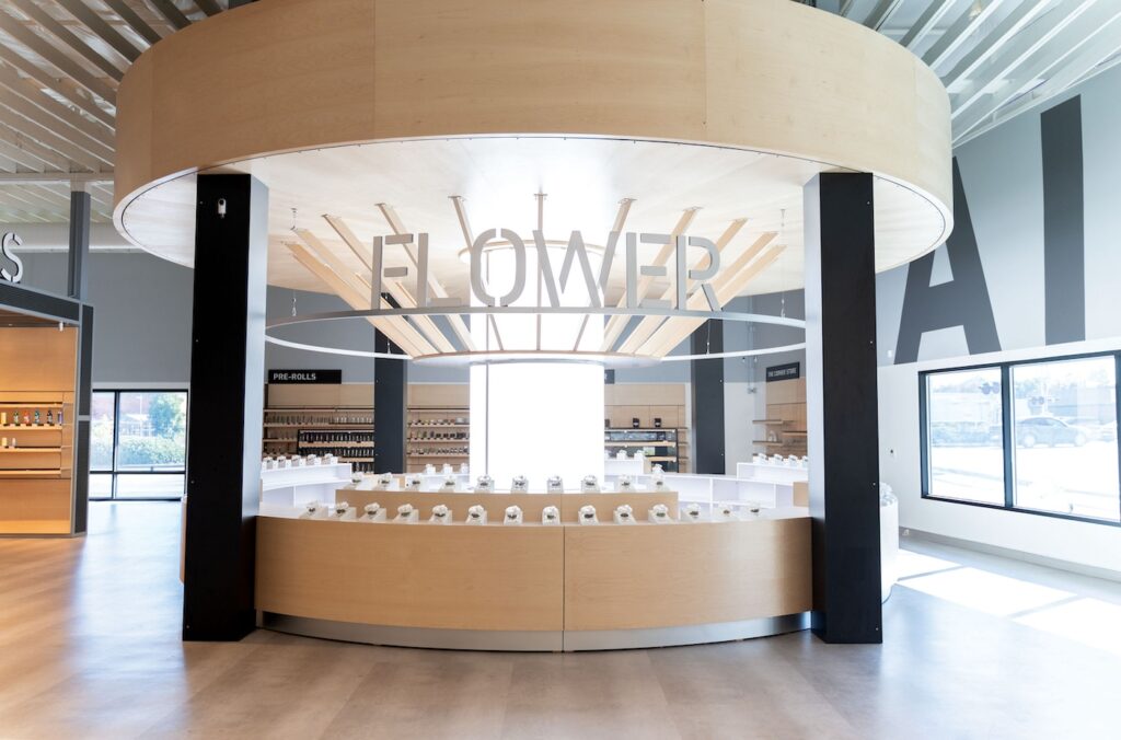
Airfield Supply Co.’s interior design reimagines a dreaded destination: an airport terminal. This dispensary uses cannabis to invite visitors to reshape their negative perceptions of navigating security checkpoints and running for departure gates. In a manner similar to navigating the bane of frequent fliers, but with a delightful twist, consumers enjoy a novel shopping experience that is both unique to the dispensary world and cheekily reminiscent of a common travel ordeal—making it from the ticket counter to the plane without a mad dash. Here, the pace is leisurely and customers are encouraged to take their time browsing, learning, and exploring. The shop’s centerpiece, a circular flower bar, warmly invites customers to experience the newest strains, and its 360-degree carousel ensures there’s always room to belly up to the bar.
Deli by Caliva
Bellflower, California | Hanford, California | San Jose, California
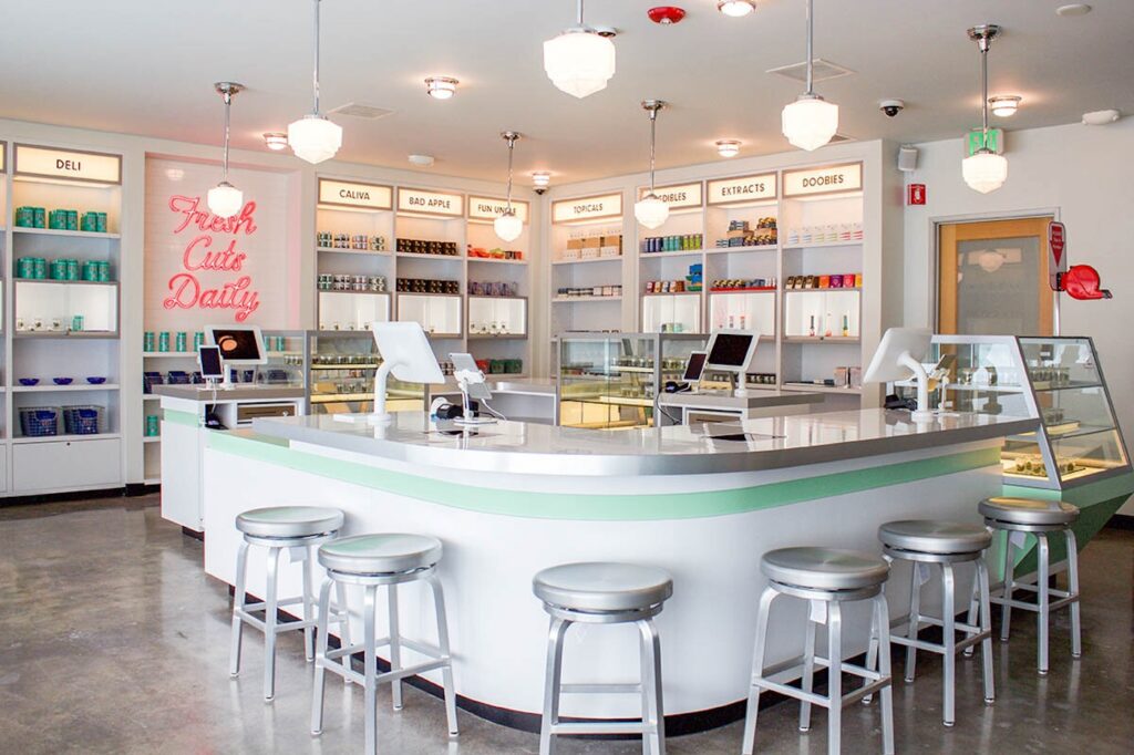
Inspired by the charm of 1950s diners and malt shops, Deli by Caliva’s flower counter blurs the line between purchasing products and ordering a banana split, or perhaps some enchanting hybrid of the two. The store’s design immerses customers so deeply in nostalgia that they might expect a budtender clad in Good Humor white to glide over on roller skates and take their order. The unique design transforms the store into a genuine day-trip destination as opposed to merely a quick pit stop: An engaging and visually appealing theme ensures Deli by Caliva’s offerings hardly need to vie for attention. Patrons are invited to immerse themselves and momentarily leave behind the year 2024; herein, escapism takes center stage, making the presence of flower and infused products a delightful add-on.
Dockside Cannabis SODO
Seattle, Washington
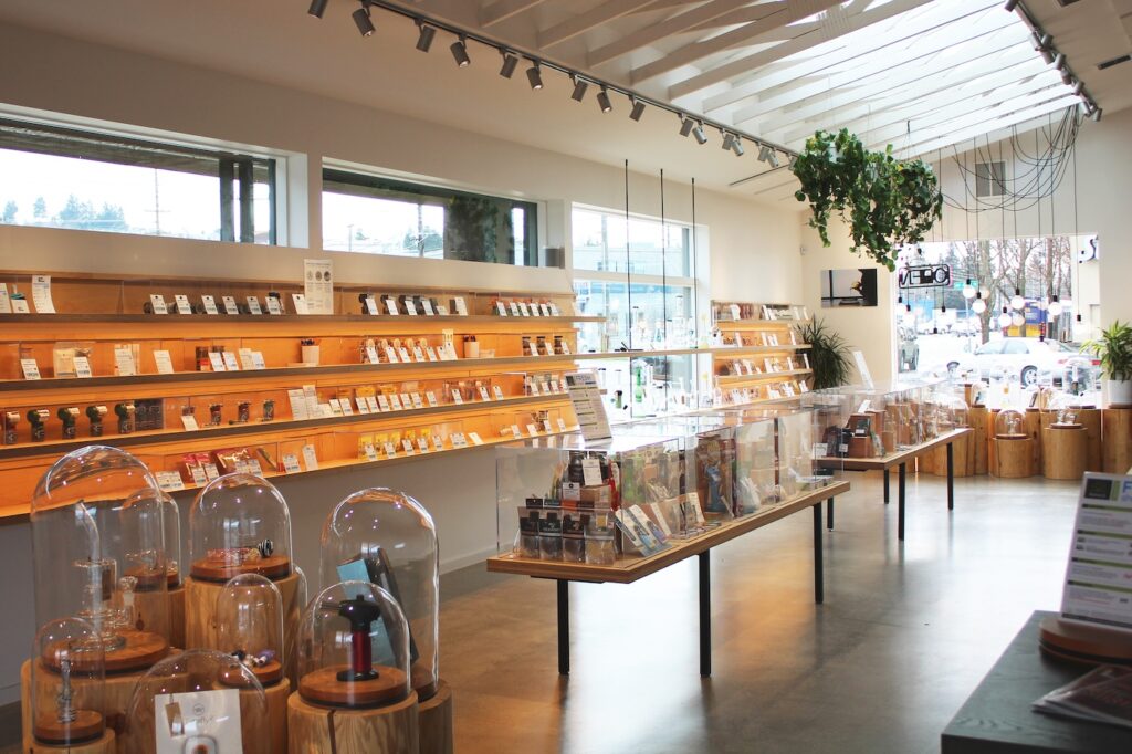
History buffs visit Dockside’s “south of the dome” (SODO) location for its quaint cannabis museum, which displays historical artifacts pertinent to today’s industry and community. Echoing the thematic prominence of establishments like Airfield Supply Co. and Deli by Caliva, Dockside evokes a nautical theme. Visitors in a hurry may overlook the value of the shop’s collection of relics, but those eager to uncover plant trivia and learn about prohibition-era apothecary items as they queue to check out find the experience intriguing, stimulating, and enlightening.
The Herbal Cure
Denver, Colorado
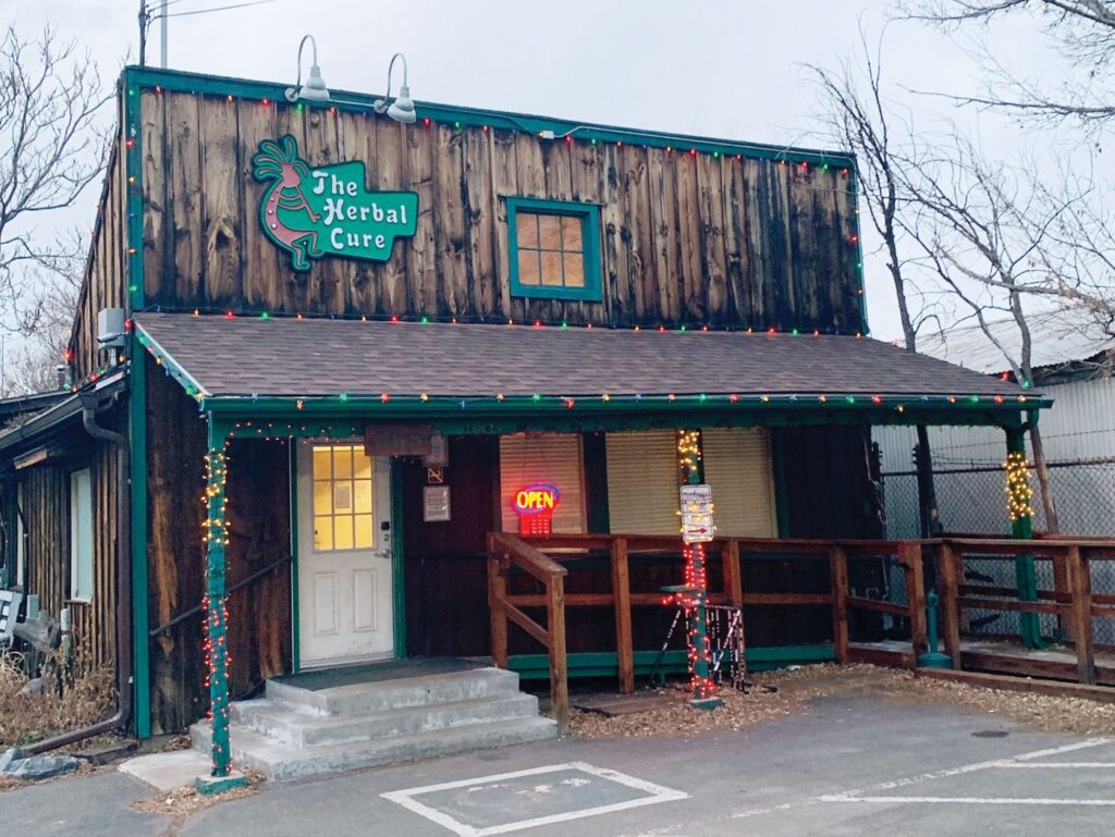
This Denver favorite is housed in a rustic cabin and caboose, both decorated with murals of legendary figures like Janis Joplin, Cheech and Chong, and Willie Nelson. The space’s design effectively taps into two branches of Colorado tourism. While some visitors are drawn to Denver for its stunning natural landscapes and rugged mountain lifestyle, others are attracted to the legal adult-use scene. Those aiming to experience both will find their sanctuary in The Herbal Cure, where products are sold within a modest, homespun interior that pays fitting tribute to the state’s outdoor grandeur.
The Bohemian Chemist
Philo, California
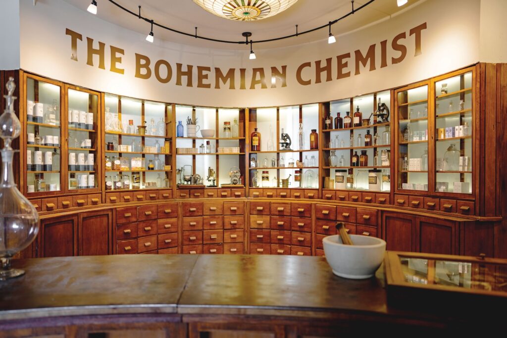
The Bohemian Chemist operates as a dispensary within a spa, and its interior design at once transcends and embraces both sectors, inspiring trust, relaxation, and goodwill. Co-founder Jim Roberts chose his Italianate enclave, The Madrones, as the site for the venture, drawing on an existing winery business to shape a new, plant-infused space. “In designing, I aimed to evoke the 1920s and tap into the spirit of the Art Deco Era mavericks,” he said. “We engaged a London-based designer known for their expertise in antique typography for our logo branding. Then, I secured the complete interiors of a European pharmacy through auction, acquiring the cabinetry for our shop. Notably, these Art Deco interiors originated from Hungary and had remained within the same family since 1910.”
Root’d in the 510
Oakland, California
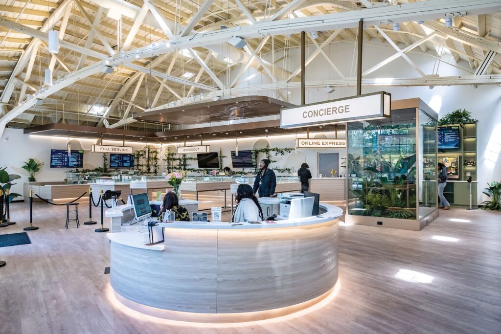
Equity-owned Root’d in the 510’s soaring ceiling, combined with abundant windows and brass-and-glass display fixtures, gives the dispensary an uncommonly spacious atmosphere reminiscent of a swanky hotel lobby or ultra-modern airport terminal. Liberally studded with living greenery and dressed in creamy neutrals from the floor to the exposed rafters and flying buttresses supporting the roof, the entire space oozes a Zen vibe that puts customers at ease right away. A large concierge desk near the front adds punctuation to the shop’s reputation for friendly, knowledgeable staff and a relaxed browsing experience.
Substance
Bend, Oregon
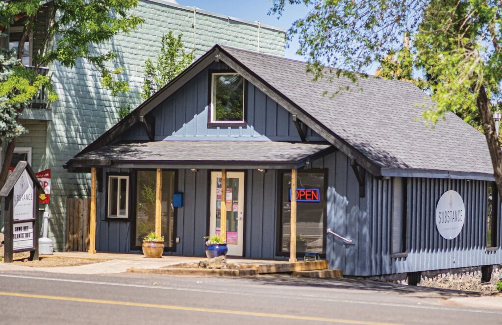
If Nordstrom and a local minimart had a baby, the offspring would resemble Substance. The Oregon chain employs features commonly found in fast-paced, product-intensive sectors like convenience stores and pharmacies but allows guests to find their own shopping pace. Known for reclaiming buildings abandoned by other businesses and remodeling on a tight budget, the Substance team nevertheless has managed to infuse each location with personality, local color, and small-town charm by embracing the unconventional.
Discovery Bay Cannabis
Jefferson County, Washington
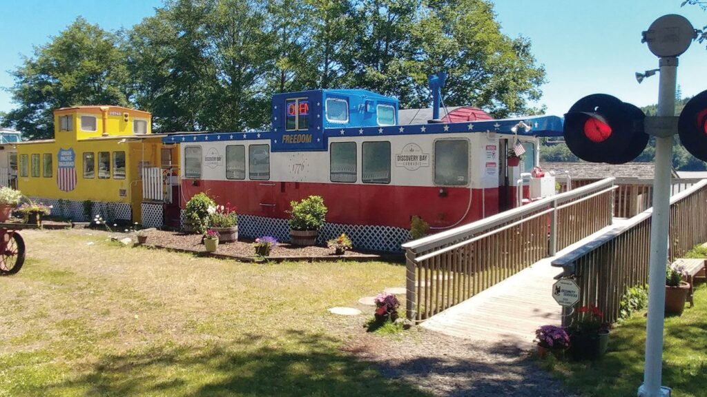
Discovery Bay Cannabis epitomizes a low-key retail establishment: The dispensary lacks a website and isn’t well-represented in online directories. Yet, the Washington-state shop is popular with locals and tourists. If it required a password for entry, the secret code undoubtedly would be “All aboard!” Accessing the sales floor requires customers to board a once-abandoned train and travel from boxcar to boxcar to explore product offerings, interact with budtenders, and complete purchases. Despite the store’s minimal online presence and marketing compared to competitors, Discovery Bay’s popularity underscores the allure of its unique atmosphere.
Prairie Records
Saskatoon, Saskatchewan, Canada
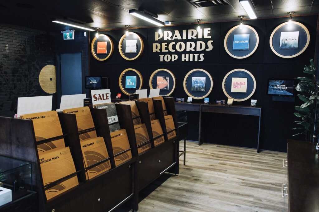
A mix of mocha browns and light tobacco shades creates a sense of smoky elegance at Prairie Records, which leans into the enduring relationship between cannabis and music in a big way. The uninitiated might be thoroughly confused by how closely the shop resembles a traditional record store, but those in the know appreciate special touches like listening booths that offer playlists curated to pair especially well with specific strains. The “Top Hits” wall shows off featured products, and rows of wooden shelves house record jackets that serve as clever disguises for educational and marketing material.
The OG Cannabis Cafe
West Hollywood, California

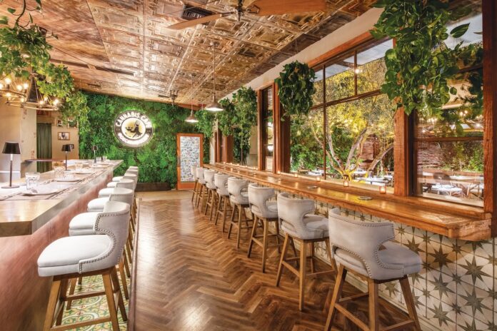
West Hollywood’s OG Cannabis Cafe achieved notoriety when it debuted in 2019 as the first consumption lounge in the United States. Unfortunately, the launch soon was followed by less-than-ideal circumstances: the emergence of COVID-19. The cafe has since reopened under new ownership. Dubbed a “pub for pot people,” the establishment is designed to emulate a classic beer-and-wine bar, complete with exposed brick and lush greenery adorning the interior. Guests may choose to take a cozy seat at the bar or relax on the patio. Whether opting for a quick visit to restock on products or seeking an enjoyable evening out with friends, the cafe’s concept introduces a cannabis-centric “third place” for WeHo residents. The spot sets a precedent for integrating social cannabis businesses as viable and progressive options within local communities.




[…] like many non-cannabis retailers do: Use point-of-sale lines to seduce and entertain customers while leaving a positive last impression, Lam […]