


Fire & Flower has had a busy 2019. The company refined its brand concept and hired a bevy of contractors, architects, and engineers to add more than twenty locations across Canada. Needless to say, challenges have been many. One of the biggest: By the date on which recreational sales became legal, many municipalities hadn’t finalized permitting requirements. Without clear guidance, stores struggled to stock the shelves—and even to design them. Packaging regulations remained up in the air as government-mandated opening dates approached, and determining what products local markets would embrace involved a considerable amount of guesswork.
Isaac Watson, Fire & Flower’s vice president of product development and retail experience, applauds his team’s herculean effort to bring everything together. “We see our staff as foundational to our business model and to our current and future success,” he said. “We have an amazing team whose expertise spans licensed production, legal, retailing, branding, government relations, compliance, and training. We would not be where we are without our stellar team, and our customers remind us of how valuable our efforts are every single day.”
The company strives to appeal to a broad swath of consumers, from the established cannabis community to first-time experimenters and those returning to a pastime they indulged secretly in the past. Apparently, the dispensary chain has found the formula. Between all shops combined, budtenders—which Fire & Flower calls “cannistas”—assist several thousand customers daily. Watson said traffic is highly dependent on the municipality and day of the week, but each store has grown month-on-month.
While each shop has a distinct design, all are based on foundations of art, urbanity, nature, and elegance. “This foundational inspiration has become the perpetual springboard for an evolving vision to satisfy an ever-broadening client base,” said Jacqueline Davis, director of store design and development. “Although we are a rapidly growing company, there is nothing ‘big box’ or cookie cutter reflected in our designs.” For each location, she curated murals, paintings, and fine-art photography by local artists. The metropolitan stores exhibit contemporary abstracts, while the mountain locations and rural shops feature rustic pieces. Greenery, whimsical elements, and intriguing furniture designs round out the effect. “These additional layers of visual interest provide an engaging and unexpected backdrop,” Davis said.
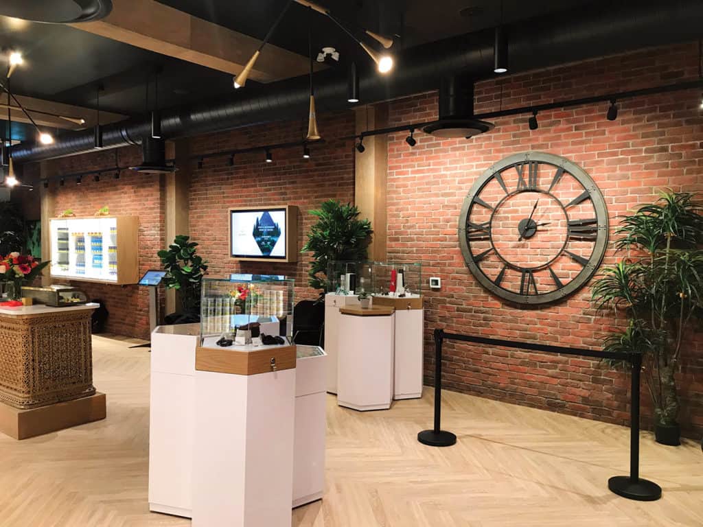
As she began researching materials to give a cohesive impression to stores that are individually designed to fit disparate communities, she realized—not for the first time—the Canadian climate can be unforgiving to floors. Her go-to flooring is white or gray luxury vinyl, as it is bright and easy to clean. However, for the Kingston, Ontario, location, she selected wood plank laid in a herringbone pattern to match the building’s 1884 vintage. A forty-five-foot-long brick wall augments the historical integrity of the space.
For the mountain locations, Davis selected dark, warm finishes that comfort chilled-to-the-bone guests and hold up well under weather than can be harsh. In contrast, the airy downtown Alberta store displays a riot of colors: reds, oranges, purples, and greens. Open, industrial-inspired ceilings present substantial impact and an ideal backdrop for layers of lighting. Chandeliers vary by location, ranging from moose antlers in Canmor to floral orbs in St. Albert and polished mod in Edmonton. “All stores’ chandeliers are complimented with sleek pendants and track lighting to accentuate our showcase displays,” said Davis.
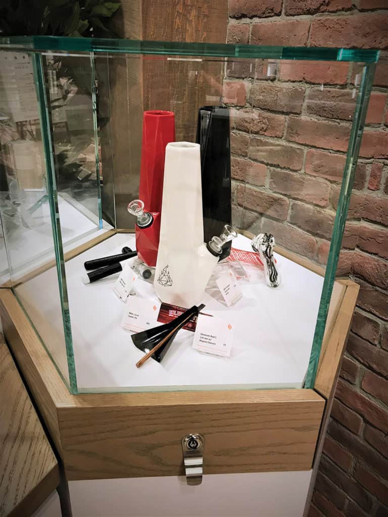
The showcases proved the biggest design challenge. Each province has a unique set of regulations, including how product may be displayed and whether customers may interact with merchandise. “There is a balance,” she said. “We want to maximize the experience of our customers while still maintaining our compliance.”
Davis chose to see the divergences as an advantage, generating a unified merchandising vision and set of standards that could be modified as necessary. “First impressions are key to our growing client base and, as a designer, my first impressions upon initial site visits will typically spark an imaginative whirlwind of ideas,” she said. “The creative catalyst begins with familiarizing and appreciating the uniqueness of the surrounding community, architectural details, and challenges within the location. Each [store] opening is essentially a functional lesson.”
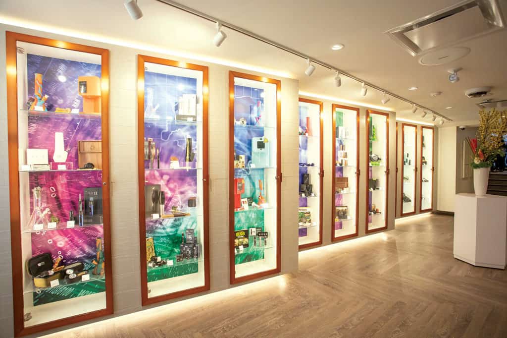
Most Fire & Flower shops contain movable floor cabinets reminiscent of a high-end jewelry store, which provide space for promotional vignettes. Cannabis accessories are displayed in full-height showcases, and hexagonal cabinets allow customers to view merchandise from a variety of angles. “This provides clarity to their anticipated purchase,” said Davis. To compliment the displays, bespoke glass pop-ups at the cash desks house necessities like rolling papers, lighters, and pipes. The overall look is “a combination of functional merchandising and color stories to create the most visually interesting, yet simple-to-shop, displays,” she said.
In addition to the cabinets and floor displays, stores incorporate a “strain wall.” The wall is an eight-foot-long, glossy-white pegboard hosting information cards for each strain in stock. The hexagonal cards come in six bright colors and can be organized in many ways. “This is effective at drawing attention to certain products and to evoke a level of wonder when customers see it,” Davis said. Each shop reorganizes its wall several times a week, keeping the atmosphere fresh.
While the stores are spacious, they’re also intimate. Each contains no more than two or three point-of-sale terminals. “This makes our shops feel welcoming during low-traffic times,” said Watson. “We deploy mobile terminals to support the sales floor when traffic picks up so transaction times don’t increase and we are able to maintain our customer service standards.”
In the end, the real trick was to have as many elements as possible in every shop. Most locations have vestibules dominated by an impressive 3D wall treatment and a glowing, copper Fire & Flower logo. The cash desk with copper logo is another defining feature, as are the showcase displays designed with copper doors. All stores incorporate community tables bearing tablet computers offering real-time menus, interactive kiosks, “budcation” boards, and supporting signage and literature.
Store exteriors also have purpose. After much debate, the team agreed community-facing features represented an opportunity to spread brand recognition. So, Davis chose channel lettering in a large, backlit, block font, ensuring visibility regardless the time of day. Graphics and colored frosting prevent window-shopping and reinforce additional branding elements. More than just a place to sell cannabis, Fire & Flower aspires to present a retail adventure that ignites the imagination. “Our intent has been to create inviting and inclusive shops to facilitate a stigma-free environment conducive to educational and impactful client engagement,” Davis said.

