Something must have happened to people during the pandemic. I think being cooped up has caused some creative types to let their minds wander, because recently, we’ve seen an explosion in new packaging designs from some of the biggest companies in the world. Perhaps sitting in front of a computer for twelve hours a day with nothing else to do can be inspiring.
McDonald’s redesigned its food containers to bring a “sense of joy and ease” to the brand’s iconic products. Each item is now served in packaging that contains a bright and simple graphic design representing the food inside. Not to be outdone, its biggest rival, Burger King, released a new logo and wrapper in January. Both brands evolved to a cleaner, more modern aesthetic.
Pizza Hut went retro when it re-designed its pizza boxes to resemble the old-school video game, Pac Man. The brand even included a QR code, which allows people to play through their phone.
Kellogg’s has been a breakfast staple for more than 100 years, however, its old packaging was no longer relevant to contemporary tastes and was thought to be contributing to the downfall of its iconic status. In response, the brand went through its biggest re-design in a century in order to re-establish its position as an authentic category leader.
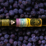
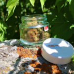
But perhaps no industry has reshaped its image through packaging design more than cannabis. Each year, hundreds of new brands launch, often with packaging that displays upscale imagery and design elements intended to make the recently legalized product appear respectable, desirable, and unashamedly mainstream.
I’ve often said the key to winning at the cannabis game is in attracting the mainstream customer. These people don’t want any connection to old-school stoner imagery or cheap plastic bag packaging. They demand something more sophisticated and refined. And today, cannabis brands are racing to create upscale looks that meet this challenge of changing perceptions.
Dalwhinnie Farms has done this better than most. The Aspen-based dispensary looks like it was designed by Ralph Lauren, and the brand’s new packaging utilizes a variable data label as a key element in its design. The variable data label captures testing results and other regulatory requirements that change with each batch.
At a time when many (if not most) other brands just slap a poorly-designed sticker on the side of the package in order to comply with regulations, Dalwhinnie designed its variable data labels as part of the design aesthetic. These labels are not only necessary, but also take up considerable real estate, so incorporating them into the design just makes good sense.
Another cannabis brand, Lemonati Family Farms, recently was nominated for a PAC award—a global competition that recognizes craftsmanship and innovation in packaging design. The first cannabis company ever to win this award, just two years ago, was a Hippo Premium Packaging client. The win was milestone that helped demonstrate how far cannabis brands have come both in terms of design elegance and growing consumer acceptance.
Packaging has always presented a challenge for brand owners. But in the rapidly evolving cannabis industry with its many limitations on advertising and marketing, and the pressure to appear upscale, acceptable, and elegant, packaging takes on an especially weighty role.

Kary Radestock brings more than 20 years of award-winning print and packaging expertise to some of the top brands in the world. She launched Hippo Premium Packaging in order to fill a need for professional, compliant packaging, brand development, and graphic design to the emerging cannabis industry.


